Large poster, written and illustrated as a means of propaganda of what we do more or less every day for many years.
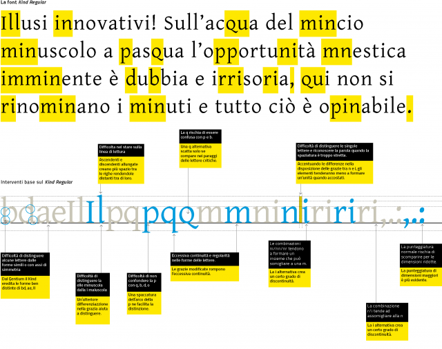
High text accessibility
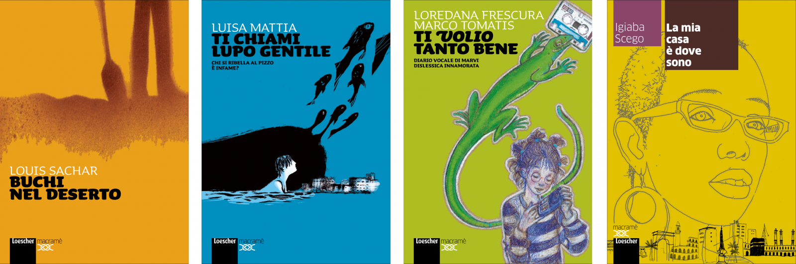
We used a "design for all" approach to create a series of fictional novels for young people for Loescher publishing house. The Macramé series is conceived to offer the best possible text accessibility, both for stronger readers and for those who may struggle due to learning difficulties, visual impairment or age. The distinctive feature of this project is the inclusive approach to the design of all visual aspects of the page.
How. We studied the specific and unique aspects of the different abilities, identified which visual characteristics were shared and which were variable, and finally built a single reading platform that removed the barriers and obstacles, without disturbing more proficient readers.
What. Graphic design.
Client. Loescher Editore, Turin (IT).
Year. 2012.

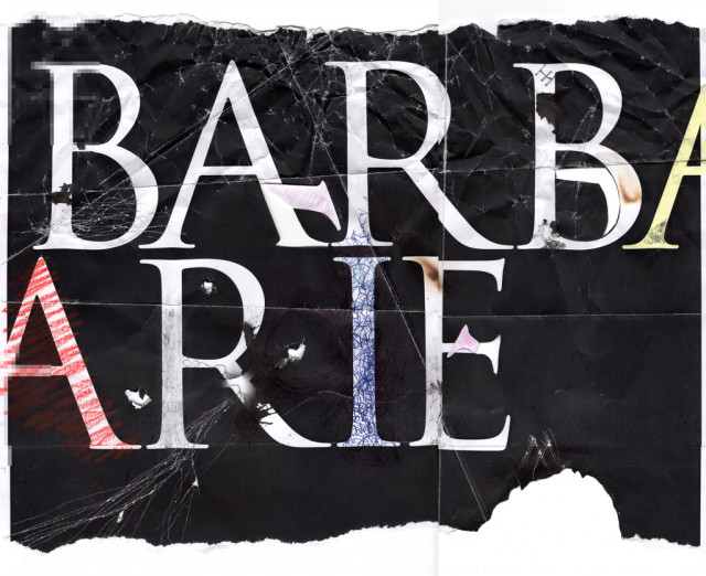
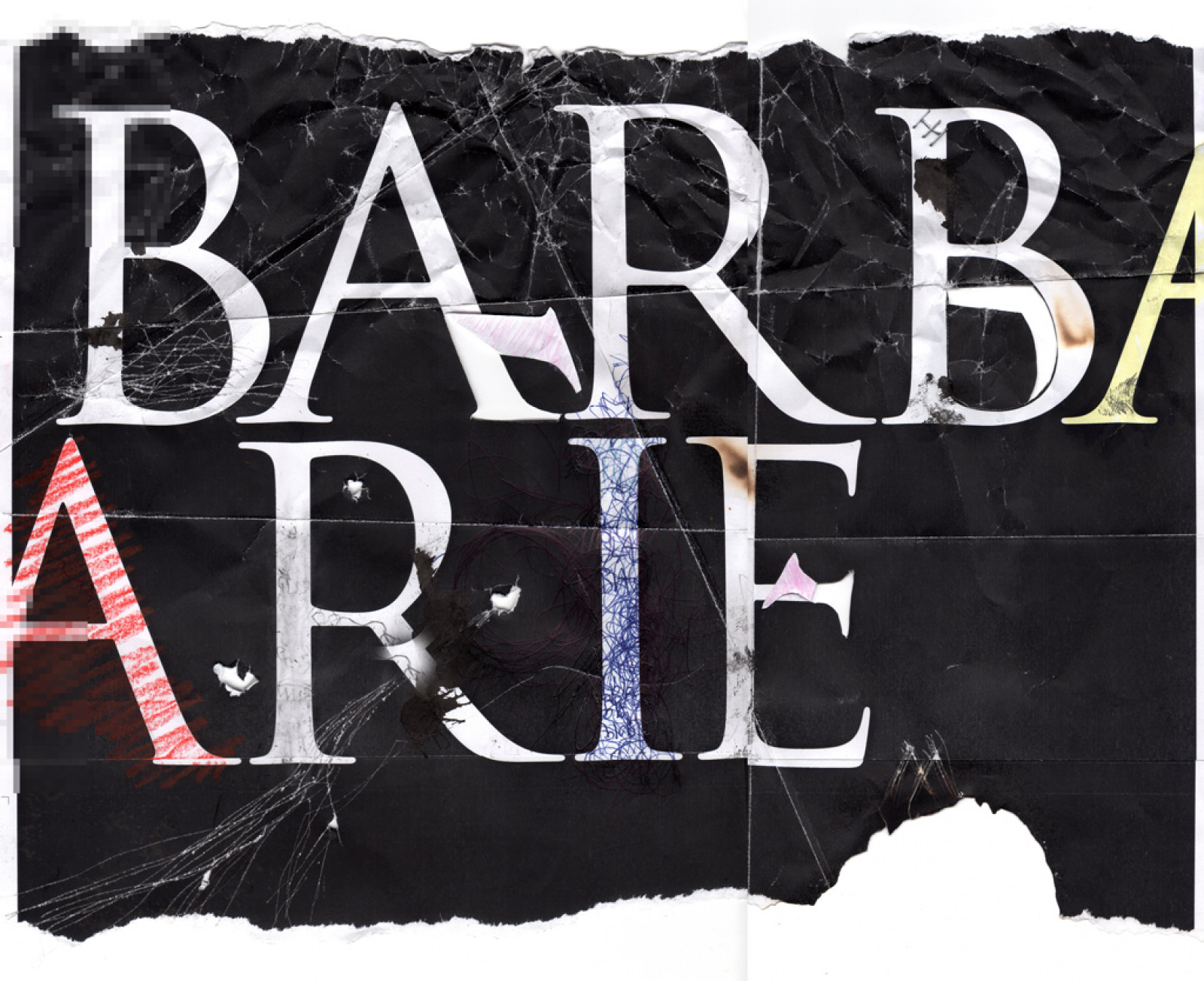
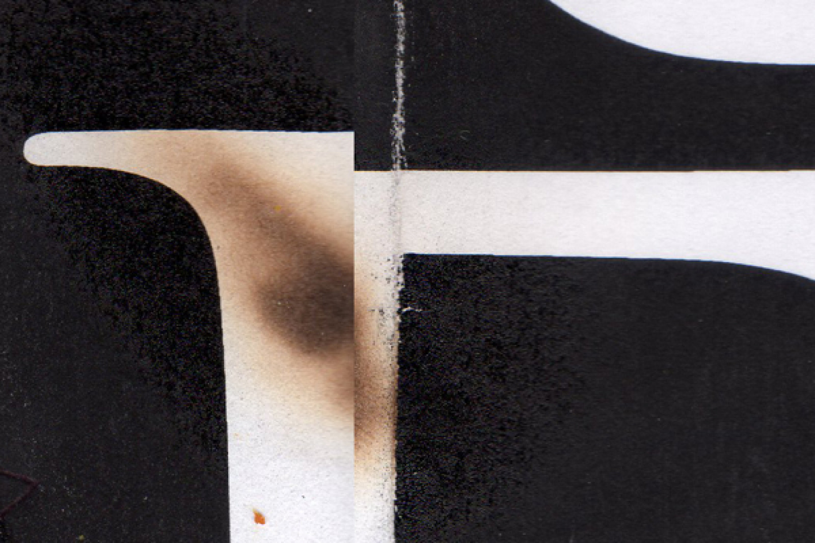
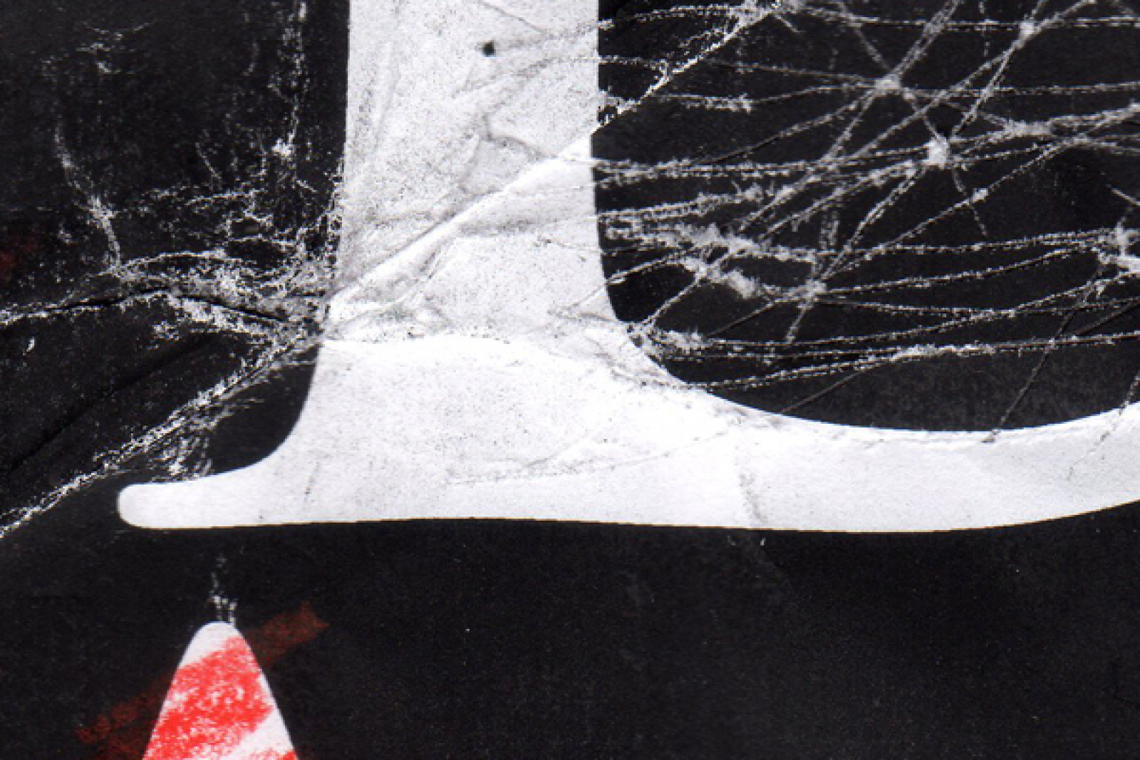
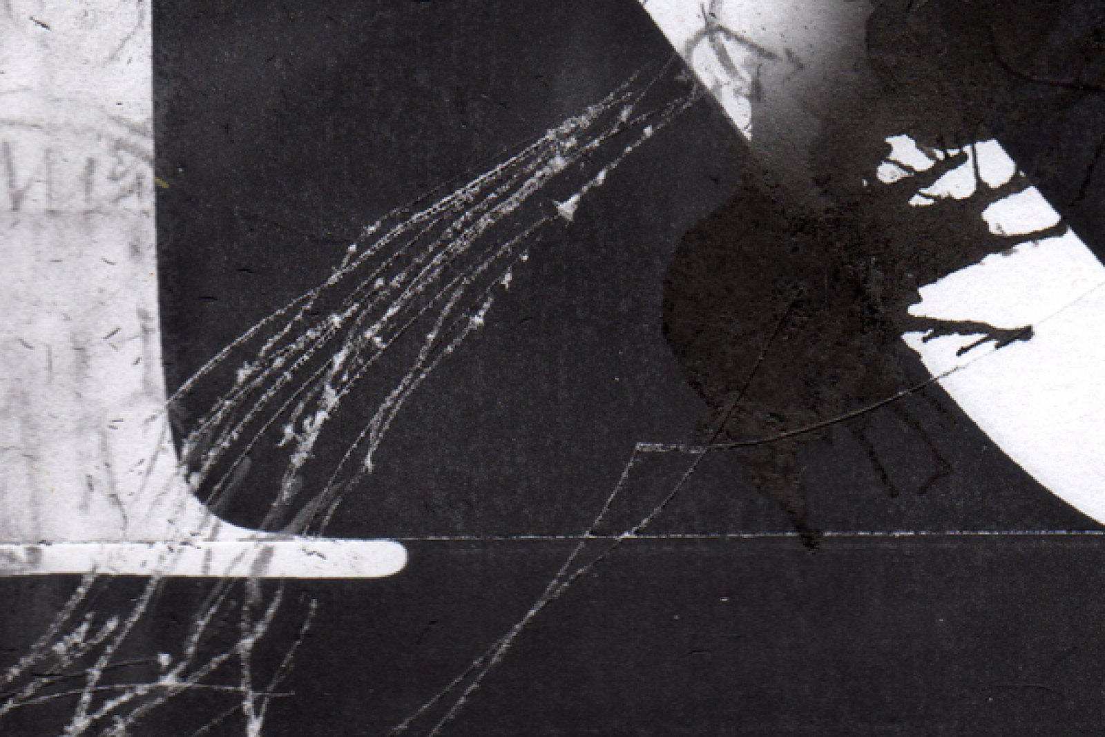
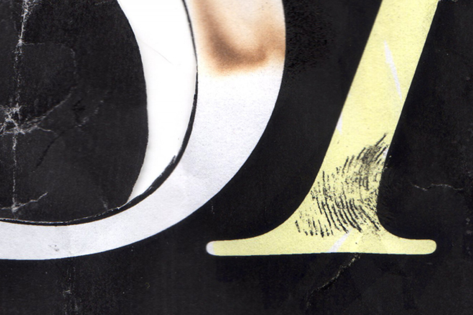
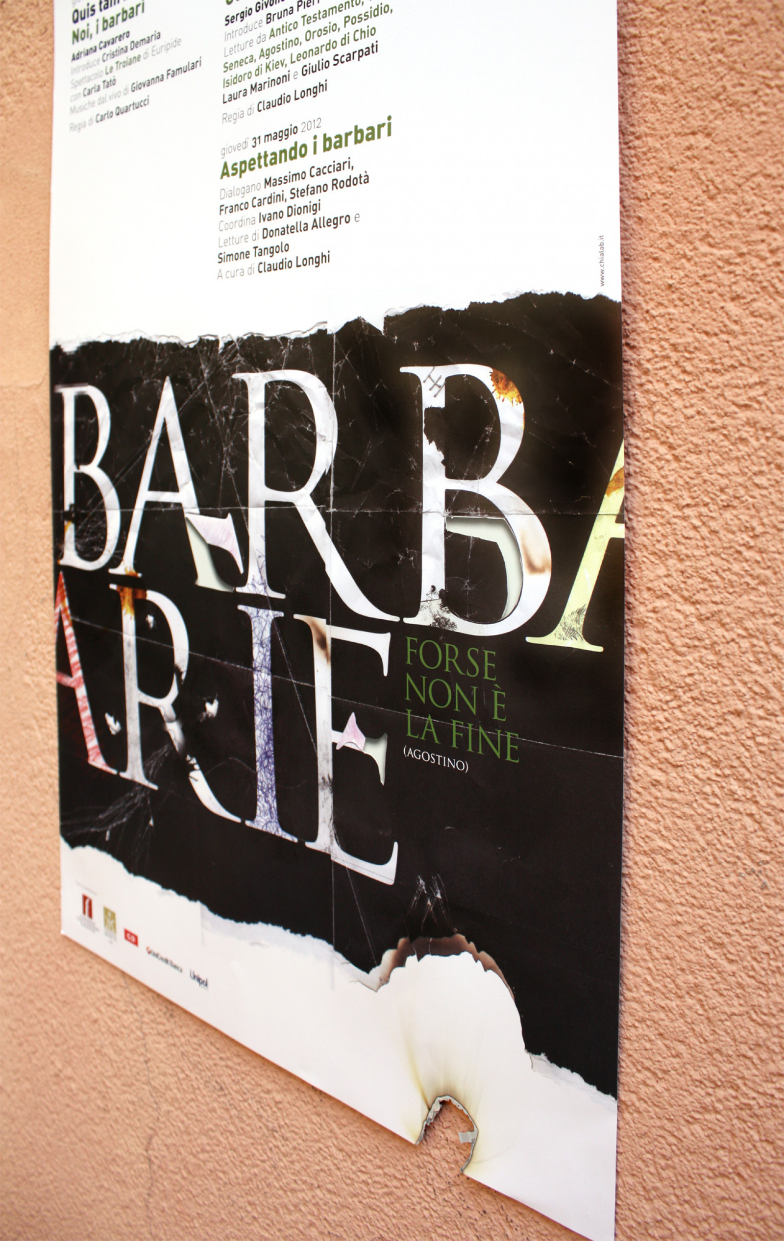
Waiting for the Barbarians
For the eleventh year running, the "La Permanenza del Classico" [Permanency of the Classical] study centre, in collaboration with the Department of Philology and Italian Studies at the University of Bologna, has organized a series of themed events, with readings by famous actors and commentary from academics and intellectuals.
How. We used the form of the typographical character to explore the topic of the “rhetoric of otherness”, which drives us to call people and cultures barbaric if they do not conform to the interests and values of the dominant culture.
What. Graphic design.
Client. “La Permanenza del Classico”study centre, Bologna (IT).
Year. 2012.
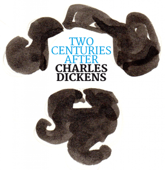
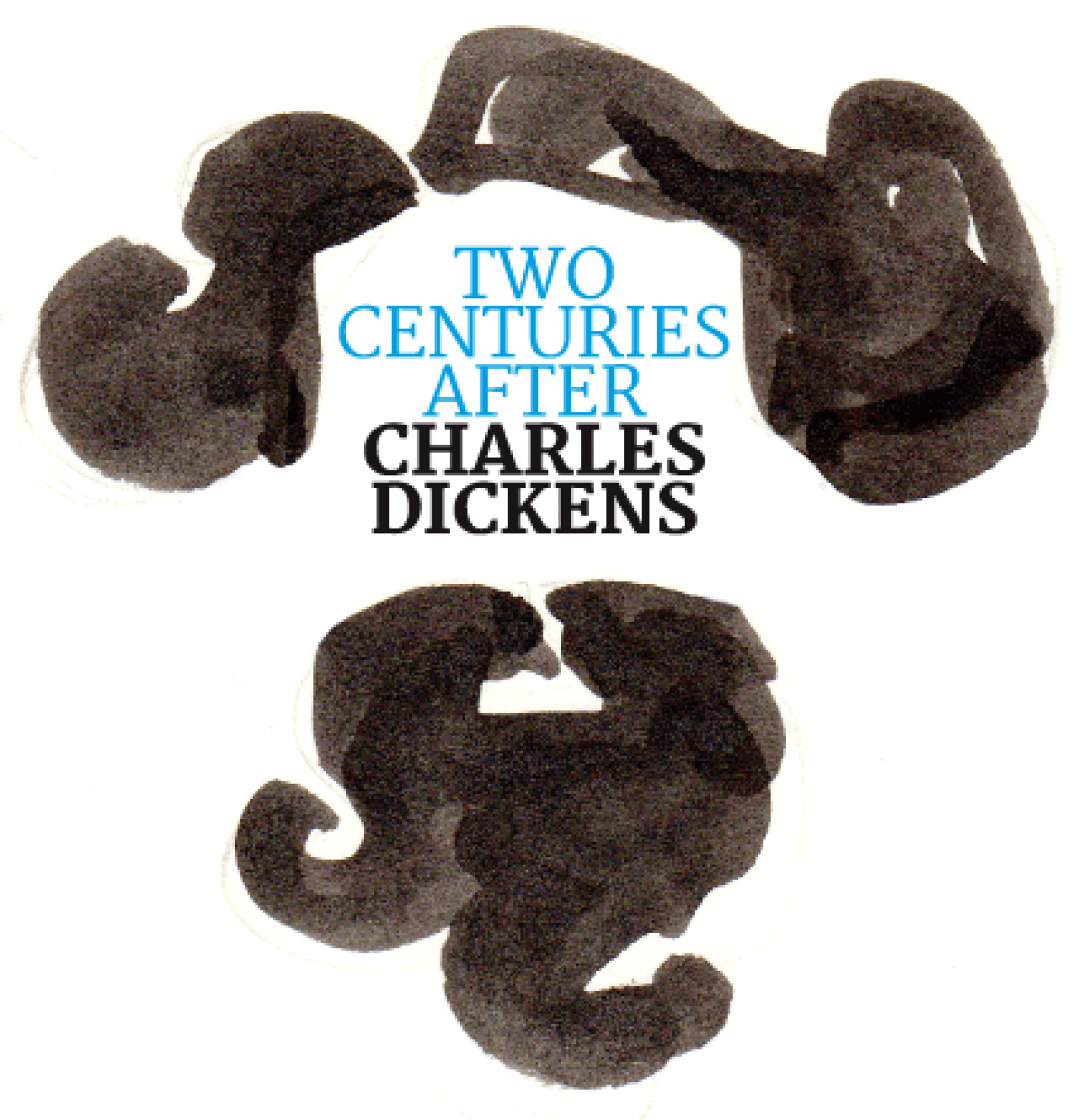
Writer face
The bicentenary of the birth of Charles Dickens.
Two Centuries After: Charles Dickens is the exhibition planned by Bologna Children’s Book Fair and curated by Cooperativa Culturale Giannino Stoppani, held at the Casa Saraceni in Bologna.
How. The logo accompanying the exhibition was created in collaboration with Vanna Vinci. A face that does not look at you, but instead writes for you. The interior design includes theatrical scenery, lavishly decked tables and stacks of first pages, to accompany the gallery of illustrations for A Christmas Carol. On display are illustrations by Barbero-Gil, Blake, Ensikat, Fomina, Innnocenti, Lynch, McKowen, Simmonds, Zwerger and Maggioni.
What. Design, staging of exhibition.
Client. Bologna Children’s Book Fair, Bologna (IT).
Year. 2012.
Partnerships. Vanna Vinci.
Formulating the future
For Fiori Group at Ecomondo 2011 we designed the interactive installation Formulare il futuro [formulating the future].
How. The idea was to offer visitors the possibility to imagine the future, building their ideal formula on a large magnetic wall.
What. Analysis, design and production, staging of exhibition.
Client. Fiori Group, Valsamoggia (IT).
Year. 2011.
Watch a video of the installation.
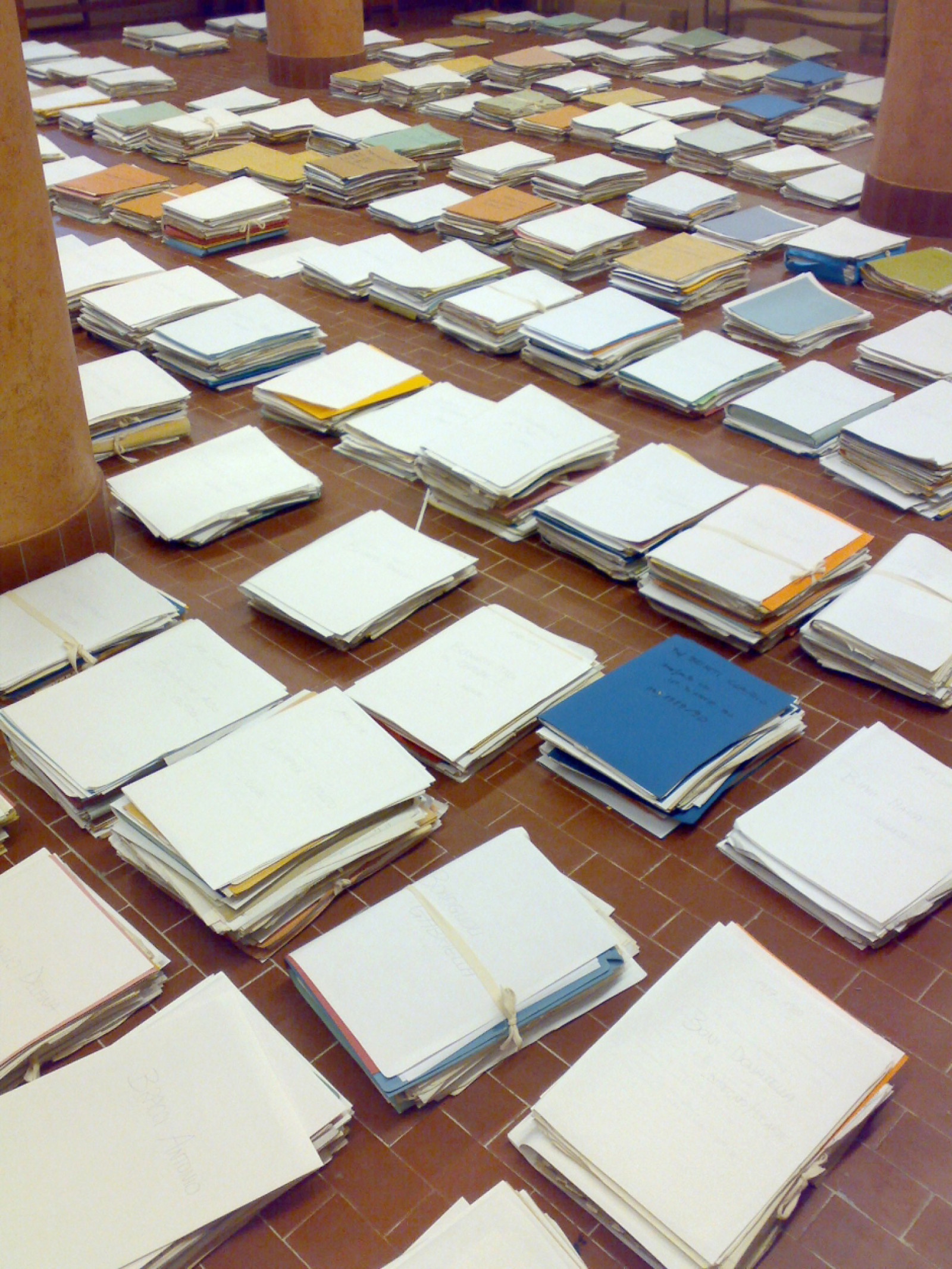
Biblioteca Salaborsa on Presadiretta
We are passionate about archives and libraries. The harrowing situation described by TV presenter Iacona on his programme Presa Diretta on Sunday 26th February 2012, regarding spending cuts to cultural projects, is something we are experiencing in many of our own projects. The Biblioteca Salaborsa [Salaborsa Library], presented after the British Idea Store project, proves that we can do it, but it does not calm our fears regarding the fate of cultural institutions. On the one hand, libraries, archives, museums, theatres and cinemas are forced to jump through hoops just to survive; on the other, the vast cost of projects (?) such as the Italy Culture and Tourism portal (the very juxtaposition of these two terms should give pause for thought) shows a lack of any strategy, projection, ability (or desire) to build meaningful relationships with those who work on the front lines, offering goods and services that are anything but superfluous. The evident distance between these two visions of building and making “culture” is of grave concern. There is great passion in the sacrifices made by those personally involved in this field. In contrast, there is a lack, on the part of the decision makers, of consideration for design as a tool that creates something of value, that looks to the future without squandering resources. Enjoy the show.

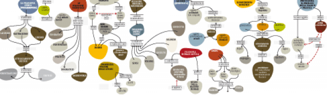
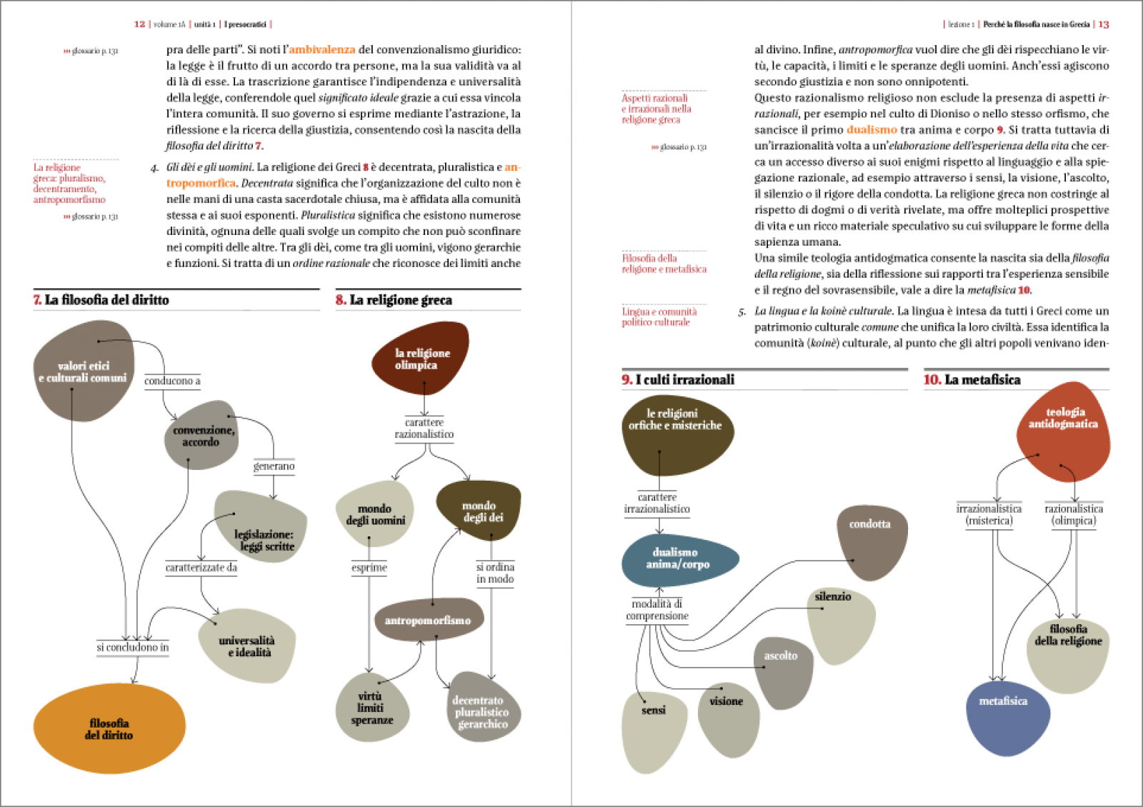
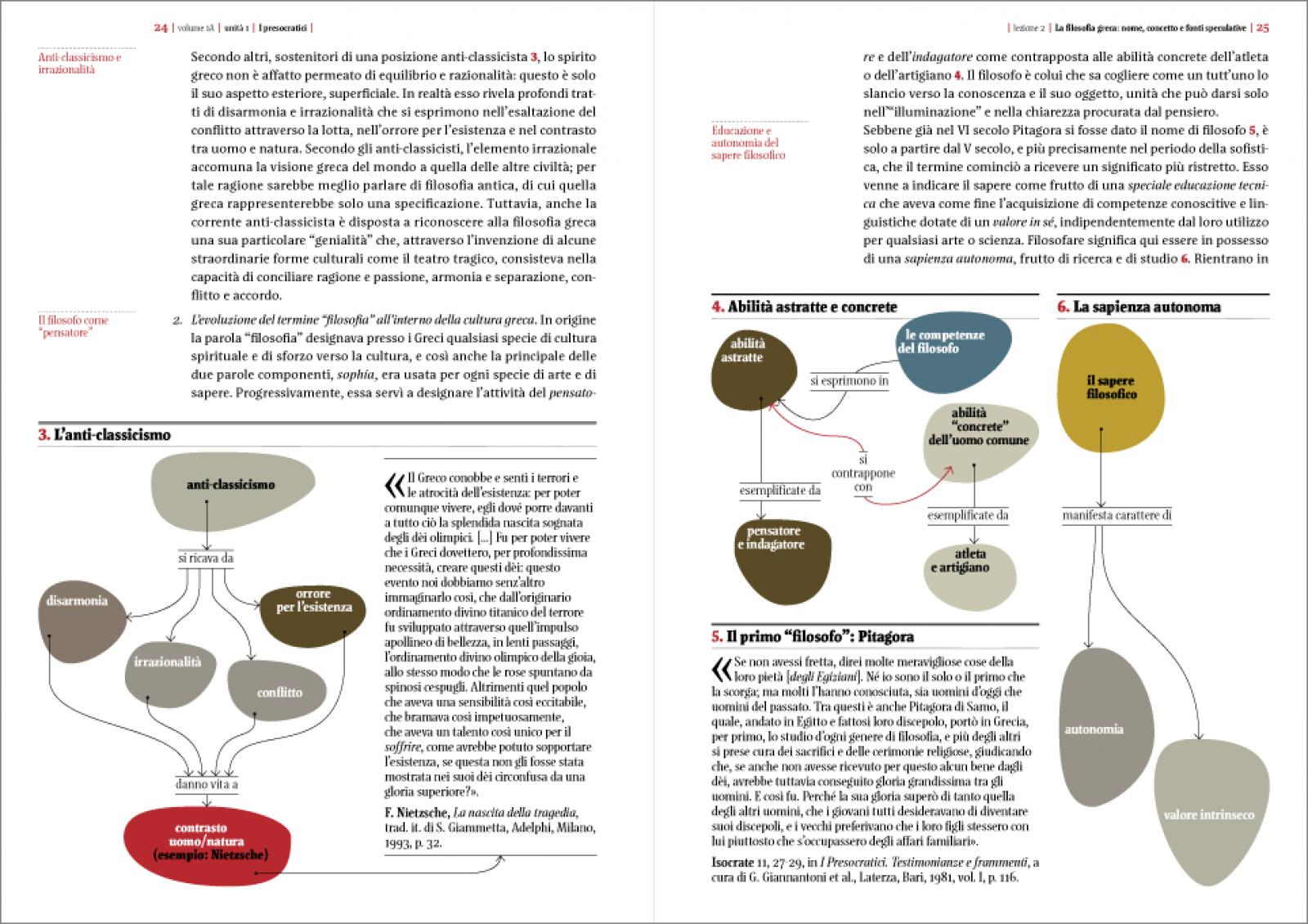
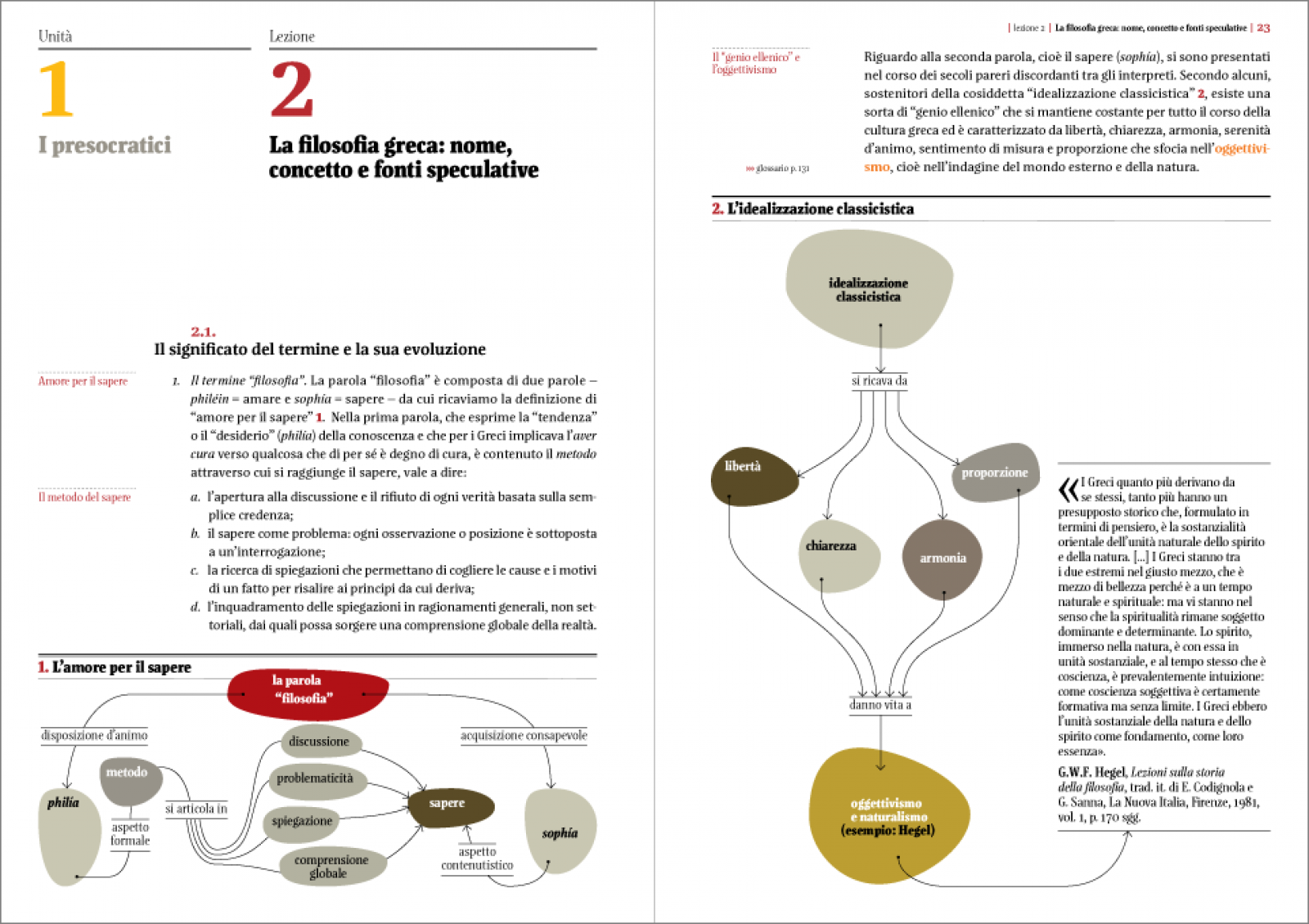
Mapping philosophy
Mind maps, charts and diagrams (collectively known as infographics, to use a buzzword) have always been extremely helpful when trying to understand complex concepts. We find them in students' notes, they are a useful mnemonic tool, and when working or studying in groups they are a great way to share information. They come to our aid, inviting us to follow their line of reasoning, encouraging us to break things down to the bare essentials, to take non-sequential paths, to see the bigger picture regarding a concept. They are a big help for people with learning disabilities and other difficulties.
History, concepts, movements, philosophical theories, explained in hundreds of maps. Le grammatiche del pensiero [the grammars of thought] is a 2,400-page book published by Zanichelli, containing 572 maps created directly within the page layout.
How. A simple, rigorous graphic layout, with few graphic elements, a colour chart and some syntactic rules for the construction of the maps enabled us to interpret the authors' instructions precisely and consistently.
What. Graphic design.
Client. Zanichelli Editore, Bologna (IT).
Year. 2012.


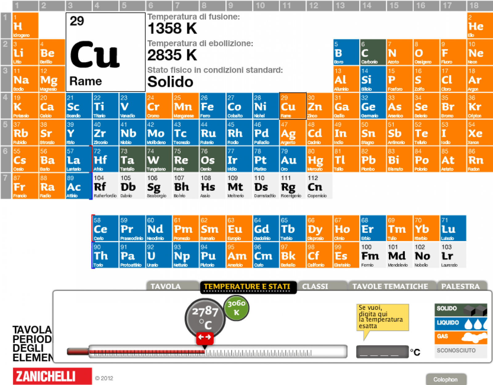
An interactive table
We developed the second edition of the periodic table of the elements for publishers Zanichelli.
How. The interface is designed to facilitate both classwork, using the IWB (interactive whiteboard), and homework. Integrated into the Interactive eBooks, in contains a several different study environments: Temperature and states, Classifications, Charts, Practice.
What. Design, UX, UI, development.
Client. Zanichelli Editore, Bologna (IT).
Year. 2012.

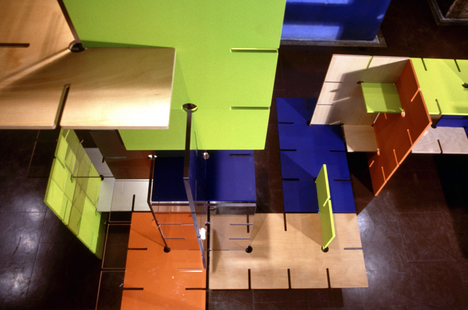
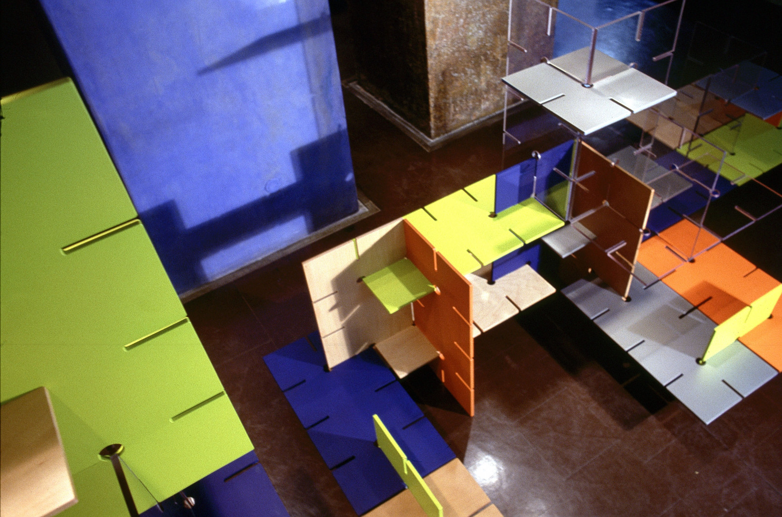
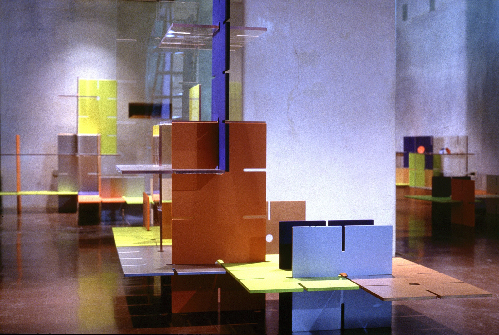
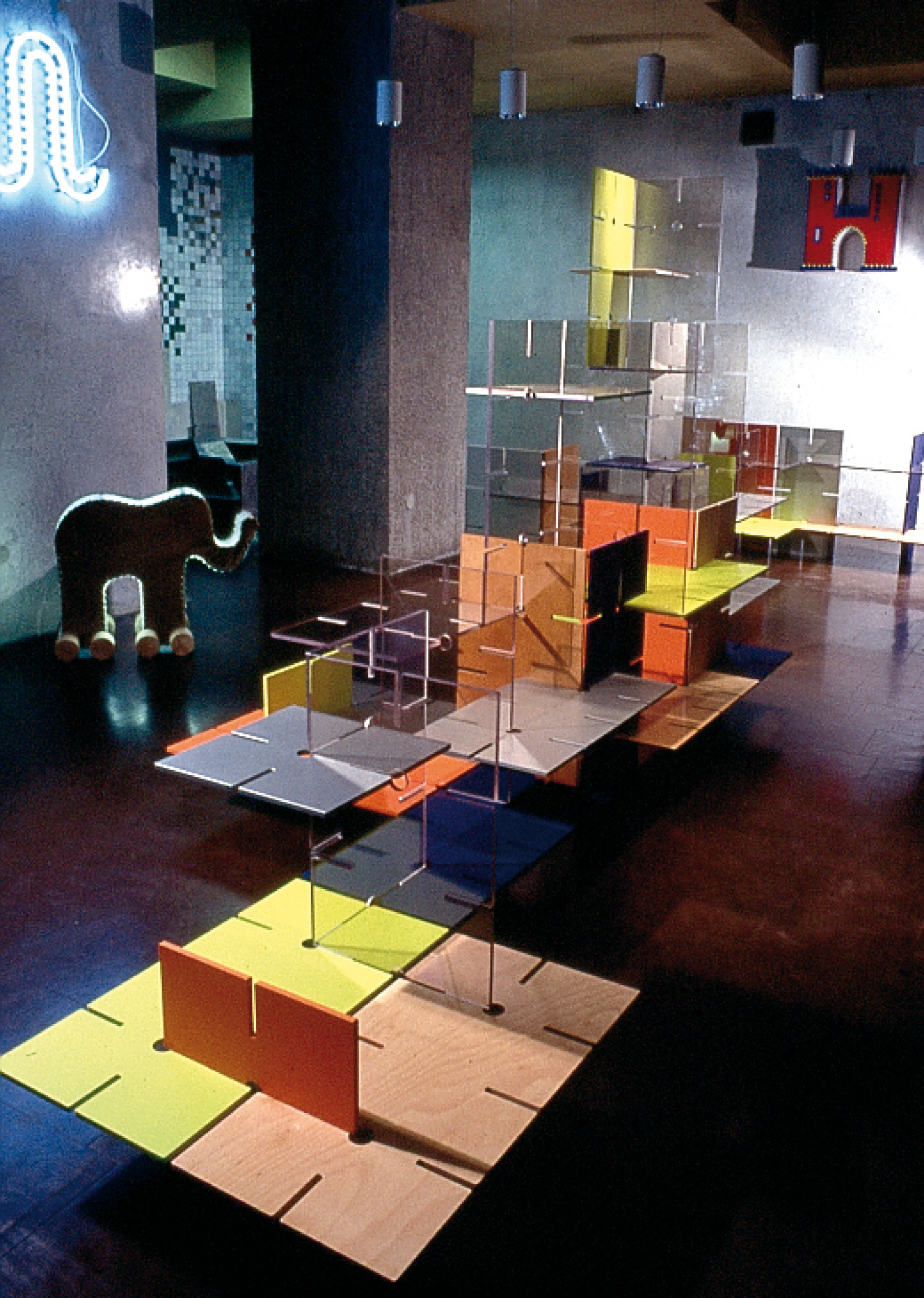
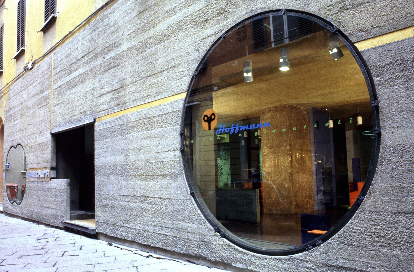
Hoffmann
A sensitive project working on the interior decor and identity of Hoffmann: a toy shop housed in the former Gavina store, designed by Carlo Scarpa between 1961 and 1963, at via Altabella, 23, in Bologna.
How. We wanted the furniture to pay homage to Carlo Scarpa, developing a modular system of panels to slot together at right angles. The panels are in a range of sizes, colours and above all, materials: wood, aluminium, polycarbonate, MDF… each panel reveals its bare material. The panels are assembled simply by slotting them together, so that the architectural forms created can be simple and linear or complex and intricate. The visual identity chosen for the brand is a clockwork winding key. An element that gives power and energy, and focuses particular attention on manual skills and the educational function of toys.
What. Interior, visual identity.
Client. Hoffman srl, Bologna (IT).
Year. 2012.

FITSTIC
ITS Foundation for Information and Communication Technology in Technical Schools is born
Chialab has established partnerships with many institutes, education and research foundations, businesses and institutions, and together we created the FITSTIC foundation (the Foundation for Information and Communication Technology in Technical Schools), with the aim of planning and developing original and innovative educational courses in the fields of IT and communication.
We know how difficult it is to find people who already possess the skills needed to be competitive. We know the level of investment faced by companies in our sector get young employees properly trained. Communication technologies evolve at dizzying speeds, while the education system seem structurally impervious to innovation and research. By taking part in the FITSTIC foundation we hope to be able to do our bit to bring training and research back into a key position, to meet the needs of businesses and support innovation.

Exploring memories
The archIVI project is a portal inviting you to explore memories of the city of Bologna, browsing through the city's public and private archives. archIVI seeks to recover, protect, index and render accessible the immense and fragmented wealth of historic documents, photographs and audio-visual materials that together form the physical memory of the past two centuries in this city.
How. In addition to co-designing and producing the IT system, it was our job to make accessibility to the vast quantity of data as smooth and simple as possible. We also took care of the user experience and the design of the graphic interface of the portal, right down to details such as the design of a special system of icons.
Year. 2012.
Partnerships. Expert System, Channelweb.
archIVI is sponsored by Fondazione del Monte and Fondazione Carisbo, and involves many of the institutions and bodies of the City of Bologna.
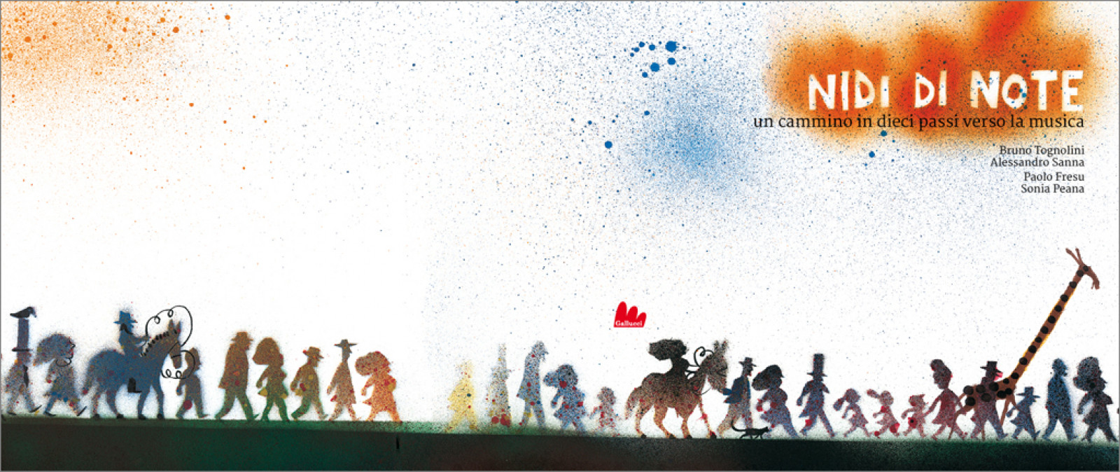
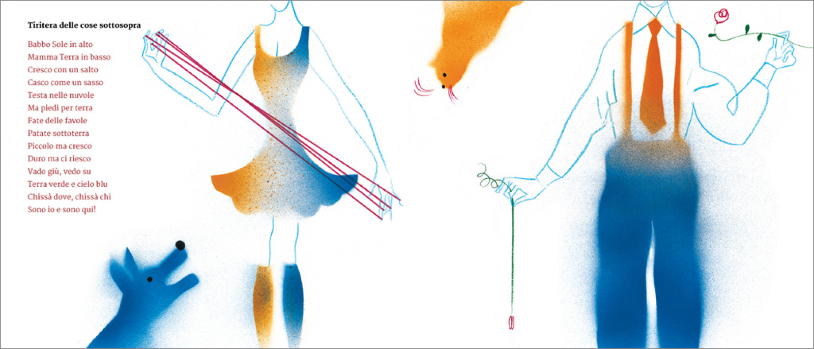
Nests of Notes
Nidi di note [Nests of Notes] is an illustrated book, a course in musical education to browse, read and listen to, which was presented at the 2012 Bologna Children’s Book Fair.
How. We worked with Sonia Peana and Paolo Fresu, who composed and performed the music, while Bruno Tognolini wrote and then read the stories and nursery rhymes, and Alessandro Sanna did the illustrations. We were in charge of the book design, and we put everything together for the guys over at Gallucci editore. It was a challenge, because the project (which will continue with an app) does not adhere to the classic canon of children’s books. It is a project that tells fairy tales, shows illustrations, plays music and recites nursery rhymes. Putting all this into a single object was a tall order.
What. Artistic direction, graphic design and page layout.
Client. Carlo Gallucci editore, Rome (IT).
Year. 2012.
Partnerships. Sonia Peana, Paolo Fresu, Giannino Stoppani Cooperativa Culturale.