Large poster, written and illustrated as a means of propaganda of what we do more or less every day for many years.
Letters in the right place
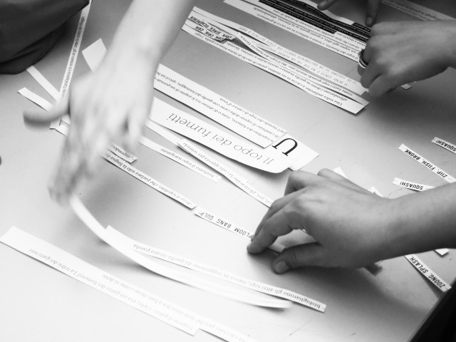
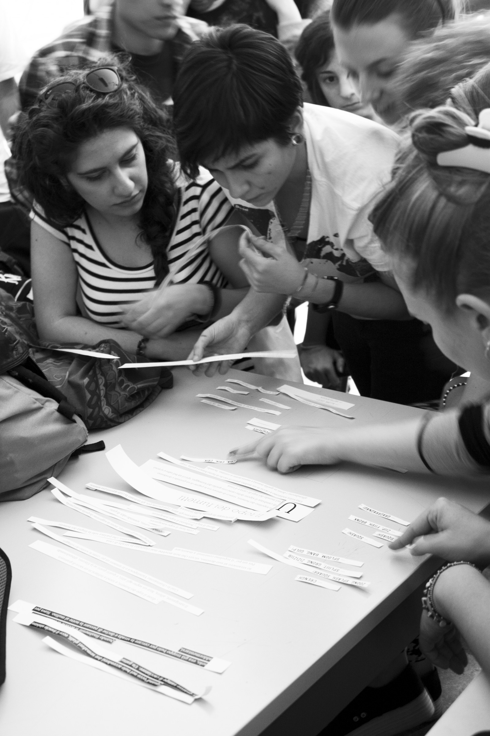
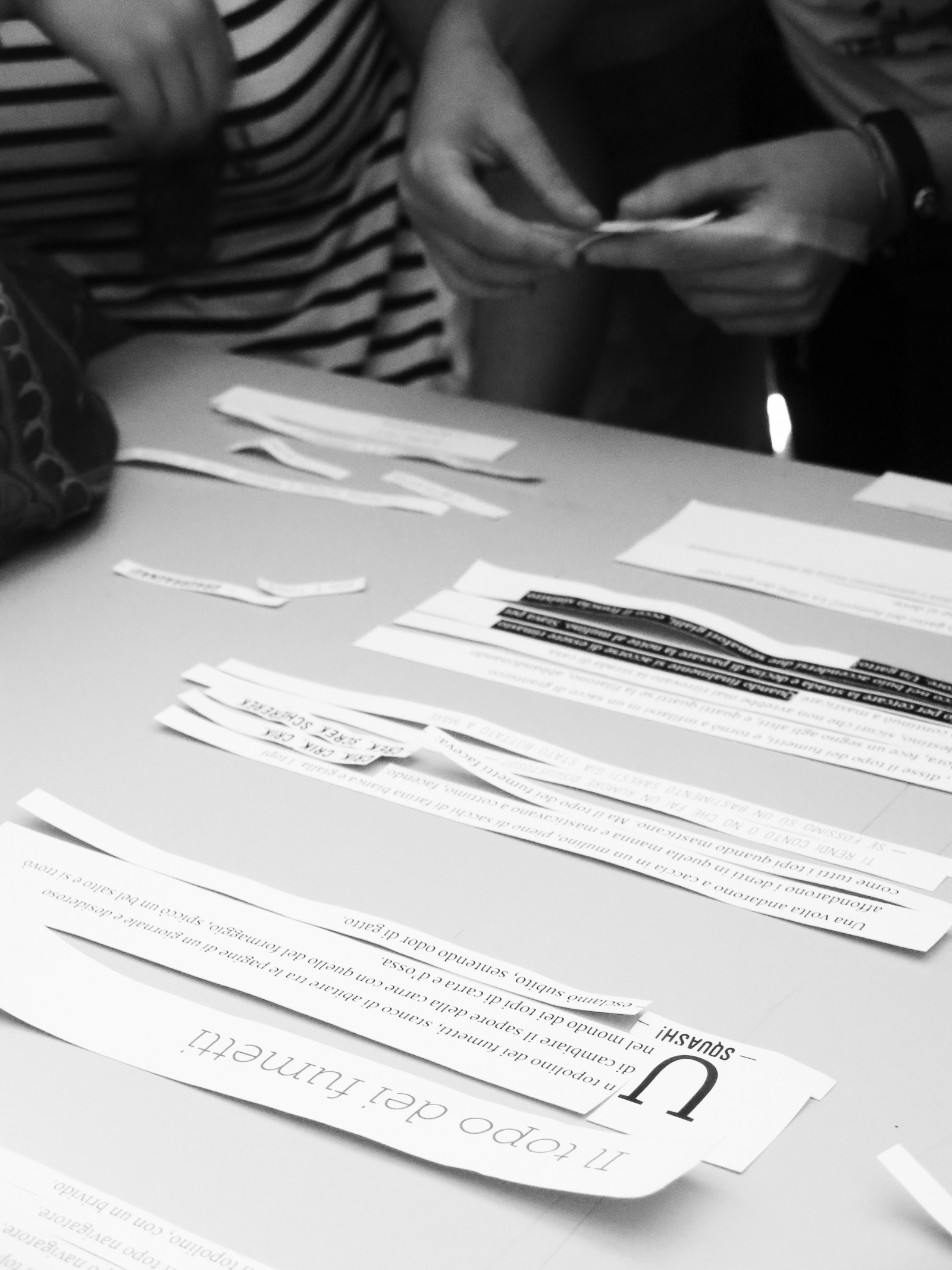
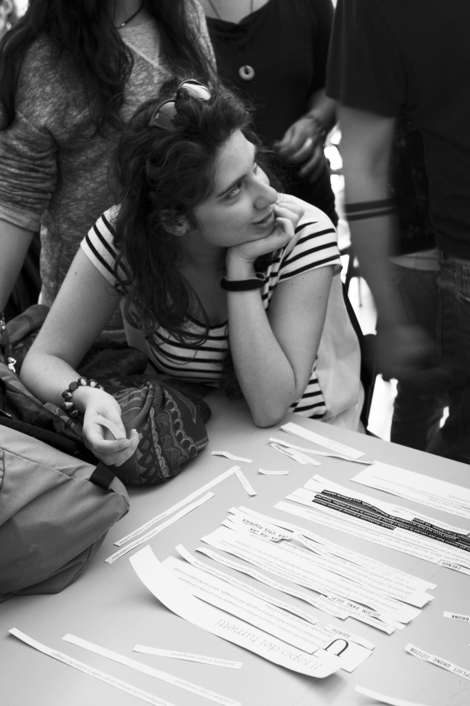
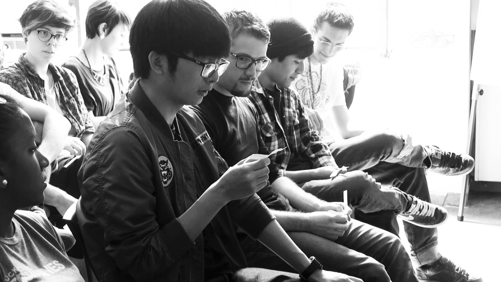
We met with the students of the Bologna Fine Arts Academy, and with them we carried out an experiment in collective self-design: rewriting one of the Favole al Telefono (Fairy tales on the Telephone) by Gianni Rodari, by rebuilding the voice and character of the book in the vocal lab, ready for self-reading.
How. Autodesign, caratteri al posto giusto [Self-design, letters in the right place] is an experience designed to bring the core elements of our work to the fore: analysis of the text and its context, self-organization and group work, separation and prioritization of semantic components, design and application of visual variables, and regular testing of the correspondence between typographical format and content.
Client. Accademia Belle Arti, Bologna (IT).
Year. 2014.


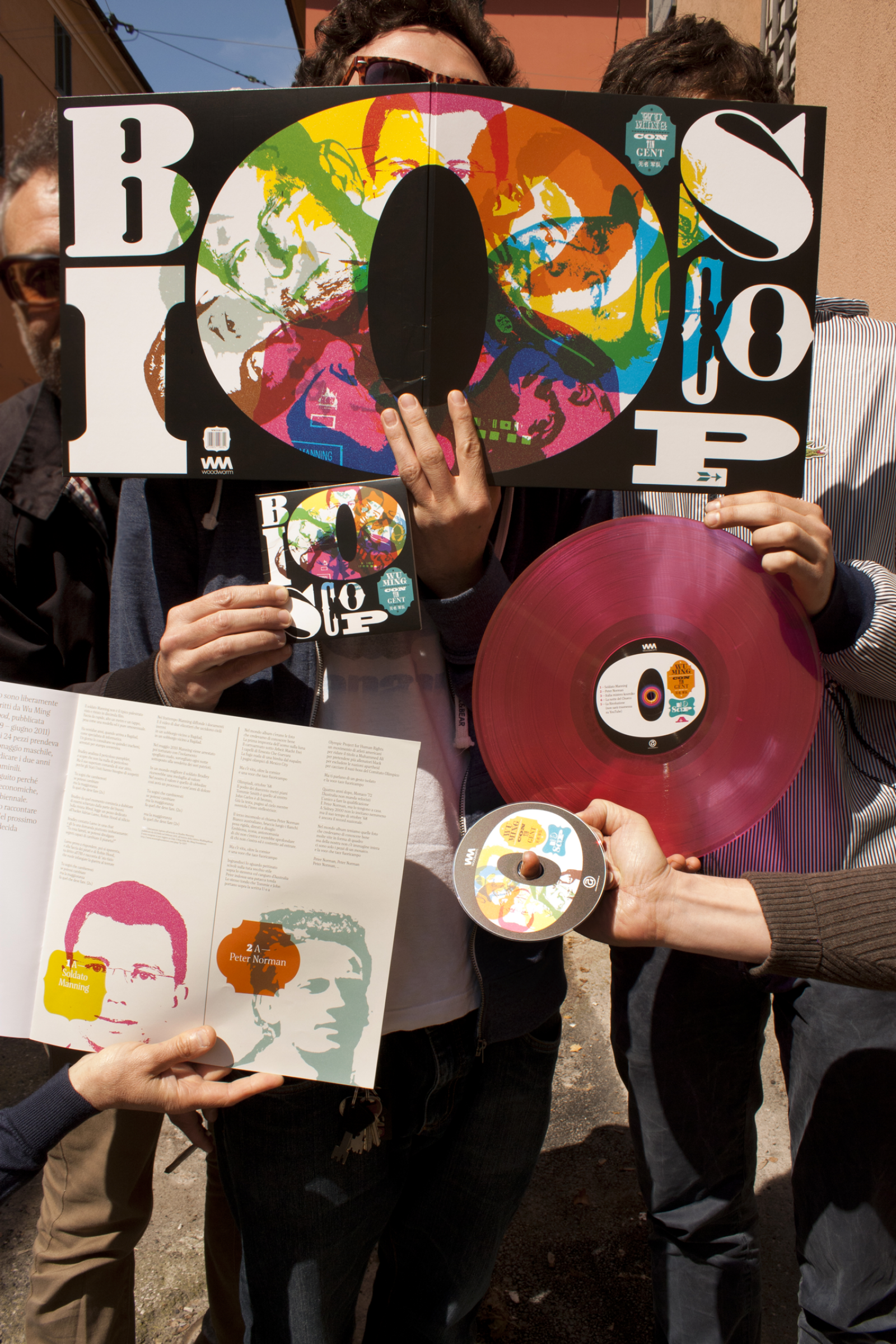
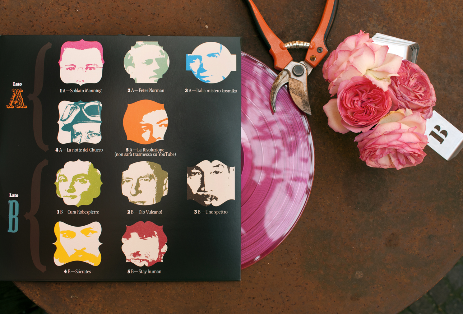
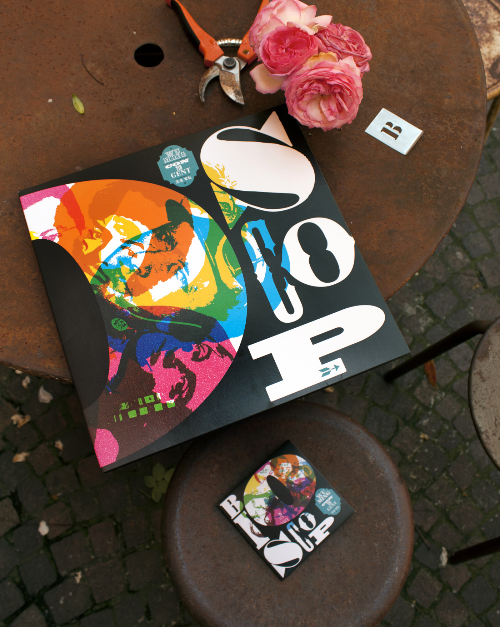
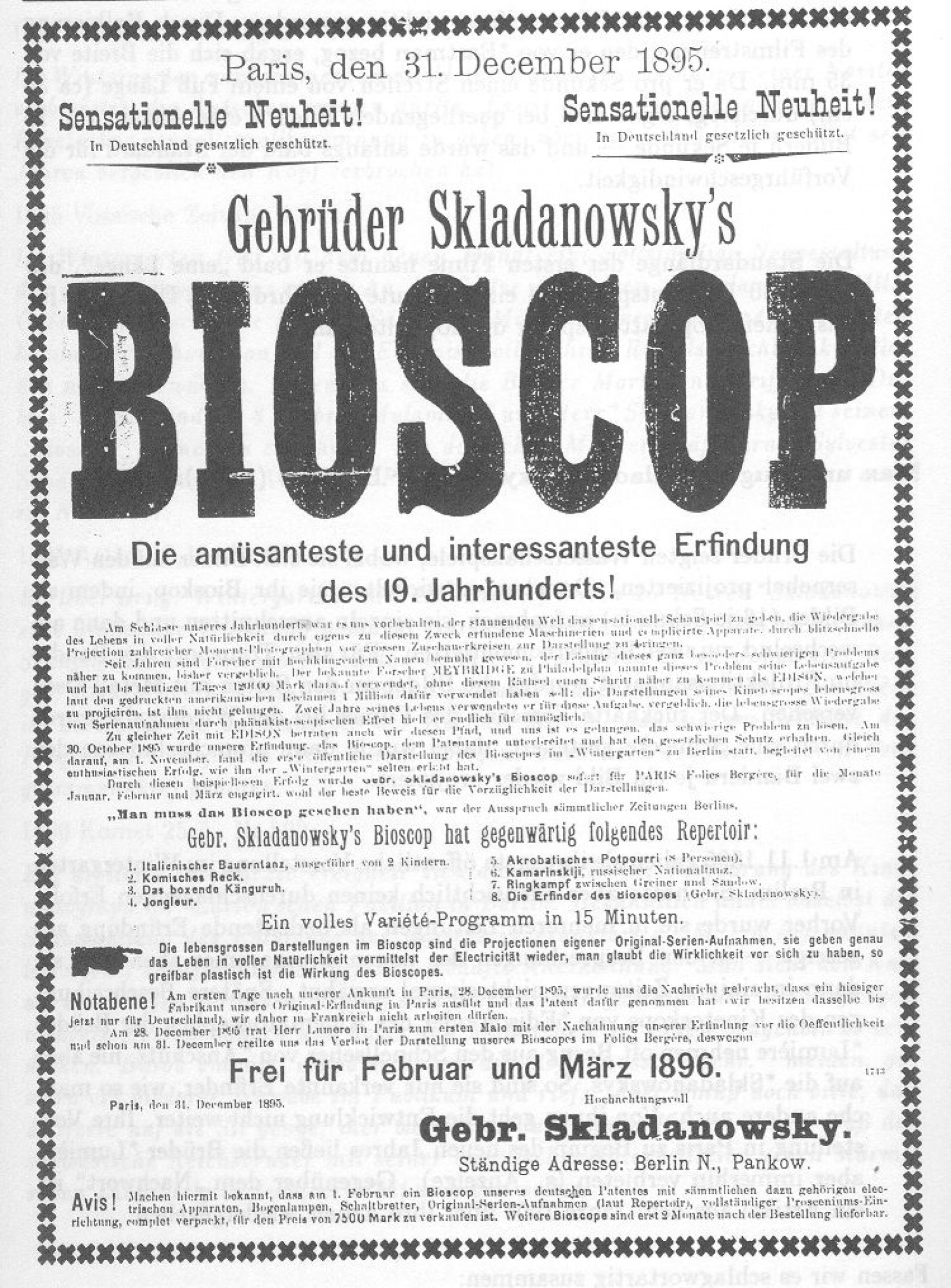
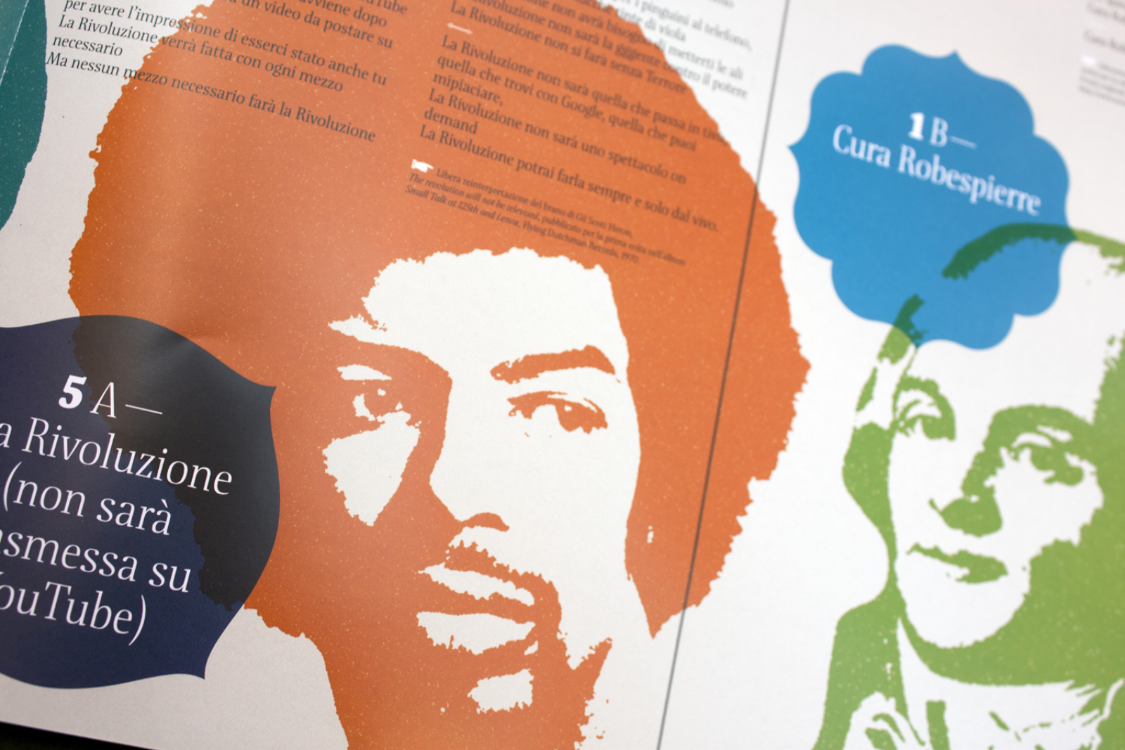
Bioscop
Bioscop is the first musical edition by the writers' group Wu Ming, in their Contingent formation.
Bioscop consists of ten biographies, ten plots, ten faces, ten stories. They are strewn onto CD, shocking pink vinyl and a booklet.
How. We created Bioscop with typographical characters made of eighteenth-century pear wood, which are resistant over the years to woodworm, runaway pixels and changing messages.
What. Graphic design.
Client. Wu Ming Contingent, Bologna (IT).
Year. 2014.
Bioscop, instructions for use: slide the pink vinyl disc gently from its sleeve, lay the B-side on the turntable, raise the volume by turning the knob clockwise. Pull out the booklet, breathe in its scent and read its (typographical) characters.
Bioscop is also an early movie projector, invented in Germany in the late nineteenth century by the Skladanowsky brothers.


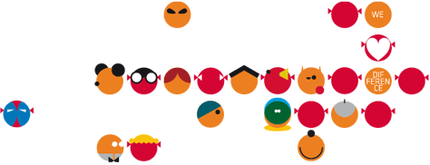
Small Faces
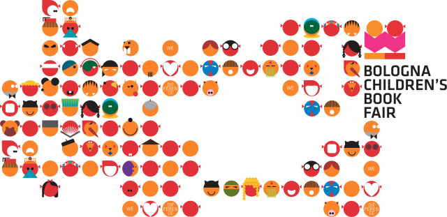
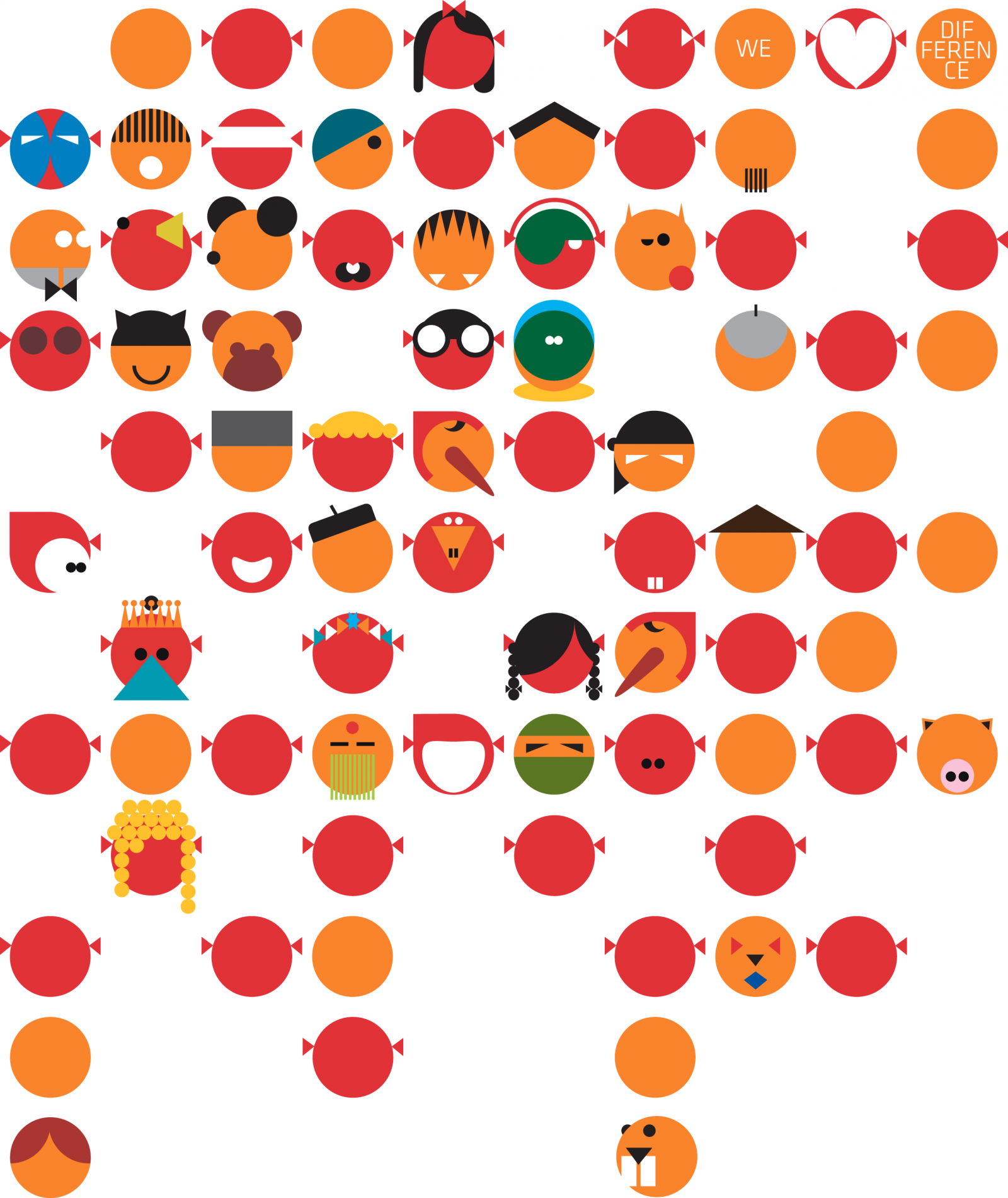
We love difference. Bologna Children's Book Fair, end of March 2014. Difference as a value was the theme we worked with to interpret the visual identity of the most important event in the world of children’s literature. We reanimated the icons of the existing logo – a boy and girl reading – making them become the protagonists of the campaign for the 2014 edition. We designed about a hundreds of well-known and lesser-known faces, real and make-believe, but all different. We gave them life and let them scamper freely across the entire campaign. A cascade of faces, dotlike and colorful, which for this year took the place of the, now-traditional, themed alphabet.

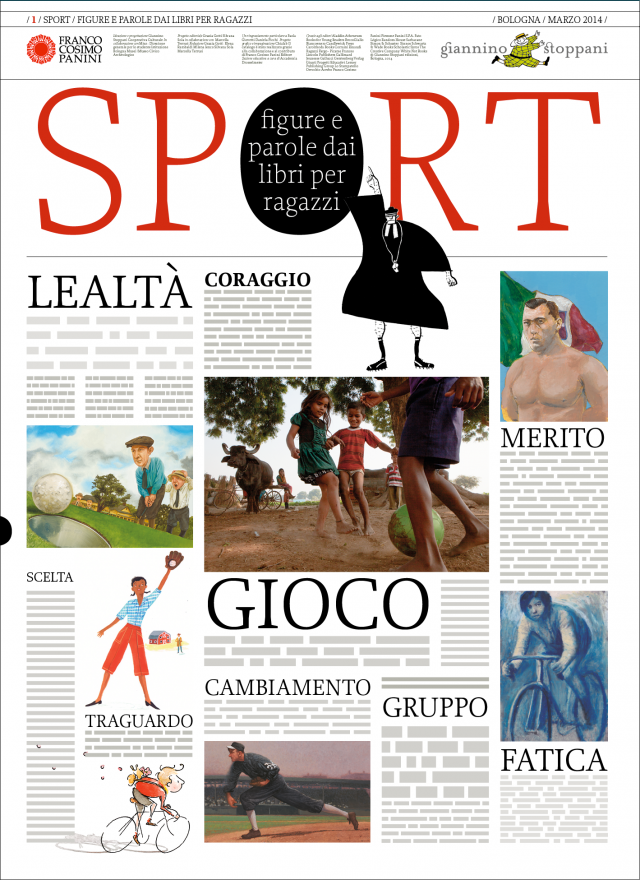
The image of sports
The media are full of sporting images, but sport is not always associated with an image that reflects legendary exploits, ethical values and moral redemption.
This dissonance between the deepest values of sport and the image we absorb every day from the media is where we set out from to build a visual identity for Sport. Figure and parole dai libri per ragazzi [sport, figures and words from children's books], the exhibition held at the Museo Civico Archeologico museum in Bologna.
How. We chose nine words, those that we would like to read every day on the front pages of the newspapers, and we emphasised them, making them the key focus of communications. We find them on the cover of the catalogue and on the walls of the exhibition, accompanying 94 illustrations selected from children's books that talk about a different kind of sport.
What. Graphic design, page layout, staging of exhibition.
Client. Cooperativa Culturale Giannino Stoppani, Bologna (IT).
Year. 2014.


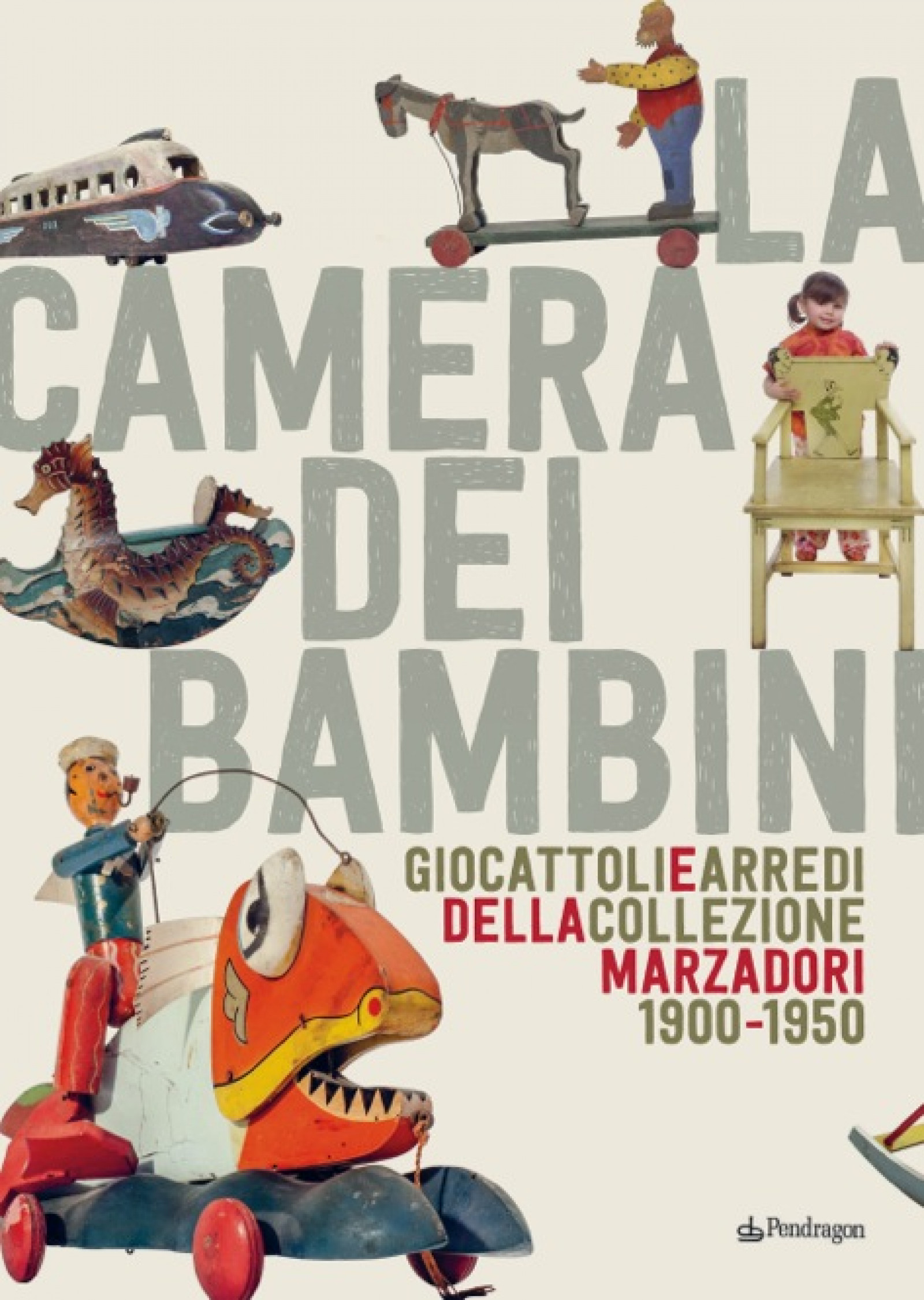
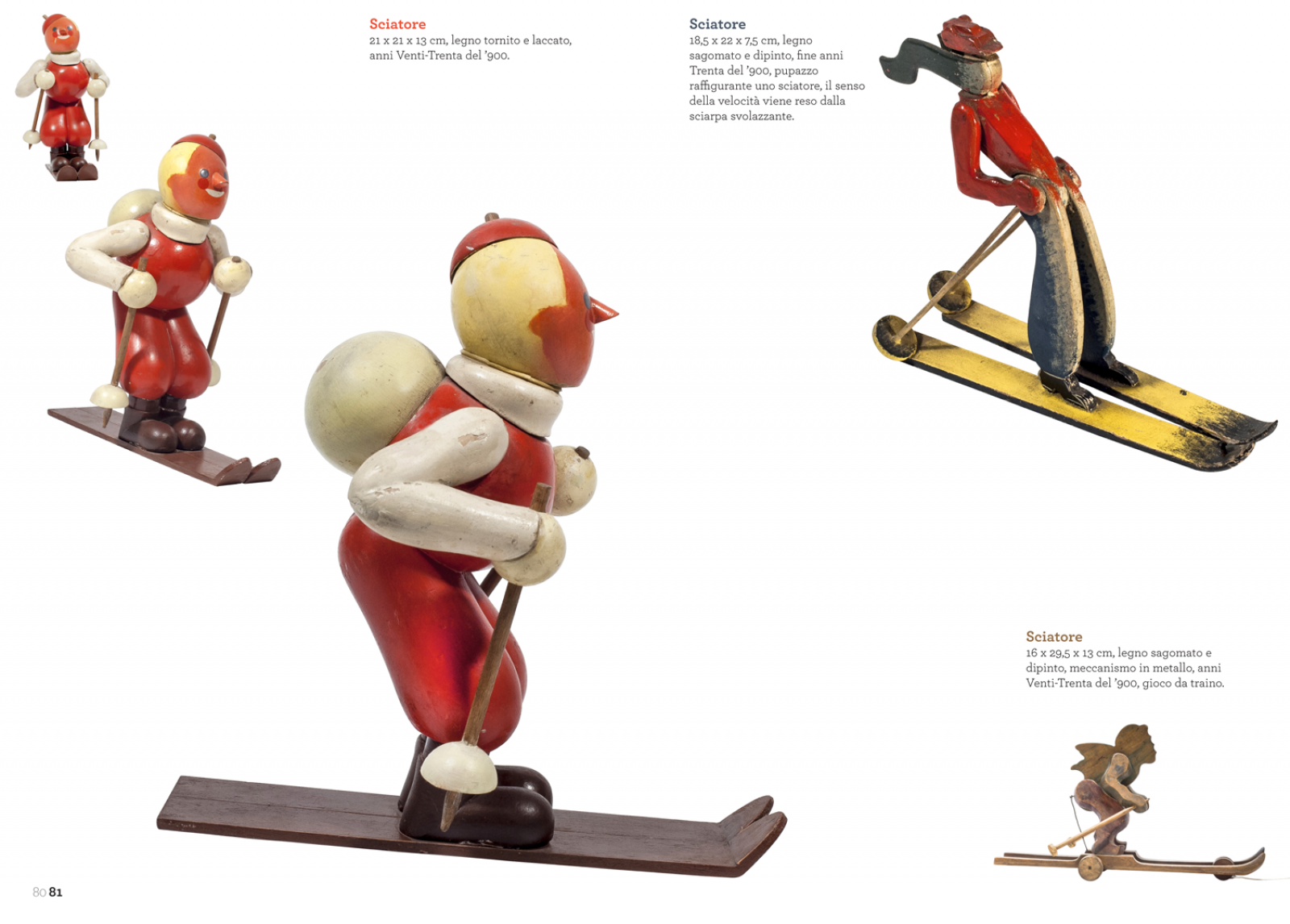
The children’s room. Toys and furniture from the Marzadori collection
The exhibition La camera dei bambini. Giocattoli e arredi della collezione Marzadori 1900-1950 [The children's room. Toys and furniture from the Marzadori collection] runs in Salaborsa, Bologna from 22 March to 14 June 2014. It includes 400 works, many of them unique.
All together, they represent a veritable inventory of the design and master-craftsmanship of the first half of the twentieth century, often drawing inspiration from avant-garde artistic movements: a testament to the development of social customs, changes in art, society, production, culture, history and education in Italy.
How. We brought toys and furniture in wood, metal, enamel and processed fabrics back to life. In the graphic design and page layout, we played without nets or grids, allowing objects to move freely in the contemporary space of the white page, simply indulging their visual weight, their glances and their tactile qualities.
What. Graphic design and page layout for catalogue.
Client. Pendragon edizioni, Bologna (IT).
Year. 2014.
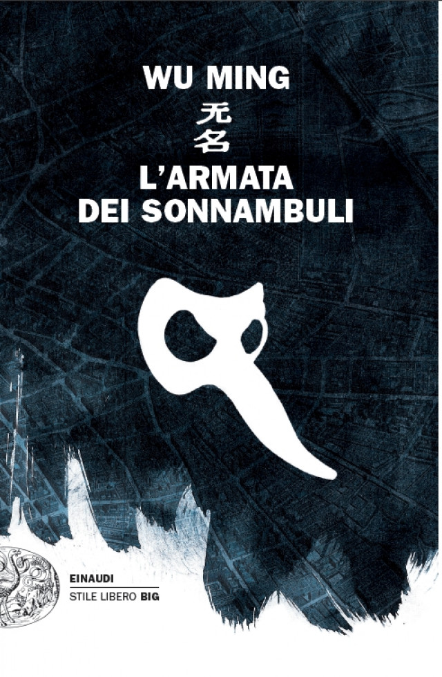
The Army of Sleepwalkers
In bookstores from 8 April 2014, L’Armata dei Sonnambuli [the army of sleepwalkers] is the new novel from Wu Ming, the writers' group established in 2000 in Bologna.
How. We designed the cover, as we had previously done for Manituana and Anatra all'arancia meccanica [duck à la clockwork orange].
What. Graphic design.
Client. Wu Ming, Bologna (IT).
Year. 2014.

TEA – A day in the life
For Tea Group we produced a video revealing – better than any infographics could ever do – a typical day in which the group's staff keep the city of Mantua running smoothly.
How. For twenty-four hours we looked TEA's staff in the eyes and discreetly recorded the places where they work, including those that normally remain out of sight. A day narrated in 210 seconds with the people who work, who do tangible, useful things for everyone's lives.
What. Video concept and production.
Client. TEA Group, Mantua (IT).
Year. 2014.
Partnerships. Muschi&Licheni.

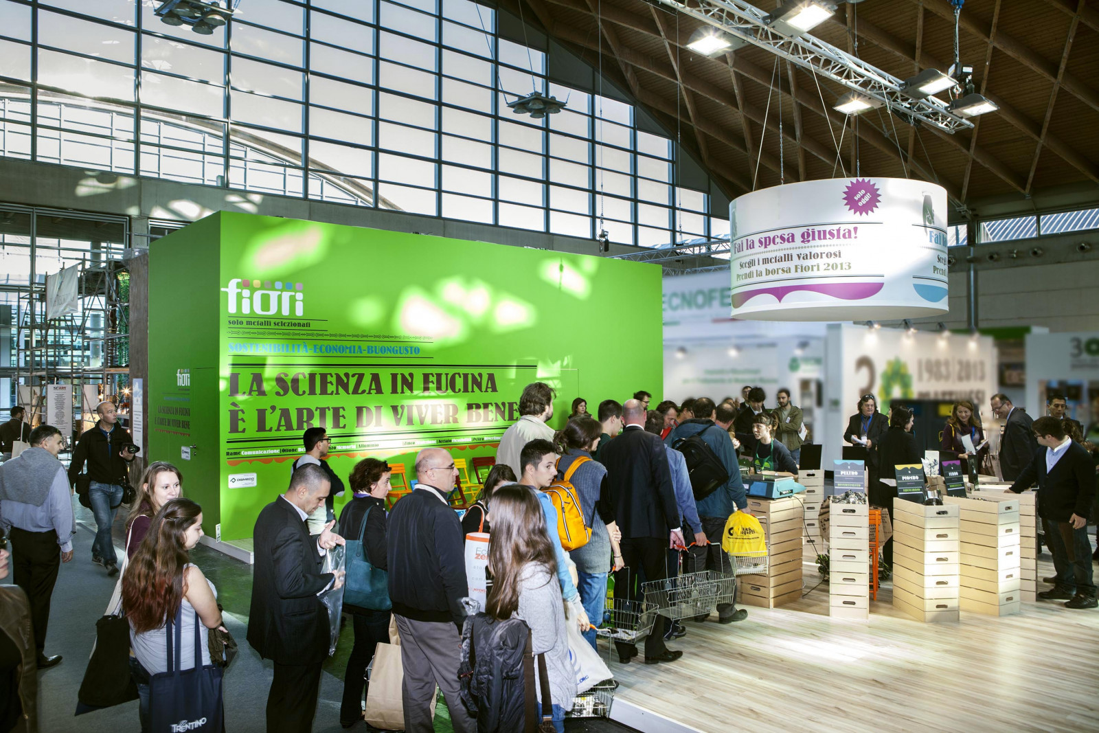
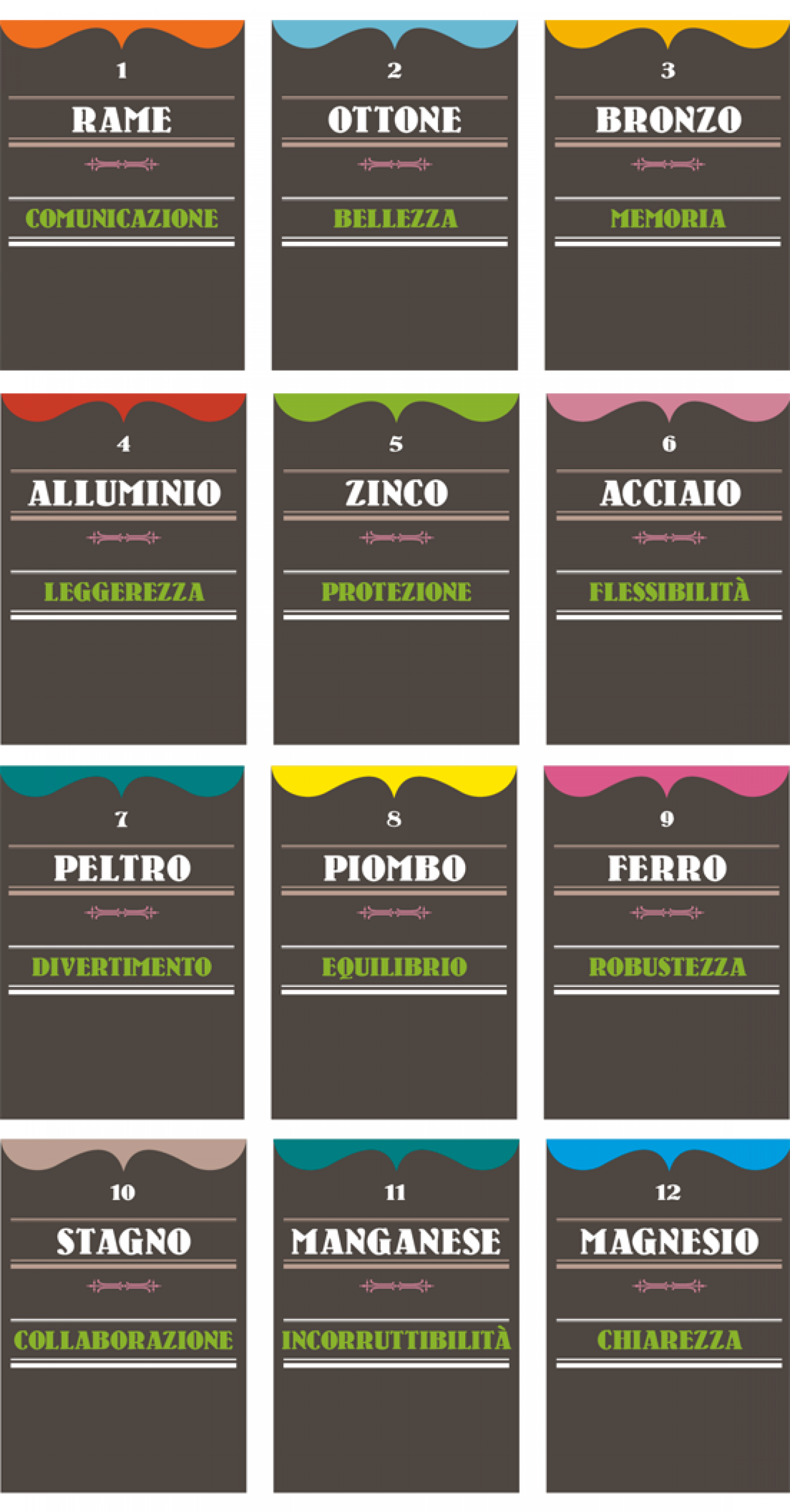
Science at the forge is the art behind good living - Fiori Group at Ecomondo 2013
La scienza in fucina è l'arte di vivere bene [Science at the forge is the art behind good living] is the installation created for Fiori Group at Ecomondo 2013. We tried to extract the hidden values of metals, special ingredients to prepare ideal recipes.
How. Knowledge of the secret virtues of metals became the starting point from which to discover and understand the virtuous process of collection, separation and recycling that leads to a better quality of life for everyone and to the preservation of our environment.
What. Analysis, design and production, staging of exhibition.
Client. Fiori Group, Valsamoggia (IT).
Year. 2013.
Nelson Mandela Forum
In 2004, the city of Florence chose the name of Nelson Mandela (and not a commercial brand) for its indoor sports arena.
Andrea Rauch and Gianni Sinni were the consultants for a well-conceived competition to create a logo: participation was in pairs, and the prize was a trip to South Africa. We entered, we won, and soon we set off to see the legacy of the father of reconciliation with our own eyes, in the streets of Johannesburg, Cape Town, Robben Island…
What. Coordinated image.
Year. 2004.
Many years have passed, and today it seems right to remember Madiba in our own way. Ubuntu!

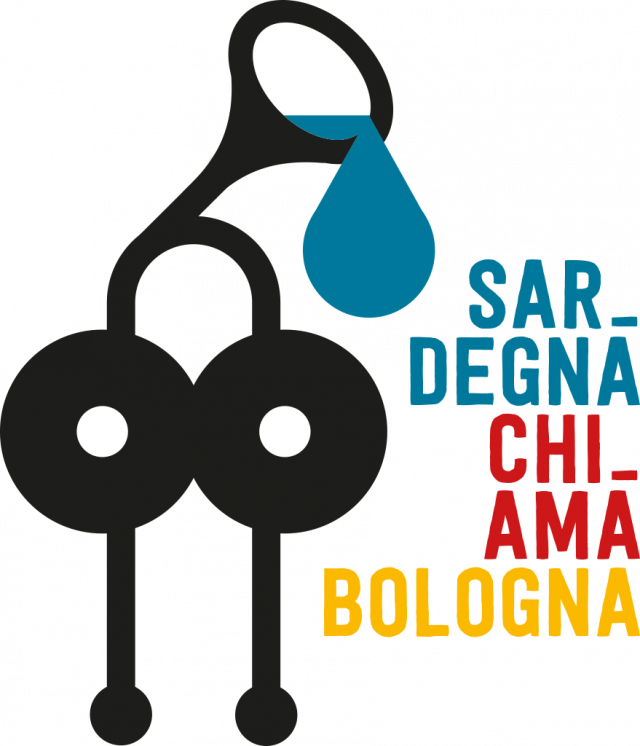
Sardegna chi-ama Bologna [Sardinia calls/loves Bologna]
A concert-show in support of Sardinia.
After the rogue wave that struck Sardinia, Paolo Fresu immediately mobilized to organize a concert and show with Devil Trio (Paolo Fresu, Bebo Ferra, Paolino Dalla Porta), I Virtuosi Italiani, Daniele di Bonaventura, Lella Costa, Geppi Cucciari, Elena Ledda, Stefano Benni and Alessandro Bergonzoni.
How. We created a logo to symbolize the dramatic situation and the call for help, rooted in Sardinian history: a symbol that we called "Bronzetto n. 01 detto: eroe of Torpè" [Bronze statuette n° 1, known as the hero of Torpè]. It represents one of the 17 involuntary heroes who, while passing lightly over the ground, became the unwitting sacrifices of this neglected region.
What. Coordinated image.
Year. 2013.

Buchmesse, on board
A small delegation from Chialab is setting off for the Frankfurt Book Fair. In our suitcase, the interactive eBook, to spread knowledge of the great potential of our new digital storyteller far and wide.
Come and meet our colporteurs on Friday 11th October at 10.30 am in the Hot Spot Education area / Stand C85.
Regarding digital books…
“In the making of digital books, the tools which will have particular importance will be multimedia storytelling, infographics, and the interactive presentation of data and information. The focus will therefore be on the possibilities offered by the integration of different communicative codes (text, images, audio, video) in the fields of information representation, multimedia narration, the ability to motivate and capture attention, as well as encourage comprehension, memorization, abstraction and reasoning skills.”
Maria Chiara Carrozza, Italian Ministry of Education – Decree on digital books 2013

Accessibility Habitability Learning
AAA Accessibilità Abitabilità Apprendimento. For the past two years we've been working on a project about the accessibility of reading.
The first stage has been completed, with the collaboration of Luciano Perondi, who helped us create the Kind font and the Macramé series for publishers Loescher. Linked to these reflections and experiences of typography and reading performance, we recommend the font TestMe, created by Luciano Perondi and Leonardo Romei, in order to check some of the most important typographical features in the reading process. TestMe can be downloaded and modified thanks to its OpenFont licence.
How. Our project Accessibilità, Abitabilità, Apprendimento is based on field testing and an inclusive design approach, and will continue for the next two years, overlapping and integrating with the interactive eBook project. The goal: to apply the results of our research on the habitability of the digital page and its accessibility for people with learning difficulties. Digital technology offers us a unique opportunity to work dynamically and create tailor-made solutions for each reader, using rigorous reading tests to find the most suitable strategies to suit their individual needs. All visual, typographical and layout-based variables with an impact on reading will be identified and adjusted individually.
What. Graphic design.
Year. 2013.
Partnerships. Luciano Perondi.
TestMe can be downloaded and explored here.
Anyone interested in contributing or working with us on this legibility research is welcome to contact us, we would be happy to compare notes.


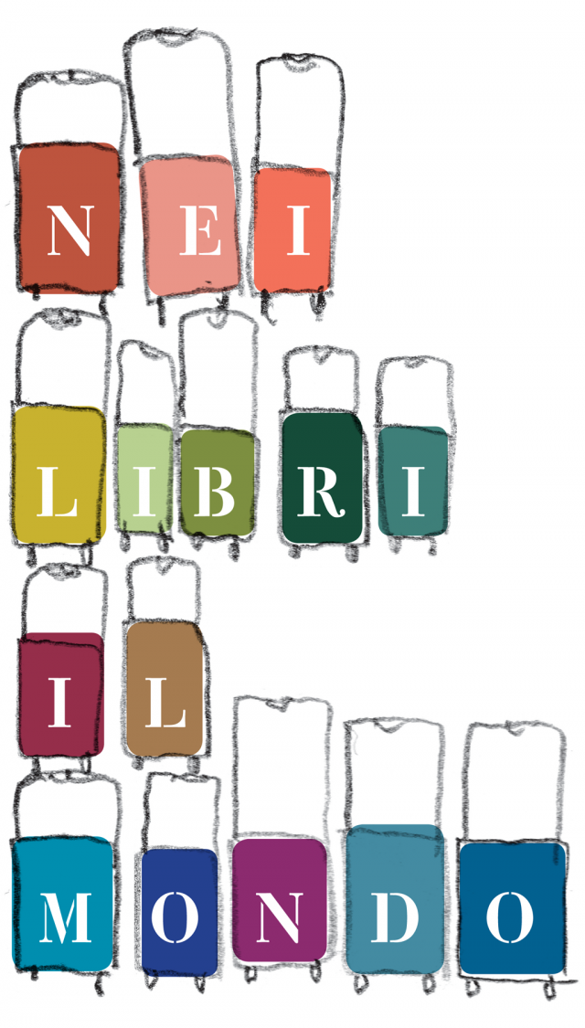
In books, the world
The project Nei libri il mondo [in books, the world] aims to use words, pictures and works of art from children's books to present the stories of peoples who have come together, women and men who have looked one another in the eye, people who have clashed, lives that have been saved, existences that have intertwined.
In the news we hear reports of xenophobia, voyages of hope, intolerance and race. We have searched children's books to find elements of intercultural dialogue that create a journey made of a mix of narrative voices, poetic rhythms, thoughts, life stories, pictures, figures, illustrations and works of art, leading us to discover new horizons.
How. Nei libri il mondo is a library, exhibit and travelling workshop that brings together children’s books without borders, reaffirming the necessity of true civic education that can provide the tools to move towards a deeper understanding, above and beyond grand and empty words. Migration, war zones, illustrators and publishing companies at the forefront are all part of a system that seeks to give voice to both the content and the quality of printed products, to the evocative and expressive power of visual media, to the particular nature of the language used to convey the concepts of meeting, welcoming and inclusion.
What. Graphic design, exhibition staging.
Client. Giannino Stoppani Cooperativa Culturale, Bologna (IT).
Year. 2013.

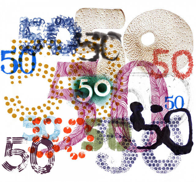
BCBF 2013: 50th anniversary
The fifty years of Bologna Children's Book Fair
In March we celebrated the 50th anniversary of the Bologna Children’s Book Fair. First we designed the logo, then we took care of all aspects of its visual communication.
How. We began by drawing the two numbers: 5 and 0. Once, twice, three, four, five times… fifty times, a hundred times, looking for the perfect design to represent the first 50 years of the fair. But each of these designs had its own significance relative to the 50 years of stories, colours, designs, illustrations, authors, illustrators, drawings, exhibitions, readings and fairy tales… and so we decided to keep them all. Hence the project involved the 50 glyphs – all different – which all began to take on a life of their own in the communications. We left them to incubate for a while, and then they began to proliferate: they joined up, overlapped, rearranged themselves or spread out, livening up all the events in the vast and varied programme and welcoming visitors.
What. Development of an idea and of the central theme, planning.
Client. Bologna Children’s Book Fair, Bologna (IT).
Year. 2013.
ieB online and offline
The ieB (interactive eBook) reading platform has grown and is now in its third version.
An agreement has been signed with publishers Zanichelli, who will exclusively adopt the platform for their scholastic publications.
How. We updated the IeBooks with: an app version for iPad, an app for Android tablets and one for Google Chrome, the possibility to navigate offline once a chapter has been downloaded, synchronization of highlighting, notes and amendments between devices, design of the adaptive page for tablet, compatible with iOS, Android and others mobile OS with distribution on AppStore, Google Play, etc., virtual classes, online exercises, comprehensive illustrations.
What. Design, UX, UI, content editing, development.
Tools and technology. BEdita CMS, IeBook.
Client. Zanichelli Editore, Bologna (IT).
Year. 2013.

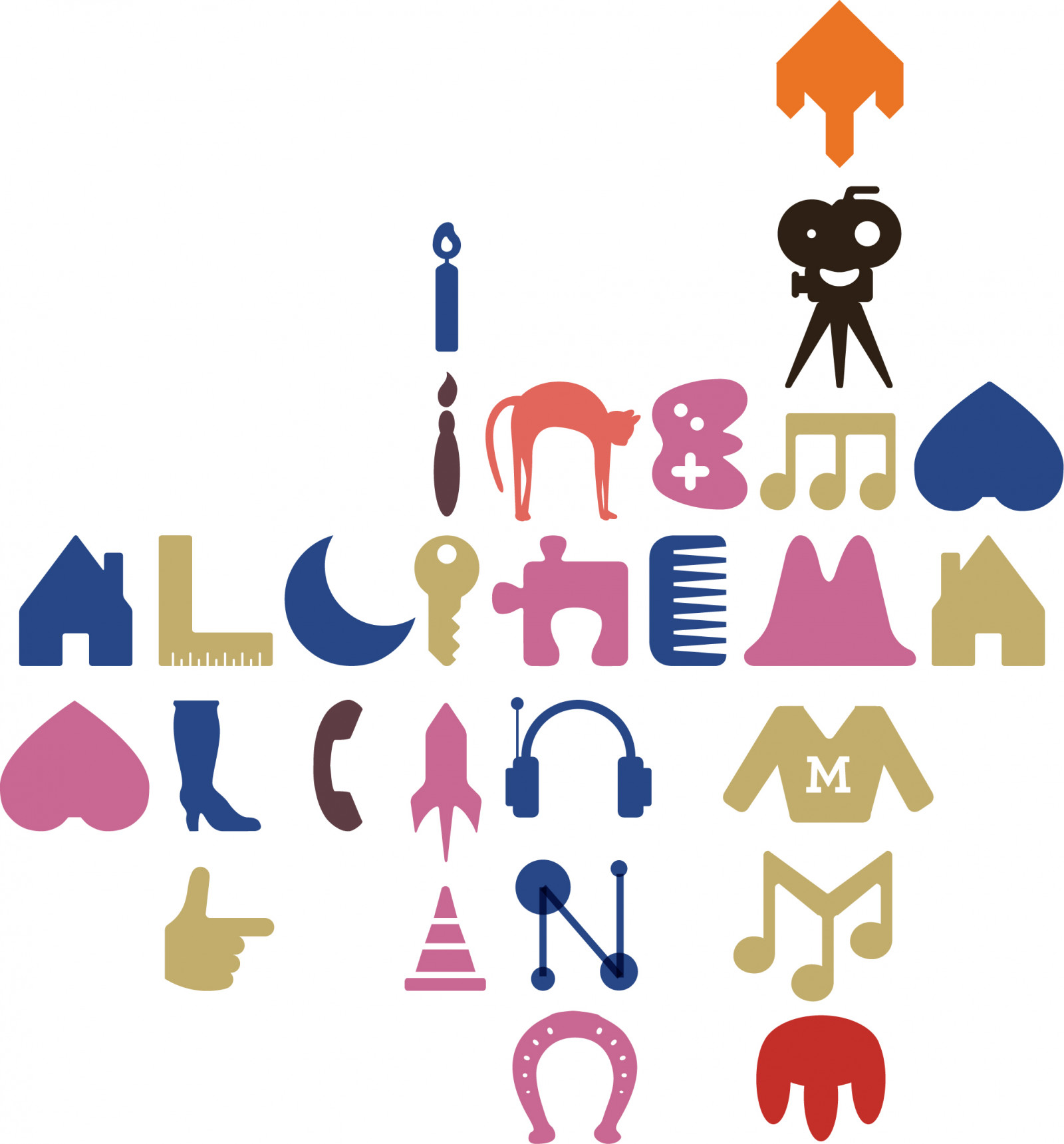
To the cinema!
Al cinema! is a new preschool that has been set up in Bologna thanks to Fondazione Gualandi, which has a long-standing focus on the special needs arising from deafness.
How. In addition to the design of the usual visual aspects – logo, colours, fonts – we came up with something extra. We asked ourselves what would be the most useful tools that visual communication can offer in a preschool. Are the logo, flag colours, visual identity and brand management enough? Or can communication design offer something more? We were greeted with great openness and sensitivity to our proposals, and so, in addition to the logo, we created three writing systems to work in perfect synergy with the school's programmes. The three writing systems will become interactive workshops and materials for play that will generate infinite forms of writing, kinetic alphabets in continuous expansion.
What. Coordinated image.
Client. Fondazione Gualandi, Bologna (IT).
Year. 2013.

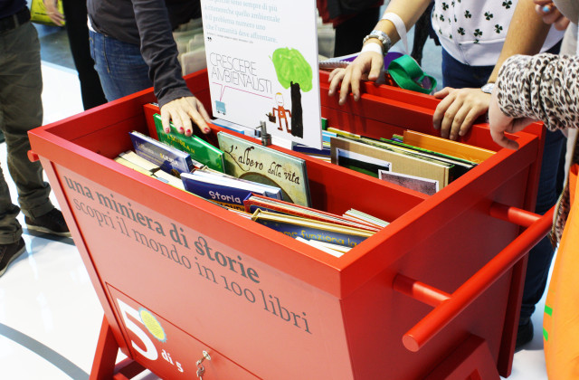
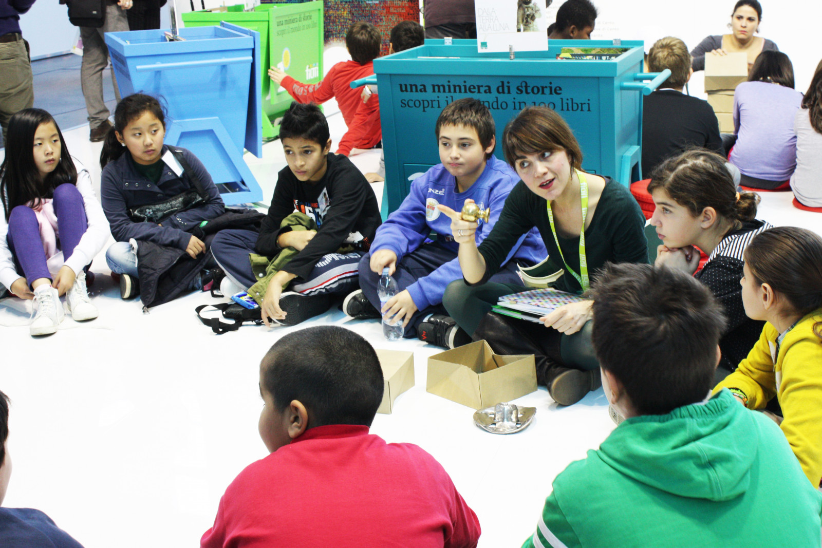
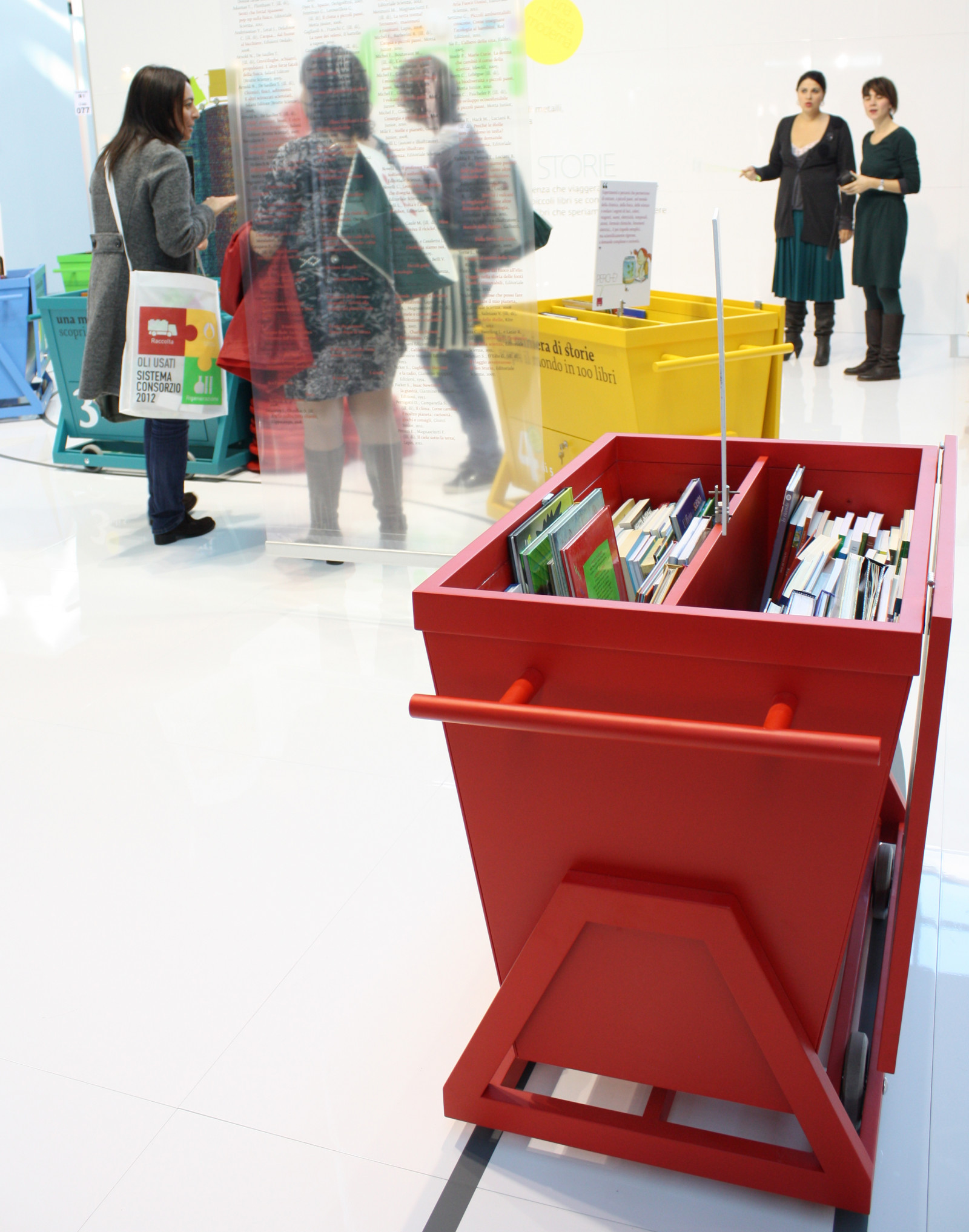
A wealth of stories - Fiori Group at Ecomondo 2012
While we were planning the Fiori Group stand for Ecomondo 2012, the earth moved under our feet.
Suddenly, all our ideas and plans were shelved, pushed aside by the feelings that had shaken us so. Reconstruction became the urgent need, widely shared and called for.
How. With the participation of the Giannino Stoppani Cooperativa Culturale, we created Una miniera of storie… [a wealth of stories], five small mobile school libraries, dedicated to science and raising awareness of environmental topics, and presented to the children in a series of reading workshops during the fair.
What. Analysis, design and production, staging of exhibition.
Client. Fiori Group, Valsamoggia (IT).
Year. 2012.
Partnerships. Giannino Stoppani Cooperativa Culturale.
5 schools.
5 class libraries.
505 science books that are moved between the classrooms of Crevalcore, Pieve di Cento and Mirabello.
505 books that seem small in comparison with the devastation of the earthquake.
505 great books that we hope will contribute to rebuilding an untroubled future.

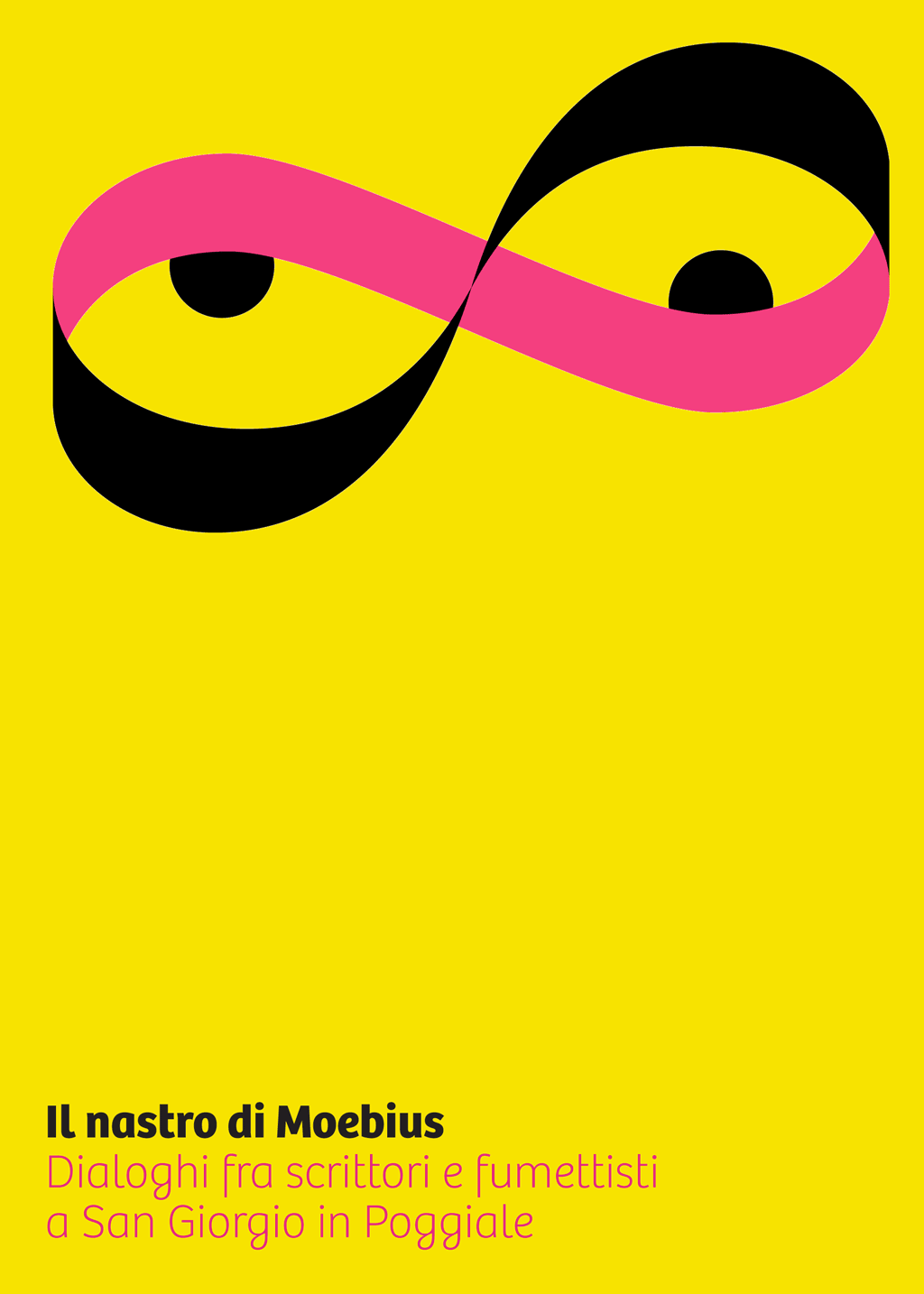
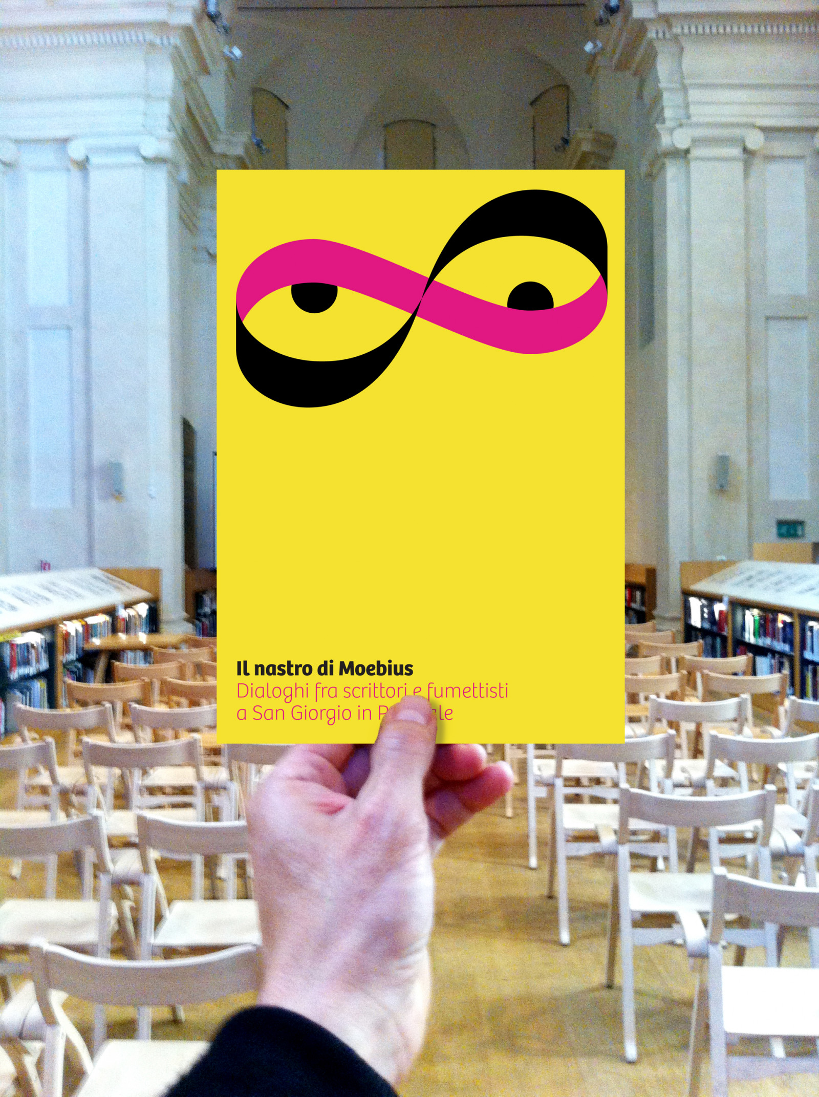
The Moebius strip
We were responsible for the visual identity of a series of meetings entitled Il nastro di Moebius. Dialoghi fra scrittori e fumettisti. [The Moebius strip. Dialogues between writers and comic book illustrators].
Six meetings to explore the dialogue between different languages that interact on the same level, with no boundaries to cross, as if they were moving on a Moebius strip.
How. We gave a face (and two eyes) to this unusual combination of languages, references and evocative impressions.
What. Coordinated image.
Client. Genius Bononiae, Bologna (IT).
Year. 2012.
“Ordinary surfaces, i.e., surfaces that we are used to seeing in daily life, always have two ‘sides’, so that it is always possible to ideally run the length of one side without ever touching the other, except by crossing a dividing line, in the form of a corner (or ‘edge’) […]. However, in the case of the Moebius strip, this principle does not apply: there is only one side and only one edge. If you run your finger around it once, you end up on the opposite side. Only after going around twice do you end up back at the starting point. Thus, for example, you could pass from one surface to the ‘rear’ without ever turning the strip and or cross the edge, but simply by travelling along it.” (translated from it.wikipedia.org)
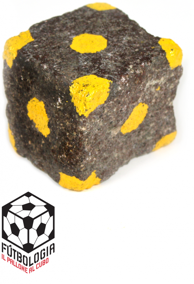
Fútbologia, football cubed
We offered to create the visual identity for Fútbologia: a three-day festival in Bologna and an association to “talk about football with style”.
How. The mascot, São Pedrinho, included in all official communications, is made of porphyry stone, and has been chosen as the official patron and talisman of all “footbologists”.
What. Coordinated image.
Client. Associazione culturale Fútbologia, Bologna (It).
Year. 2012.
“We’ve known the smell of football since we were kids. The smell of mildew in the locker room, grease for the cleats, sweaty jerseys. Entire line-ups learned by heart. We have been watching football all our lives. We recognize stadiums from across the world.
But the level of conversation about football in Italy is very low. And its global business system is up to its ears in shit. It’s less fun lately.
But we have a plan.
A conversation about football from a historical, comparative and contemporary perspective. About power and popular culture. Social and physical sciences, art and literature. Pressing upfield and Tahrir Square.”