Large poster, written and illustrated as a means of propaganda of what we do more or less every day for many years.
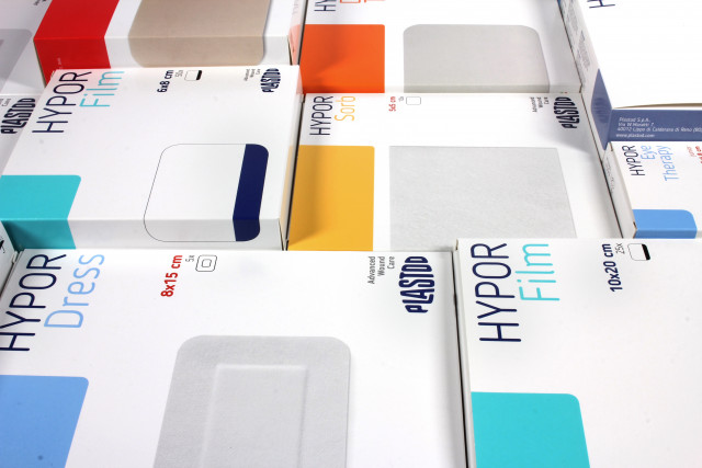
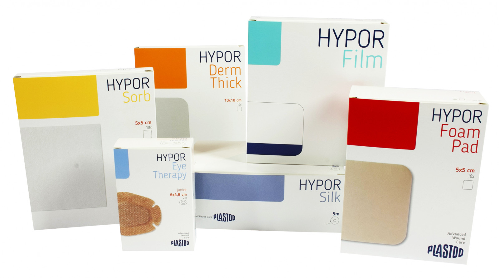
Plastod
Con oltre 100 anni di storia Plastod è uno dei marchi leader in Europa nella produzione di dispositivi medici adesivi per ospedali, farmacie e grande distribuzione.
Pur lavorando principalemente per conto terzi, l’azienda ha deciso oggi di tornare sul mercato rinnovando la linea di prodotti a proprio nome.
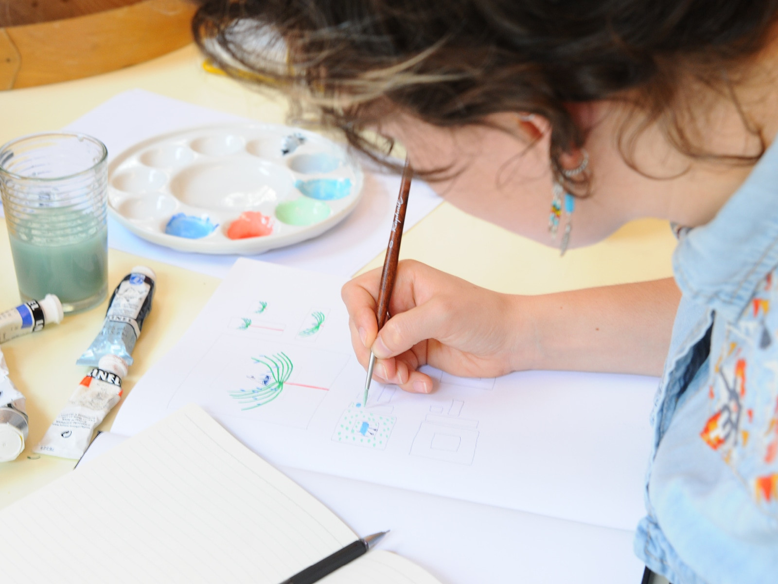
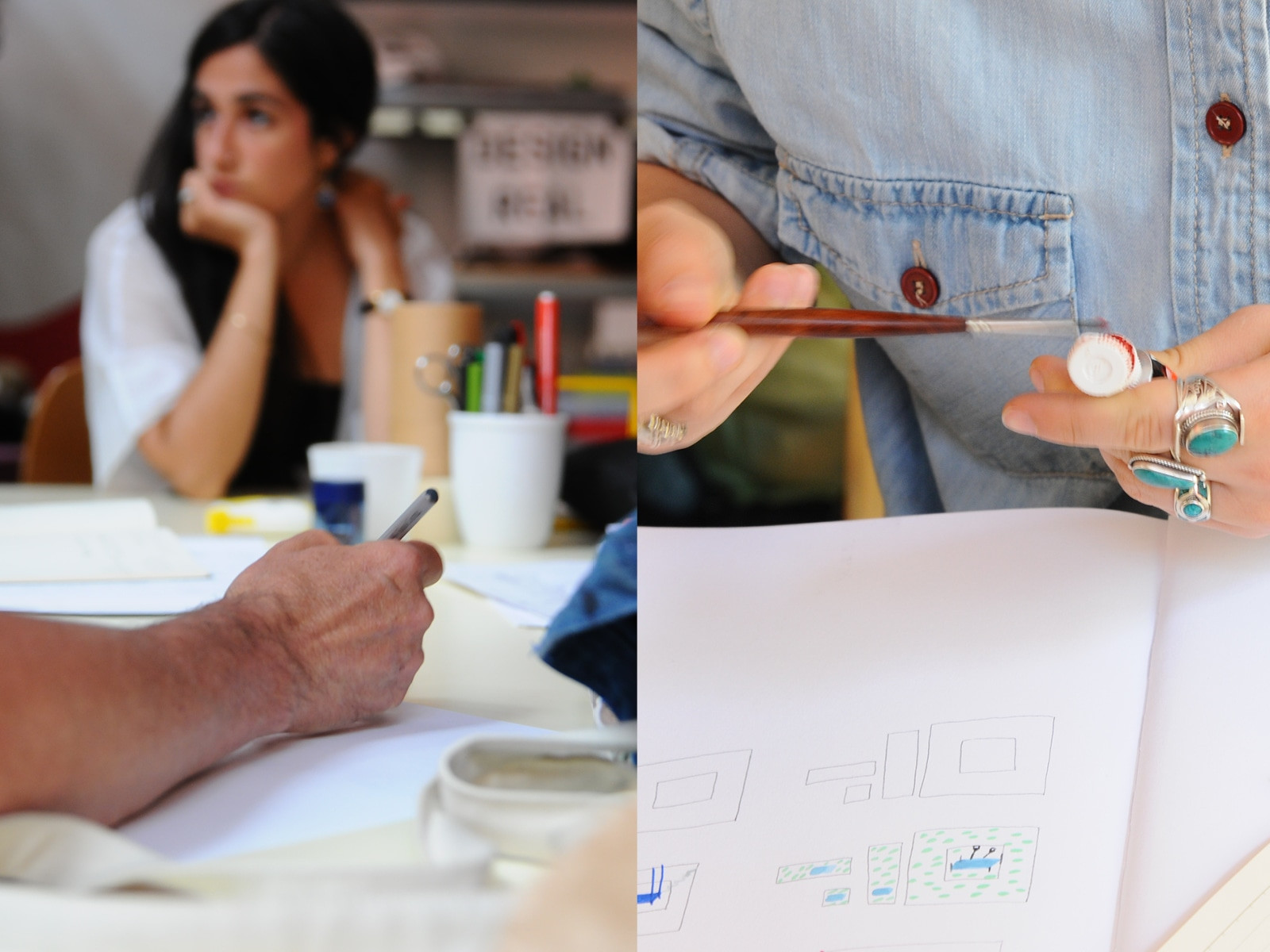
Come. Abbiamo progettato l’intera linea Plastod con un design capace di adattarsi ai 115 prodotti declinati in un’ampia tipologia di confezioni di diverso formato. Ci è stato chiesto un forte rinnovamento stilistico che mantenesse la comunicazione chiara, tecnica e professionale. Tutti gli elementi presenti sulle confezioni (colori, foto, icone, indicazioni) rendono il prodotto facilmente riconoscibile per l’utente e inquadrano la linea di dispositivi medici Plastod all’interno dei prodotti farmaceutici professionali di fascia alta.
Cosa. Packaging. Analisi, progetto, direzione artistica della fotografia, realizzazione e coordinamento del flusso produttivo.
Cliente. Plastod S.p.a, Bologna (IT).
Anno. 2018.
Per i 100 anni del marchio abbiamo progettato una pubblicazione dove si raccontano con foto, interviste, disegni e brevetti i primi cento anni di vita di Plastod.
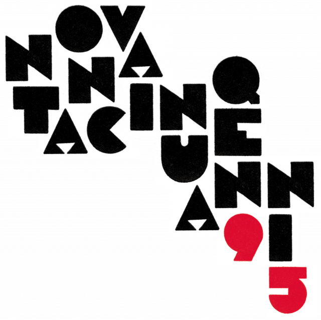
G.D 95° anniversario
Per i 95 anni della G.D, azienda leader mondiale nel settore del packaging, abbiamo realizzato un logo molto speciale.
Come. Insieme ad Anonima Impressori siamo andati alla ricerca di un carattere tipografico coerente con lo stile e il periodo degli anni della fondazione dell’azienda (1923). Abbiamo scelto di non utilizzare una font digitale per richiamare le origini artigianali di un’azienda oggi all’avanguardia tecnologica. La scelta è ricaduta sul carattere Assab, creato in legno da Xilografia di Verona risalente agli anni ‘20. Le linee dure e precise del carattere richiamano il movimento Futurista attivo in quegli anni.
Cosa. Ideazione e realizzazione logo e style guide per la gestione di molteplici uscite: video, sito, libro monografico, programmi, inviti, archigrafica.
Cliente. G.D S.p.A./Coesia Group, Bologna (IT)
Anno. 2018.
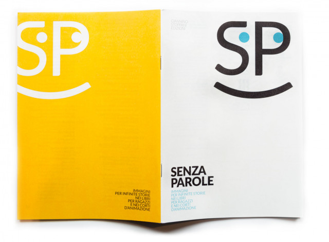
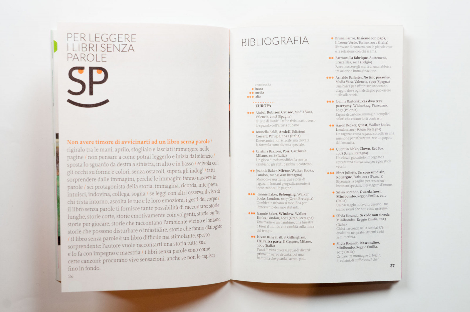
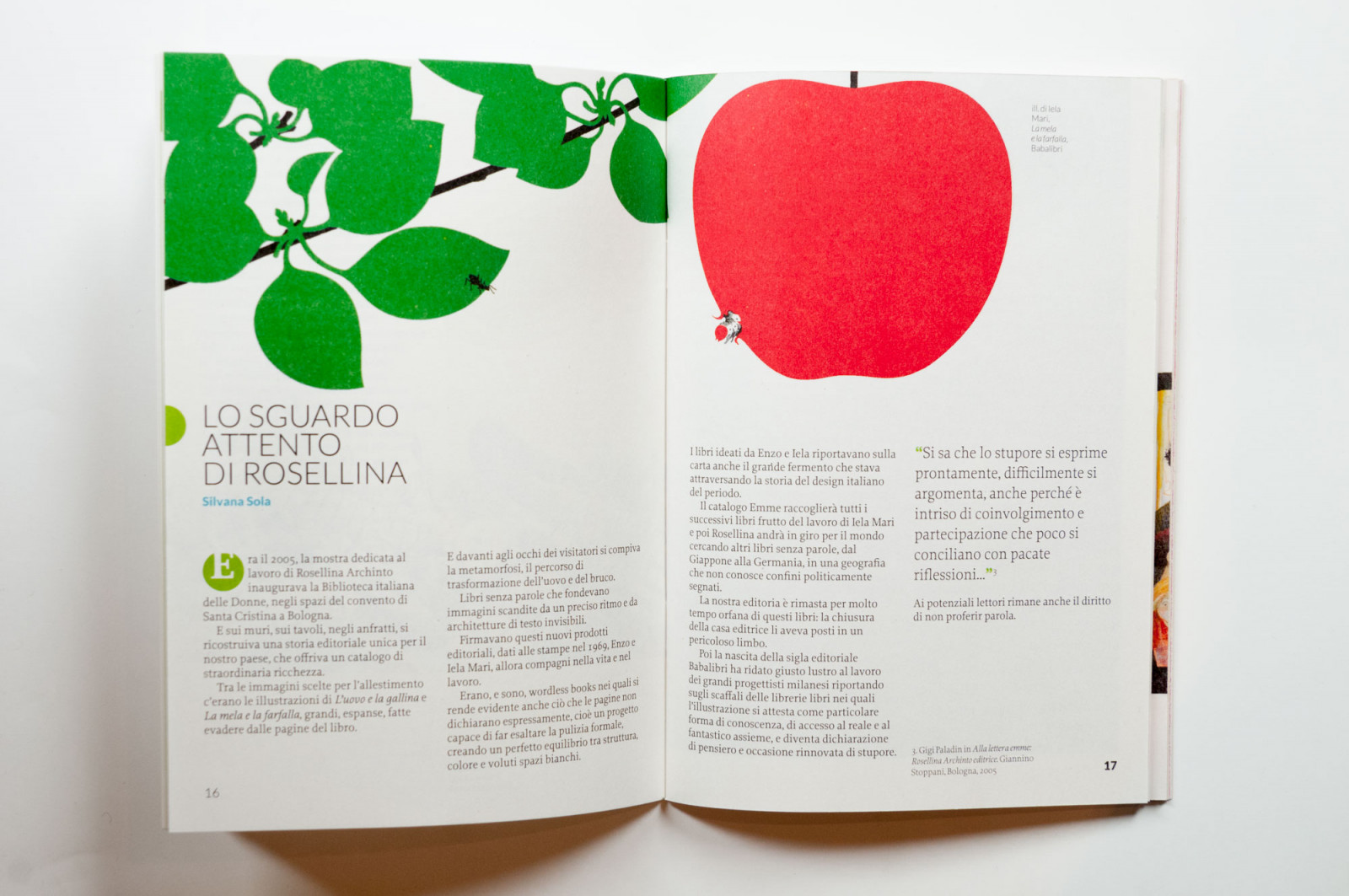
Senza parole
We have produced an illustrated catalogue for Senza Parole [Speechless], a travelling bibliographic exhibition, comprised of silent books and silent animated shorts from different parts of the world.
How. We planned the exhibition and illustrated catalogue, which includes a bibliography and a filmography as well as contributions from experts and operation sheets.
What. Staging design, graphic design and catalogue page layout, archi-graphics and coordinated image.
Client. Cooperativa Culturale Giannino Stoppani, Bologna (IT).
Year. 2018.
The exhibition project, curated by Cooperativa Culturale Giannino Stoppani, was originally the idea of the group “Un sorriso un libro per Silvia” [a smile, a book for Silvia], in memory of the librarian Silvia Agnelli and her profound sense of responsibility and care for the present, in particular towards children. Senza Parole draws inspiration from the values supported by IBBY (International Board on Books for Young People) and in particular from the international project “Libri senza parole. Dal mondo a Lampedusa e ritorno” [Books without words. From the world to Lampedusa and back], promoted by Ibby Italy.
The exhibition, inaugurated on 17 February 2018 at the Municipal Hall of San Zeno Naviglio, Italy, will visit the libraries of Rezzato, Montichiari, Sirmione, Nuvolento and Botticino.

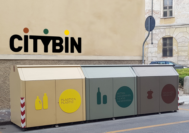
Citybin
Citybin is an innovative service for the separated collection of paper, plastic, glass and aluminium in the historic centre of Mantua. A modular container that makes it easier for people to insert their waste, cleaner waste collection for the city, and more efficient recycling in favour of the environment.
How. We drafted a communication plan to promote the new Mantova Ambiente bin to the local population. The communication will convey a strong image, coherent with the commitment and care with which Mantova Ambiente and the people of Mantua approach problems relating to the environment, ecology and sustainability. The project began by building an identity for the new bin (name, logo, graphic design for the electronic card) and continues with communications on all media used to inform the local population and raise awareness of the new service.
What. Identity, graphic design, creative direction, copywriting and editing of content.
Client. Mantova Ambiente, Mantua (IT).
Year. 2018.
The new Citybins were created by the City of Mantua, in partnership with Mantova Ambiente, based on a design by Giulio Iacchetti.
Frels - keep in touch with your glasses
Frels is a new eyewear product: two small extensions to the temple tips that ensure you don't lose your glasses, and can wear them comfortably on your shoulders. After two years of research into usability, biocompatibility and technology, they were developed to maintain the exacting standards of top-quality Swiss production.
How. We set out from a careful analysis of its characteristics, and of its future habitat in opticians' shops. We then used our conclusions to define the strategic aspects of our communication: logogram, visual identity, packaging, promotional materials and a mini website.
What. Identity, strategy, website, communications.
Client. Frels, Lugano (CH).
Year. 2016.
BCBF 2018. Visual identity workshop
We developed the visual identity for the 2018 edition of the Bologna Children’s Book Fair at the BCBF visual identity workshop.
This year, among the participants from the Illustrators’ Exhibition 2017, we have selected 22-year-old Parisian Chloé Alméras: we were looking for the architecture of worlds, inhabited landscapes, planetary systems, living, flexible environments. We dived into Chloé’s illustrations, into her shades of blue and her microscopic details, which gave us an idea about how to use them to talk about the fair. A world teeming with details and at the same time, inhabited with a calm intensity.
How. Chloé came to visit us in July, and we spent many hours together tuning in with one another. We were soon submerged in her drawings, full of minute details, suggestive of a fertile world where stories are conceived, shared and multiplied: so it was that the central theme of this edition was unearthed: “Fertile Ground for Children’s Content”.
What. Selection of an illustrator, development of an idea and of the central theme, planning.
Client. Bologna Trade fairs, Bologna (IT).
Year. 2018.
The story of the idea, the project and the first developments is also told on the BCBF website.
Our work together at Bologna Children’s Book Fair

Metal as flowers - Fiori Group at Ecomondo 2016
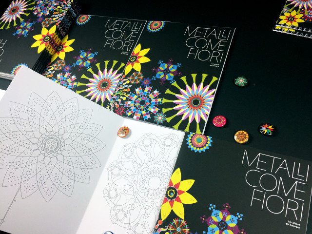
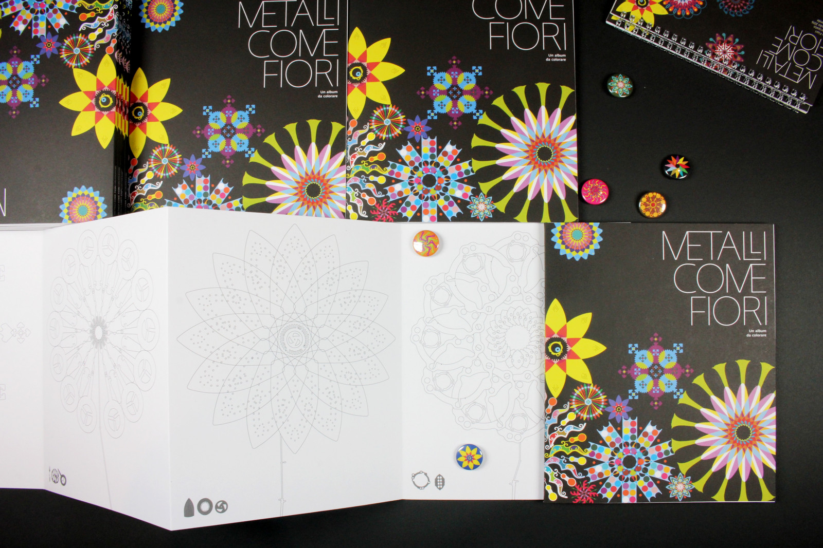
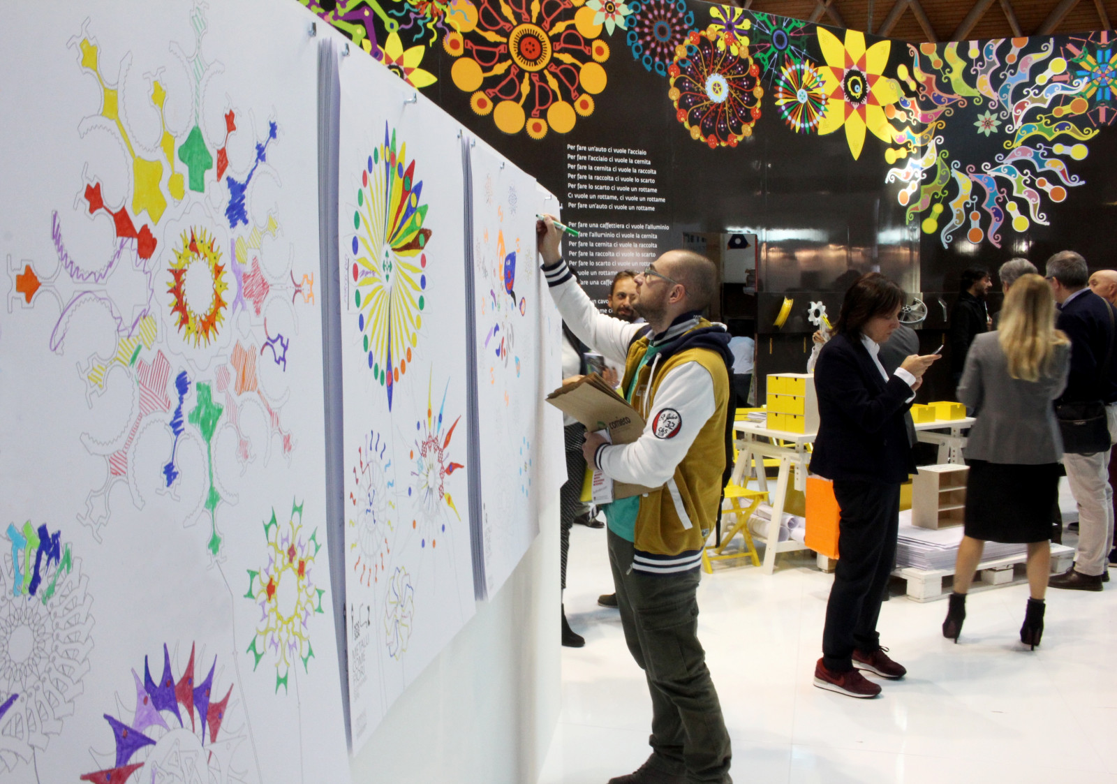
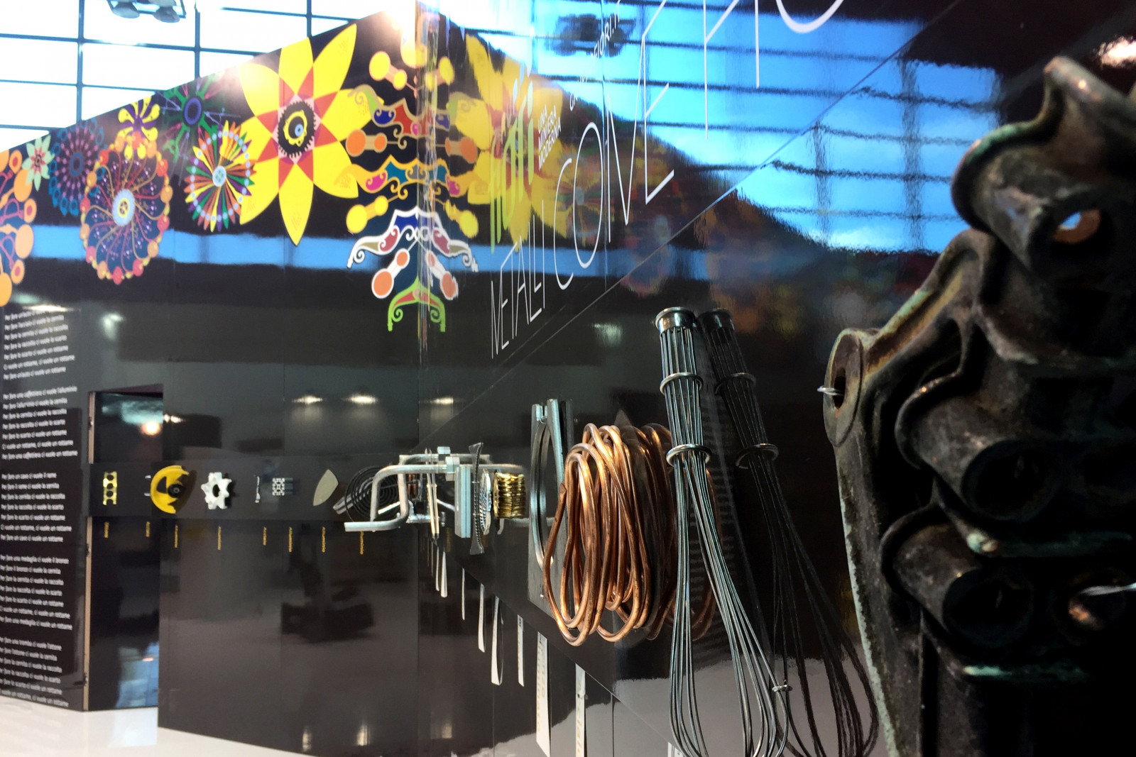
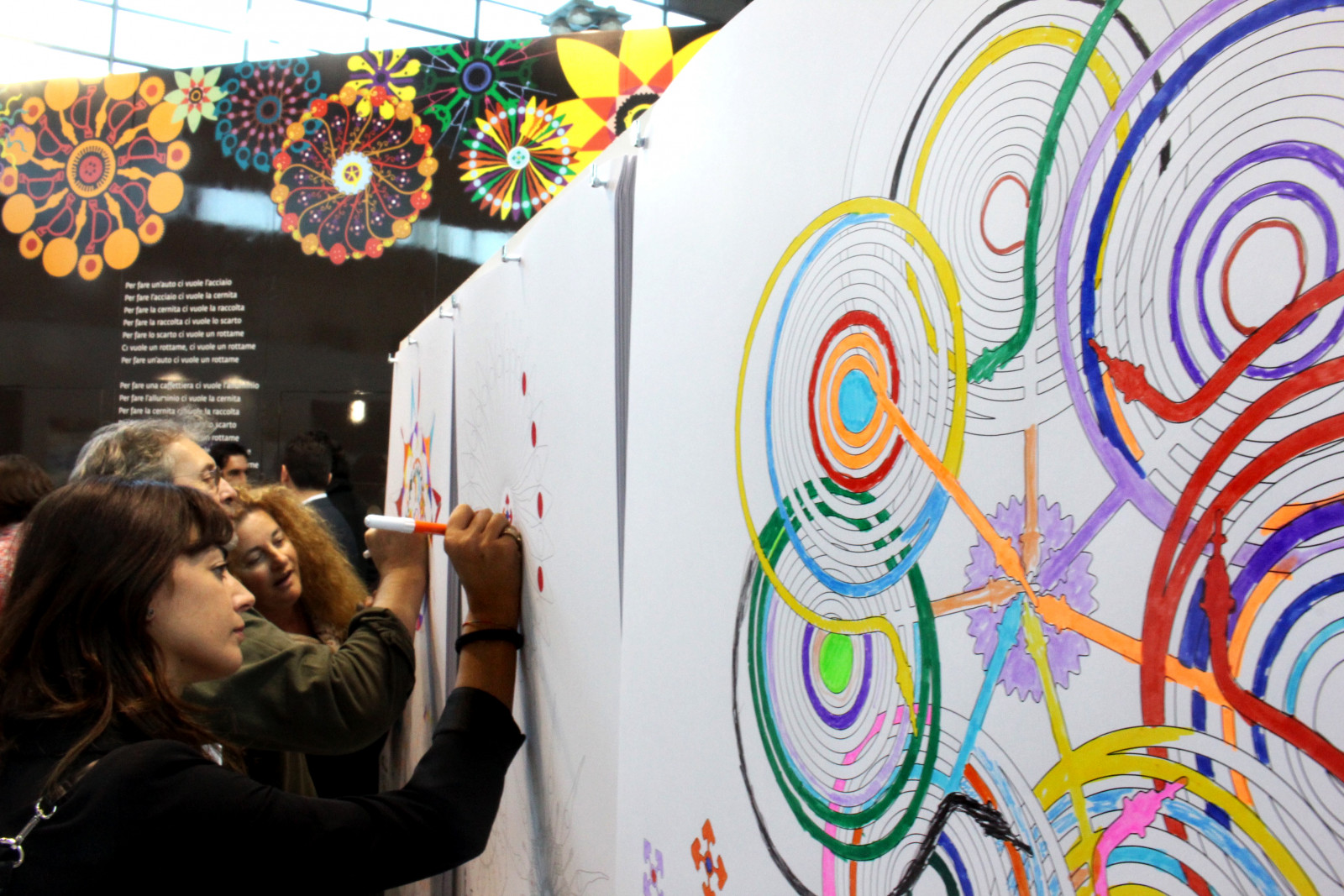
Metalli come fiori [metal as flowers] is the name of the display created for Fiori Group at the 2016 edition of the Ecomondo trade fair, conceived to give visitors a sense of involvement in the infinite transformations of metals.
How. The key idea for this edition was colouring, with visitors brightening up the walls of the stand and generating large, colourful flowers based on the shapes of the scrap metal. Thus, the stand was transformed into an art gallery full of constantly-evolving shapes and colours.
What. Analysis, design and production, staging, catalogue.
Client. Fiori Group, Valsamoggia (IT).
Year. 2016.

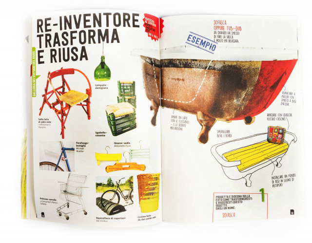
Become an Inventor 2017
Diventa Inventore [become an inventor] is a competition promoted by Mantova Ambiente for elementary and middle schools, to reduce the production of waste and raise awareness among the younger generation about reuse.
How. We designed an activity kit, comprising materials to cut out, instructions and suggestions. The kit was distributed to the different classes, where the pupils had a go at the difficult art of design for reuse. The winners were rewarded with a selection of 100 children's books about the environment, in a big bin-shaped library on wheels.
What. Analysis, design and production of kits, communications and a library-bin. Organization and direction of the prize-giving day.
Client. Mantova Ambiente, Mantua (IT).
Year. 2017.
Partnerships. Maurizio Cardillo - actor and entertainer, Gianumberto Accinelli - entomologist, Lorenzo Monaco - science journalist, Silvana Sola - pedagogist and bookseller.
Become an Inventor is part of the environmental awareness raising campaign Differenti Positivi [positively different] developed for Mantova Ambiente.
The Differenti Positivi project
The Diventa Inventore competition
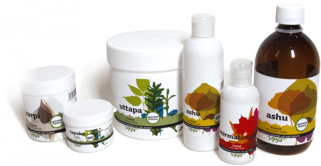
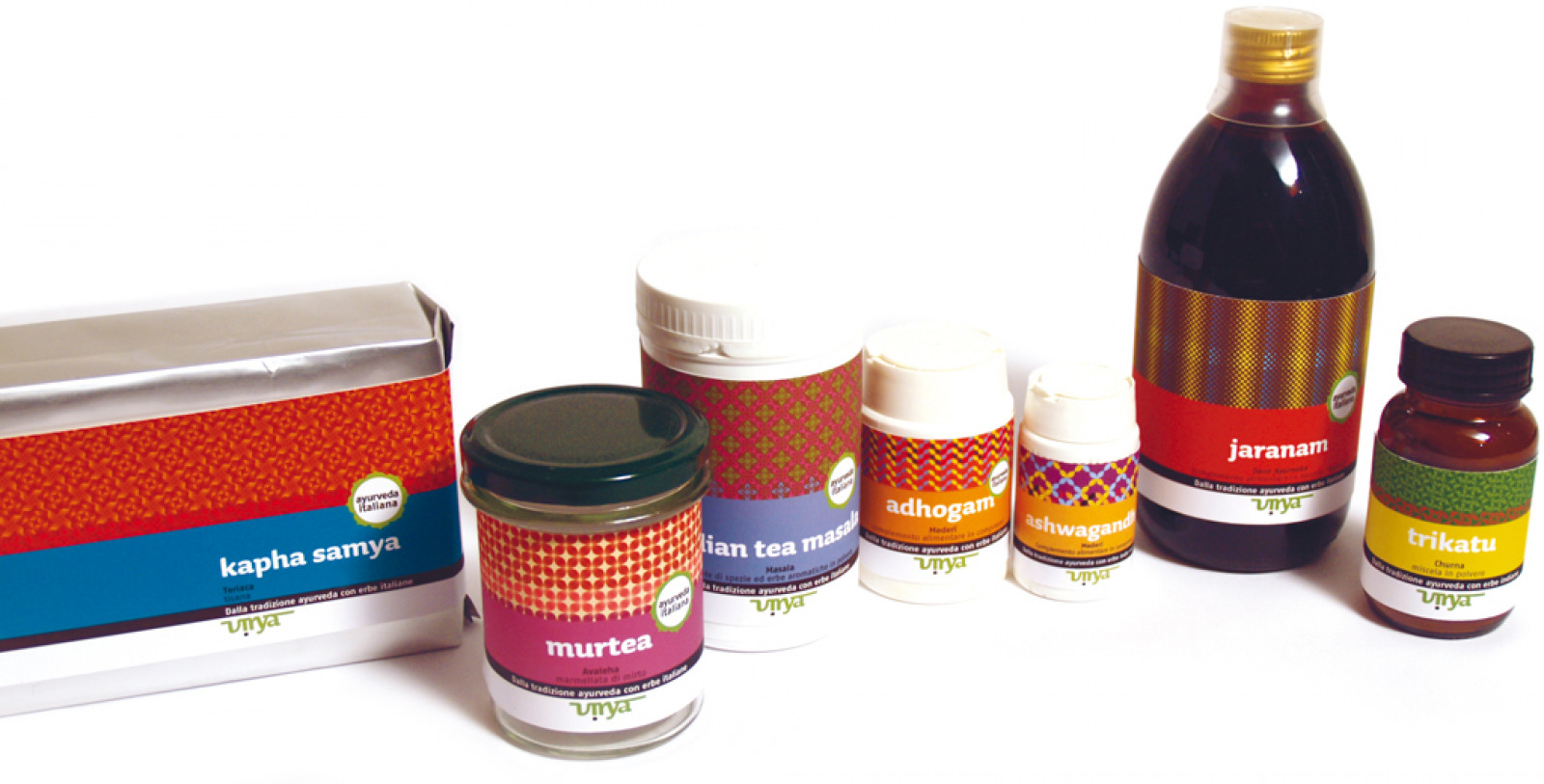
Virya
Virya produce e distribuisce prodotti realizzati secondo la tradizione ayurveda. Abbiamo lavorato al riposizionamento della marca e riprogettato l'immagine coordinata complessiva. Come è nostra consuetudine, siamo partiti da una attenta ricerca del comparto merceologico, che ci ha consentito di identificare gli spazi cromatici e i repertori iconografici occupati o liberi. È subito emersa una sostanziale differenziazione tra il settore erboristico, ricco di verde e giallo, illustrazioni naturalistiche e caratteri calligrafici, e il settore del farmaco tradizionale, dominato dall'azzurro, aniconico, con caratteri asettici e senza grazie.
Con la sua nuova immagine, Virya era interessata a posizionarsi tra questi due mondi, per offrire, con professionalità e competenza scientifica, prodotti e servizi che integrano la millenaria tradizione olistica dell'ayurveda nel contesto locale e contemporaneo.
Il secondo passo è stato quello di immergerci nella cultura che fa uso di ciò che noi europei chiamiamo medicina non convenzionale. Ci siamo piacevolemente sottoposti a massaggi ayurvedici, assaporato cibo indiano, studiato l'alfabeto sanscrito, e abbiamo imparato a conoscere i nostri dosha: vata, pitta, kapha...
Il risultato è stato un logo che riecheggia i glifi del sanscrito e l'utilizzo del loto a otto petali, icona ricca di significati e base delle rappresentazioni yantra, immagine sacra dell’Induismo e del Buddismo e simbolo nazionale dell'India. Una sistema produttivo di infinite texture caratterizanti linee e prodotti.
Itinerari (digitali) nell’arte
The digital version of one of the most commonly-used art text books in Italian schools. Itinerari nell’Arte [Itineraries in Art] offers a rich and comprehensive experience for students, and for publishers, a production flow suitable for the timescales seen in the industry.
How. We know that the medium strongly conditions the message, and that the shift to digital is not simply a matter of scanning and pasting the pages of the printed book as they are. We put together a team off editors, graphic artists and developers who revamped the pages of the book to make them suitable for the fluid environment of electronic devices.
What. Design, content editing, development.
Tools and technology. BEdita CMS, IeBook.
Client. Zanichelli Editore, Bologna (IT).
Year. 2016.
Sign up on Iebook Zanichelli to browse through Itinerari nell’Arte
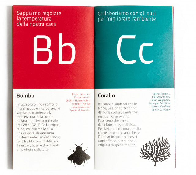
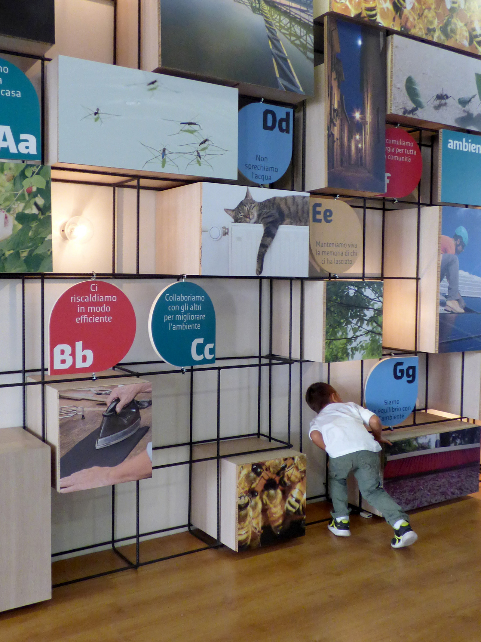
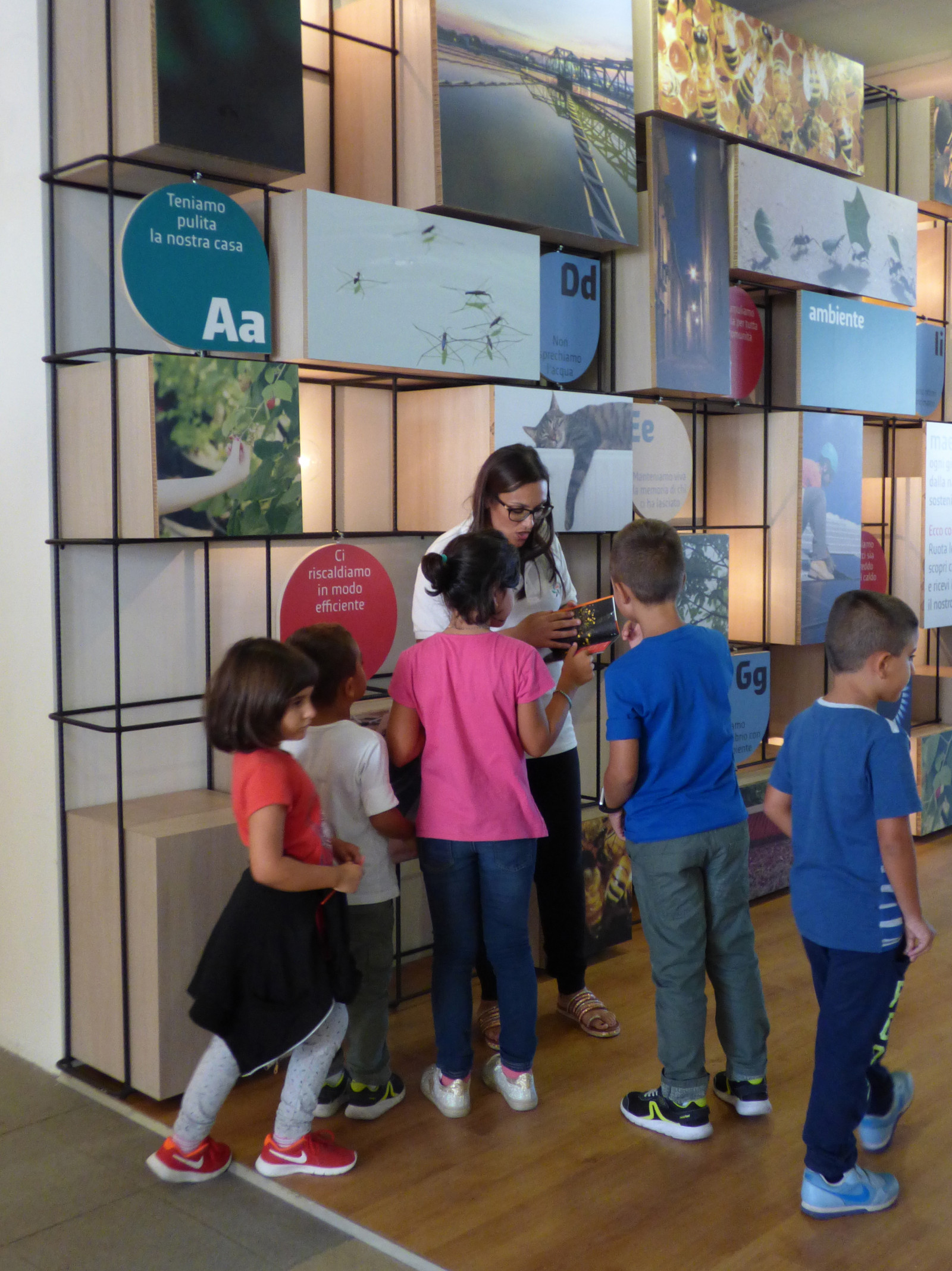
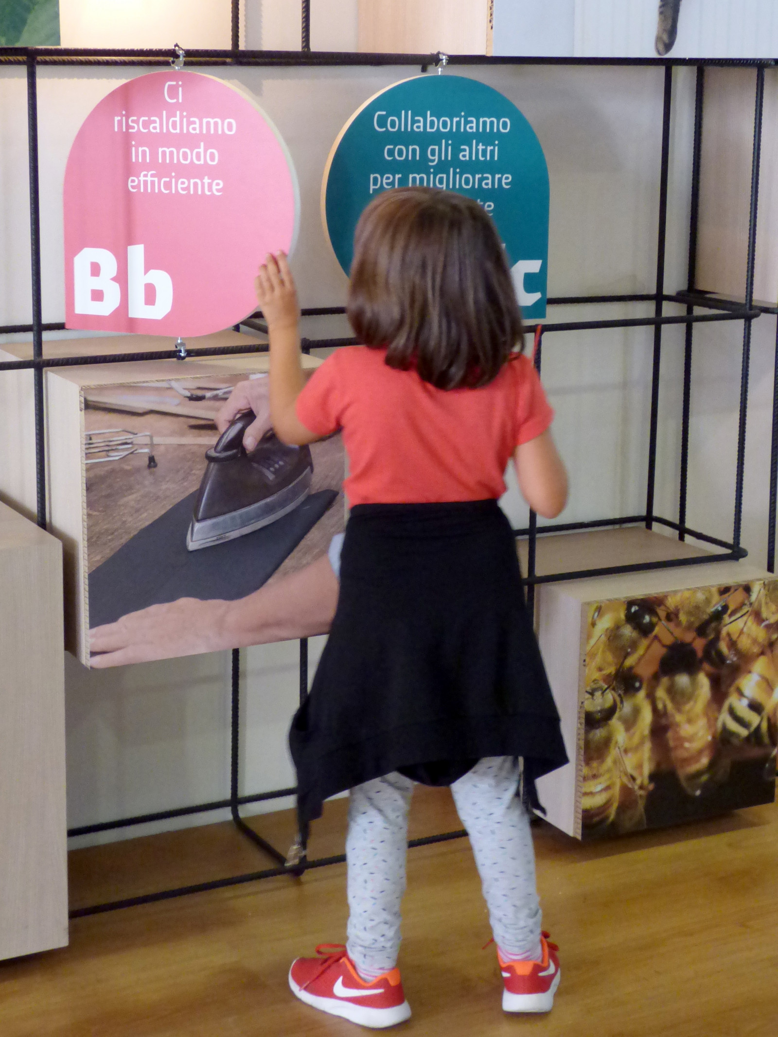
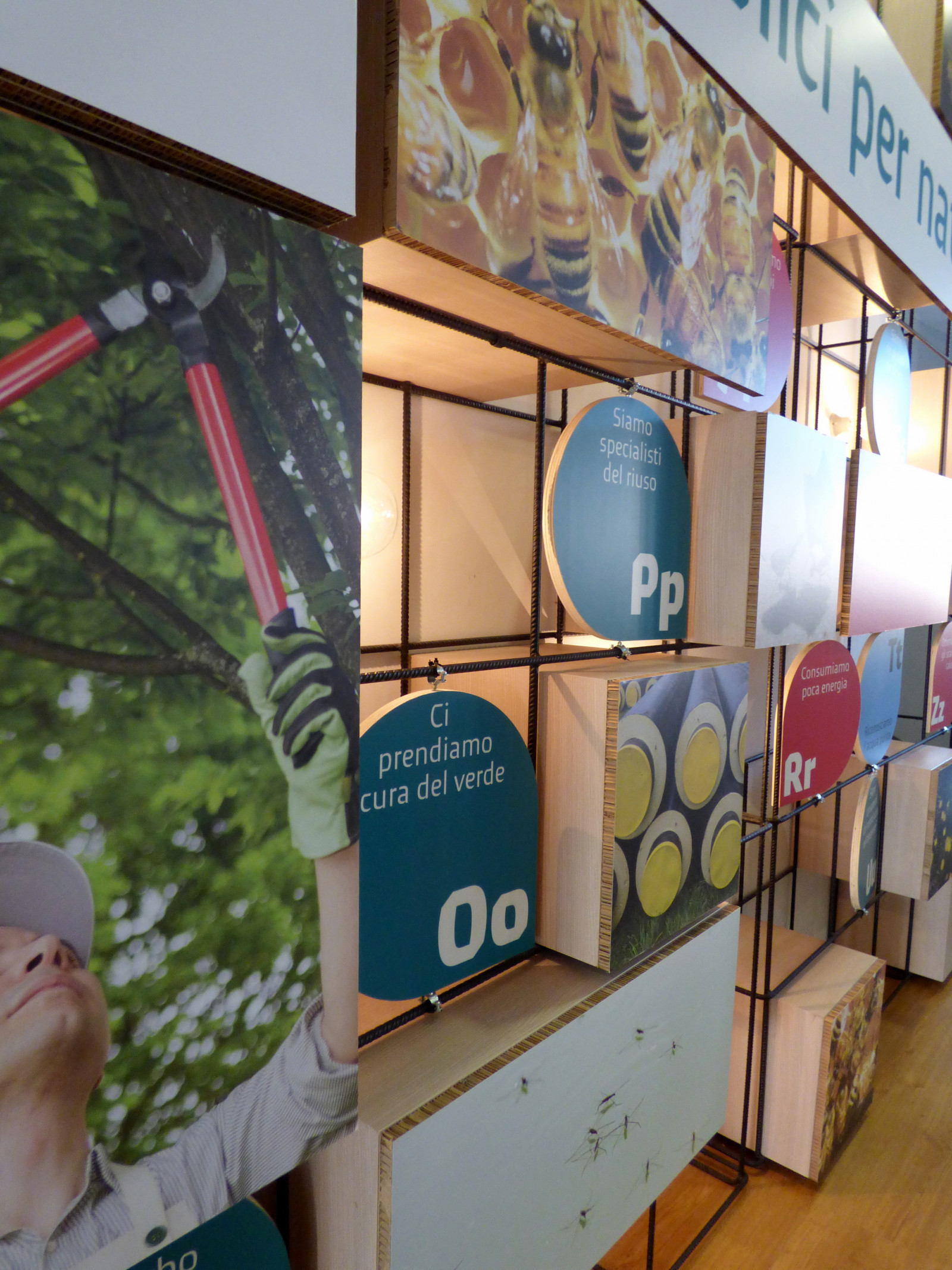
Maestra natura: Abbecedario
Abbecedario [reading primer] is a trade fair stand designed for Gruppo TEA, promoting the value of sustainability. It also includes a printed and digital publication.
How. We designed and created an interactive reading primer for the Millennial Fair of Gonzaga, with twenty-one rotating letters, each revealing sustainable behaviours naturally adopted by animals. Abbecedario is part of the Maestra Natura [learning from nature] project.
What. Analysis, design and production, copywriting and editing of contents.
Tools and technology. IeBook.
Client. Gruppo TEA, Mantova (IT).
Year. 2017.
“Why a reading primer? Because, like good schoolchildren, the first thing we need to learn is to read nature. Letter by letter, step by step, nature teaches us how to take care of the environment. Each animal, even the smallest one, can prove to be a great life teacher, ready to reveal to us, page after page, the art of protecting, helping, preserving and working together to live in perfect harmony with the environment. Naturally sustainable.” (translated from the pages of Abbecedario)
The digital version of Abbecedario-Maestra Natura can be seen on BiblioTEA.

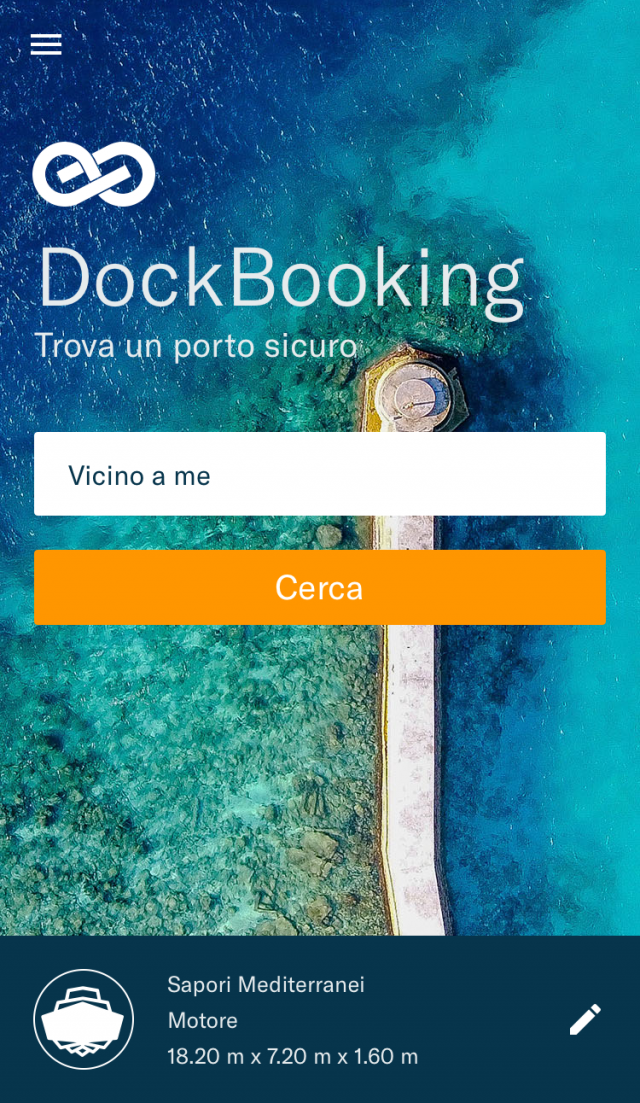
DockBooking
DockBooking is a mobile app for reserving seats on boats, and a WCMS with which port facilities can manage and administer them.
How. DockBooking asked for a long analysis of competitors in the boating sector and of best practices in the online reservation sector. Having concluded the analysis and the initial planning stages, we quickly moved on to the development of a prototype that would then enable us to collect data and information on the firms and to test how the app worked.
What. Analysis, general design, UX and UI design, prototyping, development, testing.
Method and technology. Agile, Scrum, DNA, Synapse, Nativescript, Stripe.
Client. DockBooking, Lugano (CH).
Year. 2017.
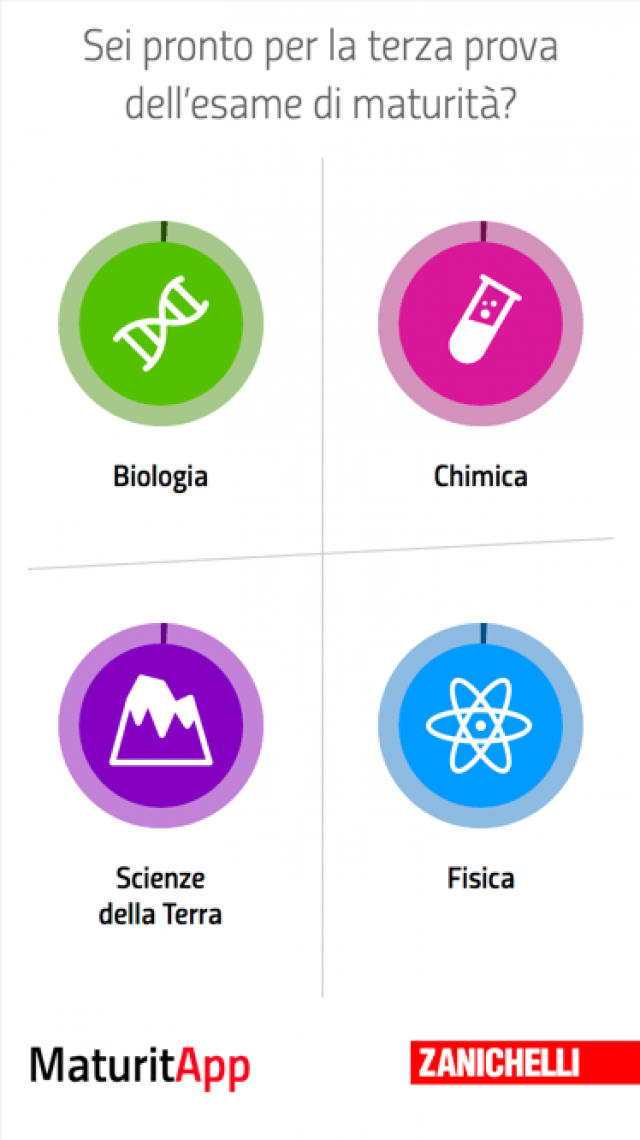
MaturitApp
MaturitApp is a quiz app for smartphones containing 540 Biology, Chemistry, Physics and Earth Sciences tests on all topics to be revised for the Italian high school leaving exams. It helps students to check how well-prepared they are, confirming what they know well and rapidly highlighting any weak areas for further revision.
How. We designed and developed a tool to encourage students to test themselves, making revision more fun. MaturitApp is designed for students approaching their leaving exams, but it can also help those preparing exercises for students, by identifying the most difficult topics, and thus creating exercises more suitable for revision work.
What. Strategy, design, UX, UI, development, promotion.
Method and technology. Agile, Scrum, DNA, Synapse.
Client. Zanichelli Editore, Bologna (IT).
Year. 2016.
MaturitApp and UniversitApp in detail
“The app that needs to be on the smartphone of every candidate is undoubtedly MaturitApp by Zanichelli, available free of charge from Apple Store and Google Play. This highly functional app allows students to assess their level of preparation across a range of subjects, such as Biology or Earth Sciences, using quizzes on the main topics that have to be memorized in order to be sufficiently prepared and pass the third exam with ease.” (Smartworld, June 2016)
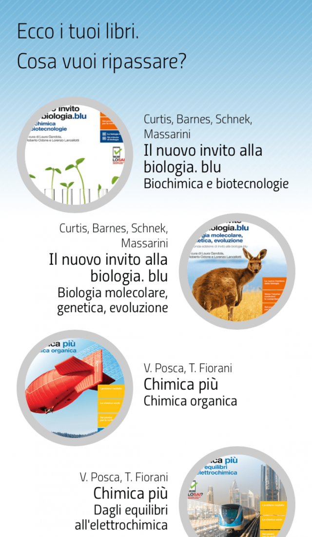
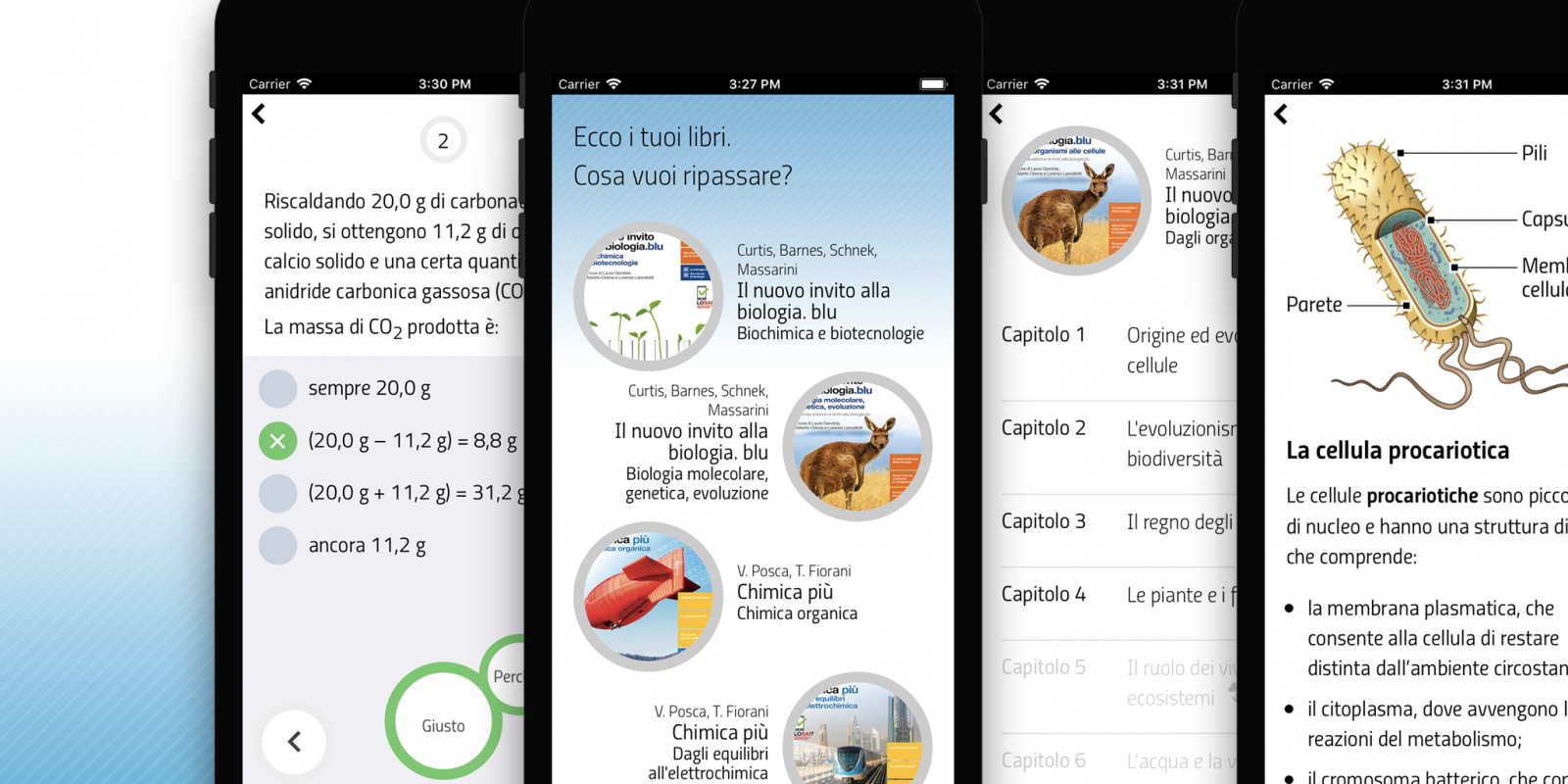
Lo Sai? Ripassa con lo smartphone
Lo Sai? Ripassa con lo smartphone [Do you know it? Revise with your smartphone] is a mobile phone app for use with Zanichelli text books, offering exercises and revision sheets. It helps students with self-assessment and rapid revision when preparing for tests at school.
How. Lo Sai? is designed in collaboration with publisher Zanichelli Editore. Students helped to analyse their own needs and habits, and took part in trials to evaluate their satisfaction regarding the user experience and graphic interface. The team worked simultaneously on the design, development, editing and testing. A website simulating the app enables editors to enter the questions and calibrate them to the screen dimensions of smartphones.
What. Market analysis, design, UX, UI, development, testing, coordination of content editing.
Method and technology. Agile, Scrum, DNA, Synapse.
Client. Zanichelli Editore, Bologna (IT).
Year. 2017.
Partnerships. Edigeo, Mondora, SPX Lab.
Lo Sai? Ripassa con lo smartphone was a finalist at the Lugano Grand Prix Moebius 2017 in the Evolving Publishers category.
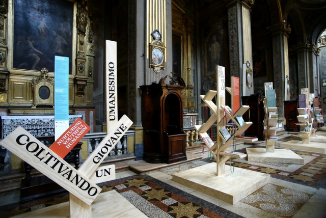
Nurturing Youthful Humanism
Nurturing Youthful Humanism is an exhibition, complete with coordinated image and catalogue, exhibiting 200 children's books from around the globe, starting with the words of Pope Francis. We organized it to mark the Pope's visit to Bologna on 1st October 2017.
How. The tree is the key idea for the structure of the exhibition, communications and catalogue. The exhibition comprises nine trees in natural wood, each three metres tall, with the books displayed on the branches.
What. Staging design, graphic design and catalogue page layout, archi-graphics and coordinated image.
Client. Bologna Children’s Book Fair, Bologna (IT).
Year. 2017.
Partnerships. Cooperativa Culturale Giannino Stoppani.
The digital version of the catalogue is available for download here.
The project was developed from an idea by Elena Pasoli (Bologna Children’s Book Fair) with scientific supervision from Cooperativa Culturale Giannino Stoppani. The catalogue is published by Giunti Editore.
The exhibition runs from 4 October 2017 at the church of Santi Bartolomeo e Gaetano, Bologna.

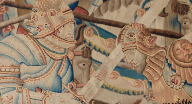
What Ariosto saw when he closed his eyes
The Palazzo dei Diamanti in Ferrara asked us to prepare six short videos, ahead of the exhibition Orlando Furioso 500 Anni [Orlando Furioso 500 years]. Each video opens a curtain behind which the great poet Orlando's world comes to life: six works which reveal what Ariosto (maybe) saw when he closed his eyes.
How. The challenge was to convey “What Ariosto saw when he closed his eyes” in a ninety-second video. The sensations aroused by tapestries, illustrated first editions, weapons, maps, sculptures, musical instruments and the masterpieces of artists of the period collected in museums around the world, from Mantegna to Raphael, Botticelli and Titian. A great Wunderkammer that comes to life on the screen.
What. Video concept and production.
Client. Palazzo dei Diamanti, Ferrara (IT).
Year. 2016.
Partnerships. Muschi&Licheni.
The exhibition combines a wide variety of wonders, all associated with the character of Orlando. The idea is to reveal the huge influence that the poem has had on the imagery of so many artists over time, and to bring out the sense of discovery and adventure that it so powerfully conveys.
The videos can be seen on palazzodeidiamanti.it
Orlando Furioso 500 anni - Video post inaugurazione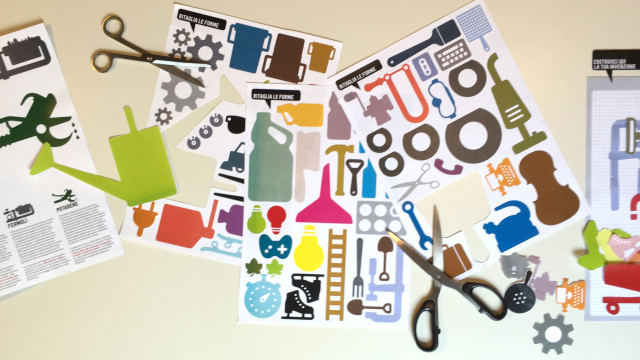
Become an Inventor 2016
For Mantova Ambiente we designed and organized the competition Diventa Inventore [Become an Inventor]. Forty-six classes from local primary and secondary schools were enthusiastic participants, proposing their ideas, inventions and designs, drawing inspiration from the company's Fantastic Patents.
How. We designed an activity kit, comprising materials to cut out, instructions and suggestions. The kit was distributed to the different classes, where the pupils had a go at the difficult art of design for reuse. The five classes selected by the jury were rewarded with a selection of 100 children's books about the environment, in a big bin-shaped library on wheels.
What. Analysis, design and production of kits, communications and a library-bin. Organization and direction of the prize-giving day.
Client. Mantova Ambiente, Mantova (IT).
Year. 2016.
Become an Inventor is part of the environmental awareness raising campaign Differenti Positivi [positively different] developed for Mantova Ambiente.
The Differenti Positivi project
The Diventa Inventore competition
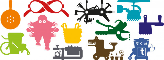
7 Fantastic Patents
The Fantastic Patents use a combination of irony and positiveness to talk about the deepest aspirations of Mantova Ambiente. We took them as a starting point to reconsider the company's identity and communication.
How. The key element of the communications redesign for Mantova Ambiente lies in the 7 Fantastic Patents. Rimiserve, Raccobista, Separino, Ricicletta, Fermolì, Spazzavolo, Potabene: seven inventive creations that illustrate seven of the company's actions and values.
What. Analysis, design, coordinated image.
Client. Mantova Ambiente, Mantova (IT).
Year. 2015.
The values of Mantova Ambiente expressed by the Fantastic Patents are:
- We do not destroy what has been created
- We do not throw away waste
- The difference is more than just subtraction
- Everything is illuminated
- Useless things will eventually become useful
- A clean environment makes for a better life
- Of all the colours, green is the most fertile
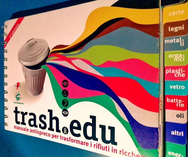
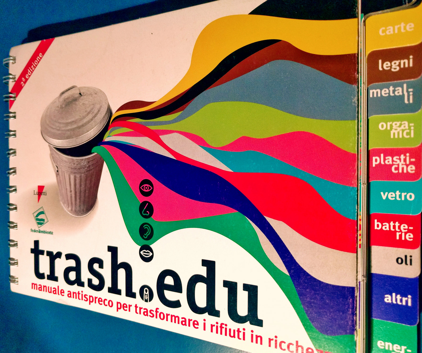
Trashedu
With Federambiente, we brought to life an anti-waste manual, to transform rubbish into riches. The manual is designed for teenagers, and is intended to provide support for cultural, scholastic and educational activities.
How. Trashedu is full of pictures, illustrations and diagrams, and includes interactive experiences that can be used in the classroom or at home. The aim is to spread a culture of attention and care for the environment.
What. Graphic design and page layout.
Year. 2002.
The manual was a great success, and indeed, over the following years three updated editions were reproduced.
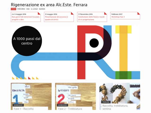
Alc.Este Urban regeneration
With Real Este Ferrara, we created a website documenting and communicating the regeneration process taking place at the former distilleries of Alc.Este in Ferrara.
How. Participation is a fundamental part of the entire process of urban regeneration, which will give a new lease of life to a currently disused area. The website brings together the various proposals of ways to use the area, and gives an account of the workshops on which all stages of the project are based.
What. Visual identity, design and architecture of website content.
Client. Real Estate Ferrara, Ferrara (IT).
Year. 2016.