Large poster, written and illustrated as a means of propaganda of what we do more or less every day for many years.

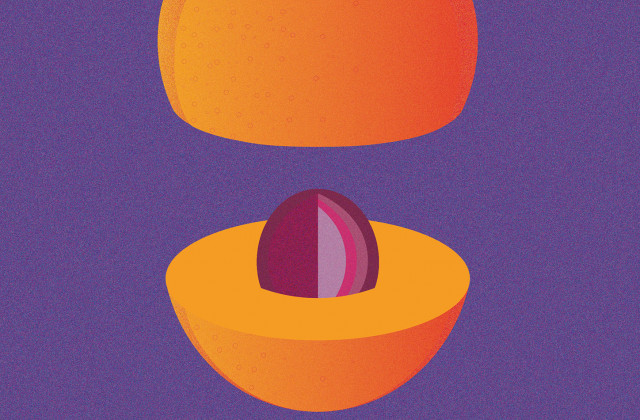
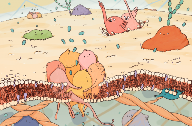
Maestra Natura
Maestra natura [learning from nature] is the company profile we designed for Gruppo TEA, with a printed and digital publication that talks about the values, services and environmental strategies of the multi-utility group.
How. Services regarding energy, water, waste collection and cemetery management are described and narrated through animals that have a virtuous relationship with the environment. Bees, pond skaters, fireflies and butterflies are the masters teaching us how to relate with the surrounding environment.
What. Publishing project, graphic design, editing and page layout.
Client. Gruppo TEA, Mantova (IT).
Year. 2016.
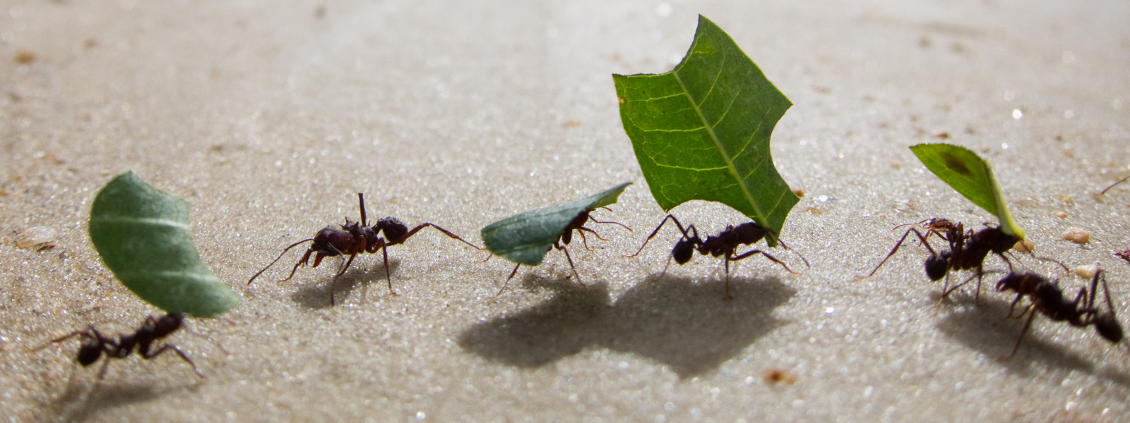
“The soul of the world, my friends,
is there, in a speck of dust or pollen
or purpurin, in a strand of hair,
in an ant.”
[Translated from Leonardo Sinisgalli, Furor Mathematicus
Milano, Arnoldo Mondadori Editore, 1950]
The digital version of Abbecedario-Maestra Natura can be seen on BiblioTEA.
Back at work for BCBF 2017
After a one-year break, we have resumed work on the design and development of the visual identity of the Bologna Children's Book Fair. We have been taking care of it since 2009, rising to the challenges of each new edition with glyphs, alphabets, icons, colours… never with illustrations!
How. For the 2017 edition, for the first time in the history of the event, the visitor is accompanied by illustrations, in the form of a series of images created by Daniele Castellano. With him, we created a flexible identity that could tell some stories. His chimera enabled us to put together the fundamental soul of Bologna Children's Book Fair in a single animal, while the unique characteristics of the various fantastic creatures from which it was made gave voice to the contents of the event.
What. Selection of an illustrator, development of an idea and of the central theme, planning.
Client. Bologna Children’s Book Fair, Bologna (IT).
Year. 2017.
The story of the idea, the project and the first developments is also told on the BCBF website.

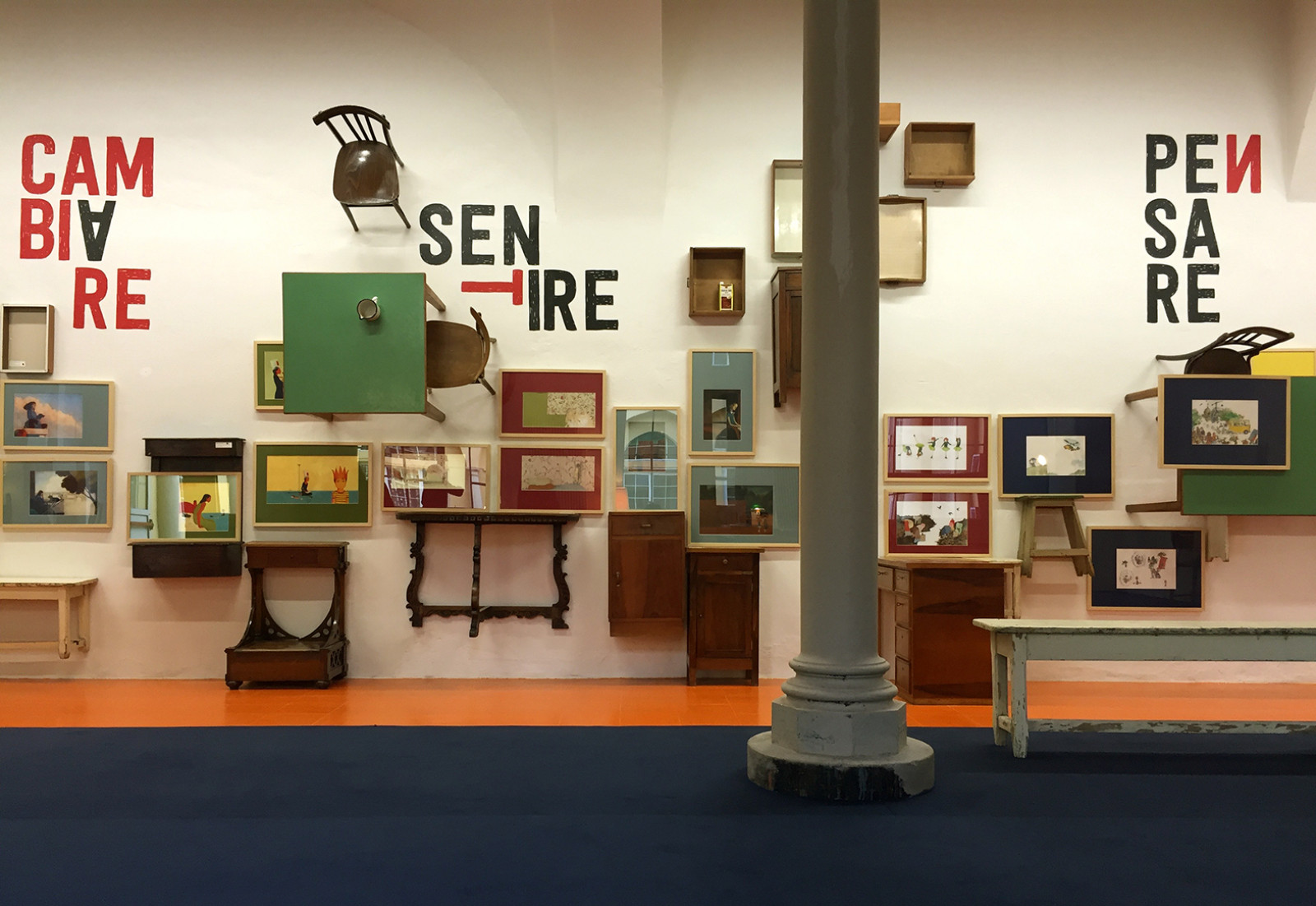
Another view
Un altro sguardo. Figure e storie di disabilità nei libri per ragazzi [Another view. Illustrations and stories of disabilities in children's books] is an exhibition of original plates regarding what is classified as differently abled. We do not see the boundary between ability and disability. We want everything to be normally achiev-able. Hence, for Another View, we turned out letters, tables, chests of drawers, nightstands, books…
How. Around the original plates, taken from books in the special Disability section of the BolognaRagazzi Award 2016, we built up our exhibition, hosted by the Fondazione Gualandi foundation for the deaf.
What. Staging design, graphic design and catalogue page layout, archi-graphics and coordinated image.
Client. Fondazione Gualandi, Bologna (IT).
Year. 2016.
Partnerships. Giannino Stoppani Cooperativa Culturale, Bologna Children’s Book Fair.


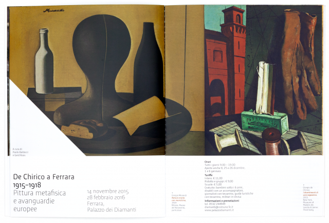
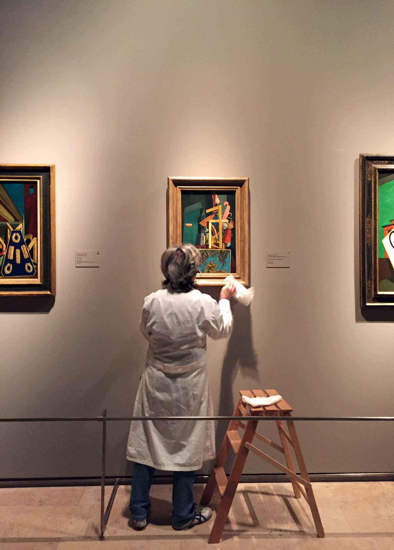
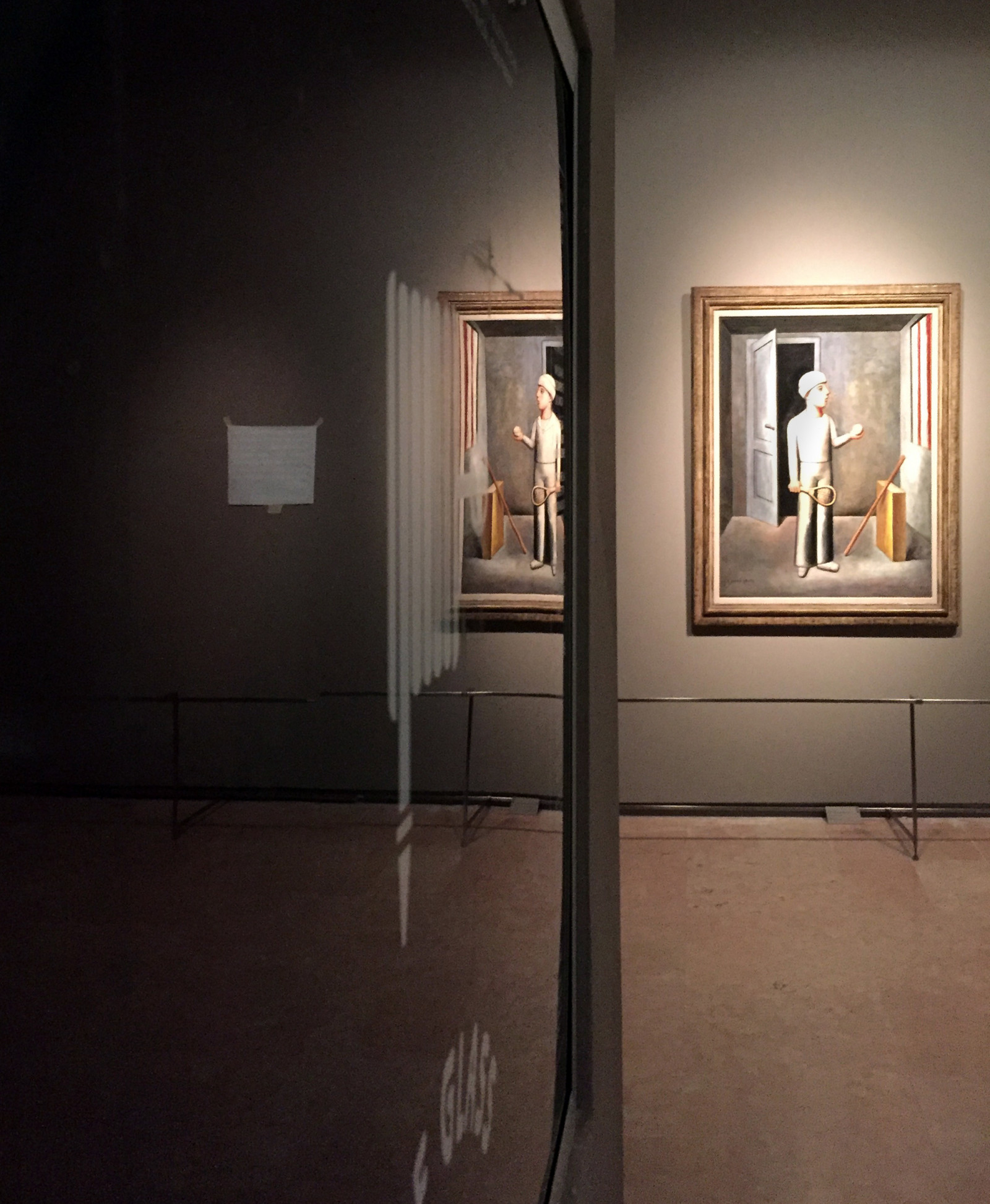
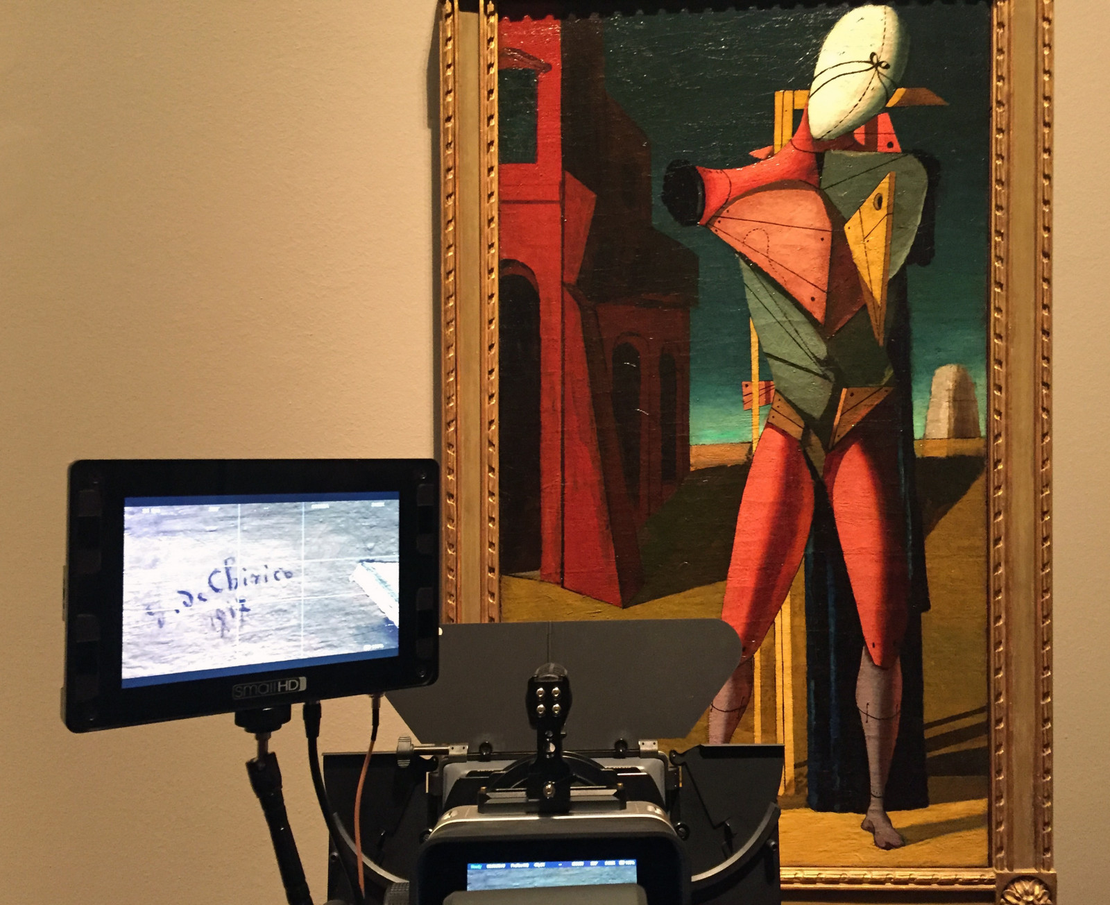
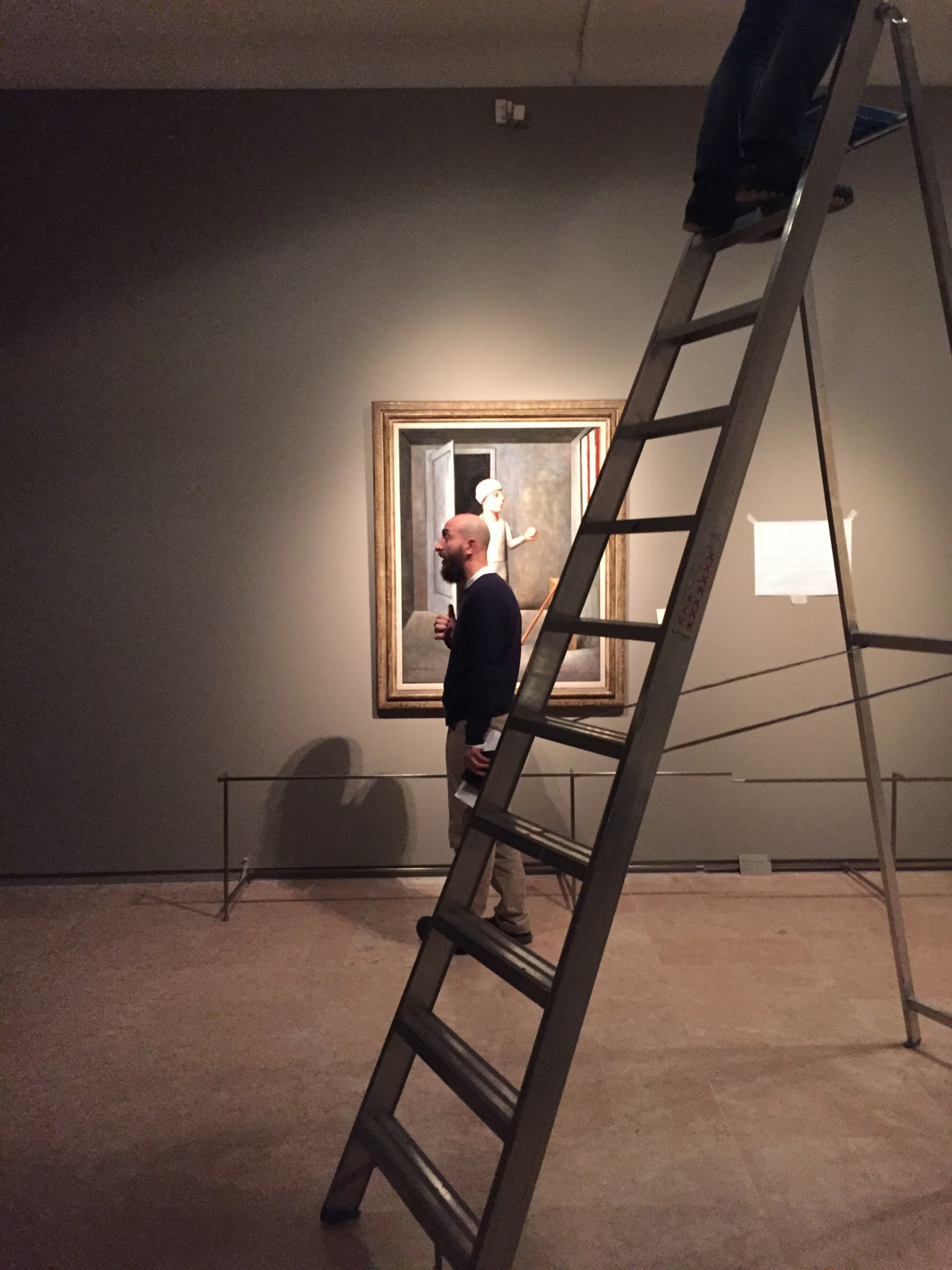
Metaphysics in Movement
The Palazzo dei Diamanti in Ferrara asked us to produce a short video presentation of the exhibition De Chirico a Ferrara. Metafisica e avanguardie [De Chirico in Ferrara. Metaphysics and the Avant-garde].
How. Many metaphysical masterpieces are imbued with an atmosphere of suspension and rarefied stillness. We took up the challenge of conveying these sensations in eighty-five seconds, offering a view from up-close to reveal the substance of the works.
What. Video concept and production.
Client. Palazzo dei Diamanti, Ferrara (IT).
Year. 2015.
Partnerships. Muschi&Licheni.
De Chirico in Ferrara, video.
De Chirico in Ferrara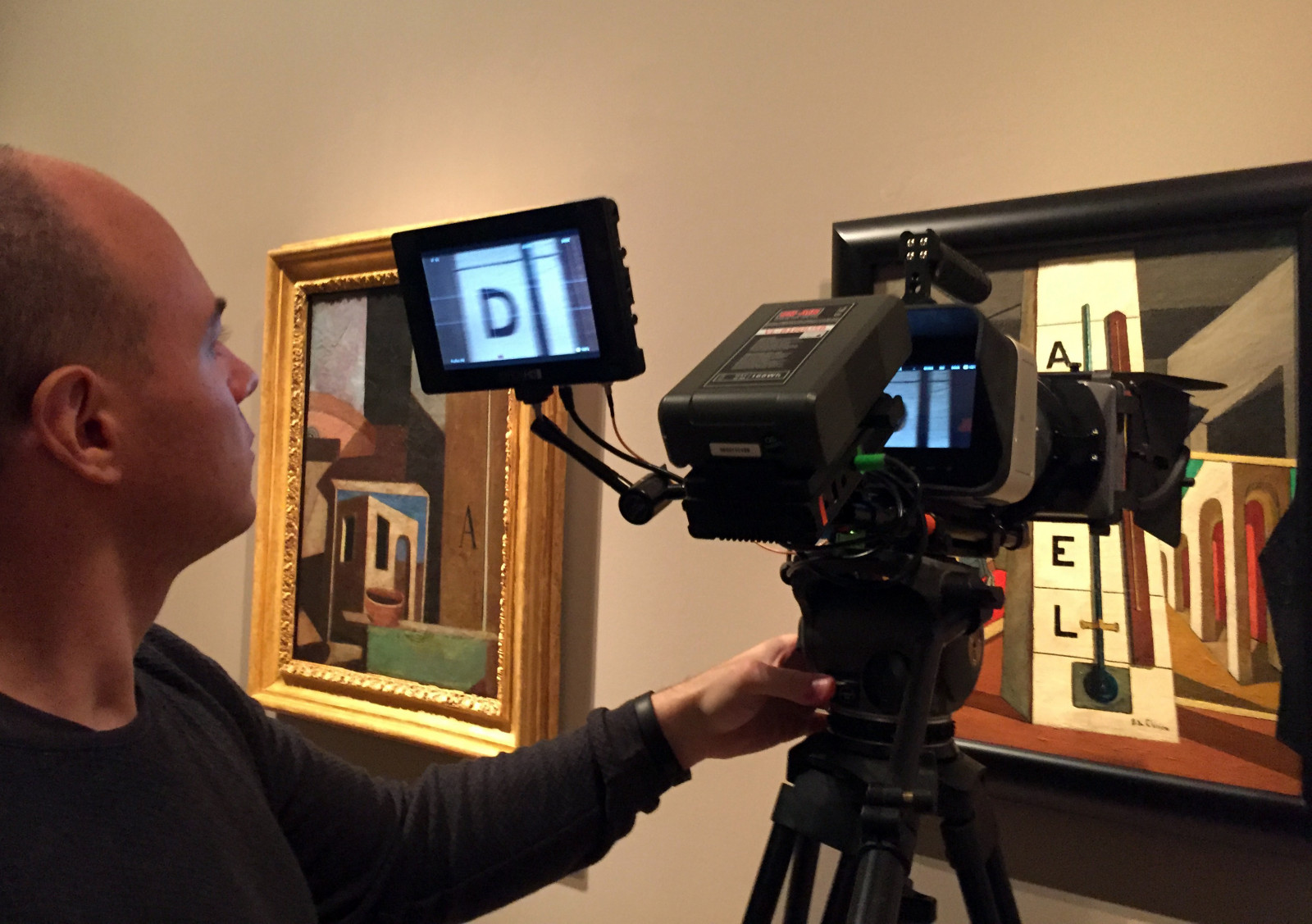

Crucial words - Fiori Group at Ecomondo 2015
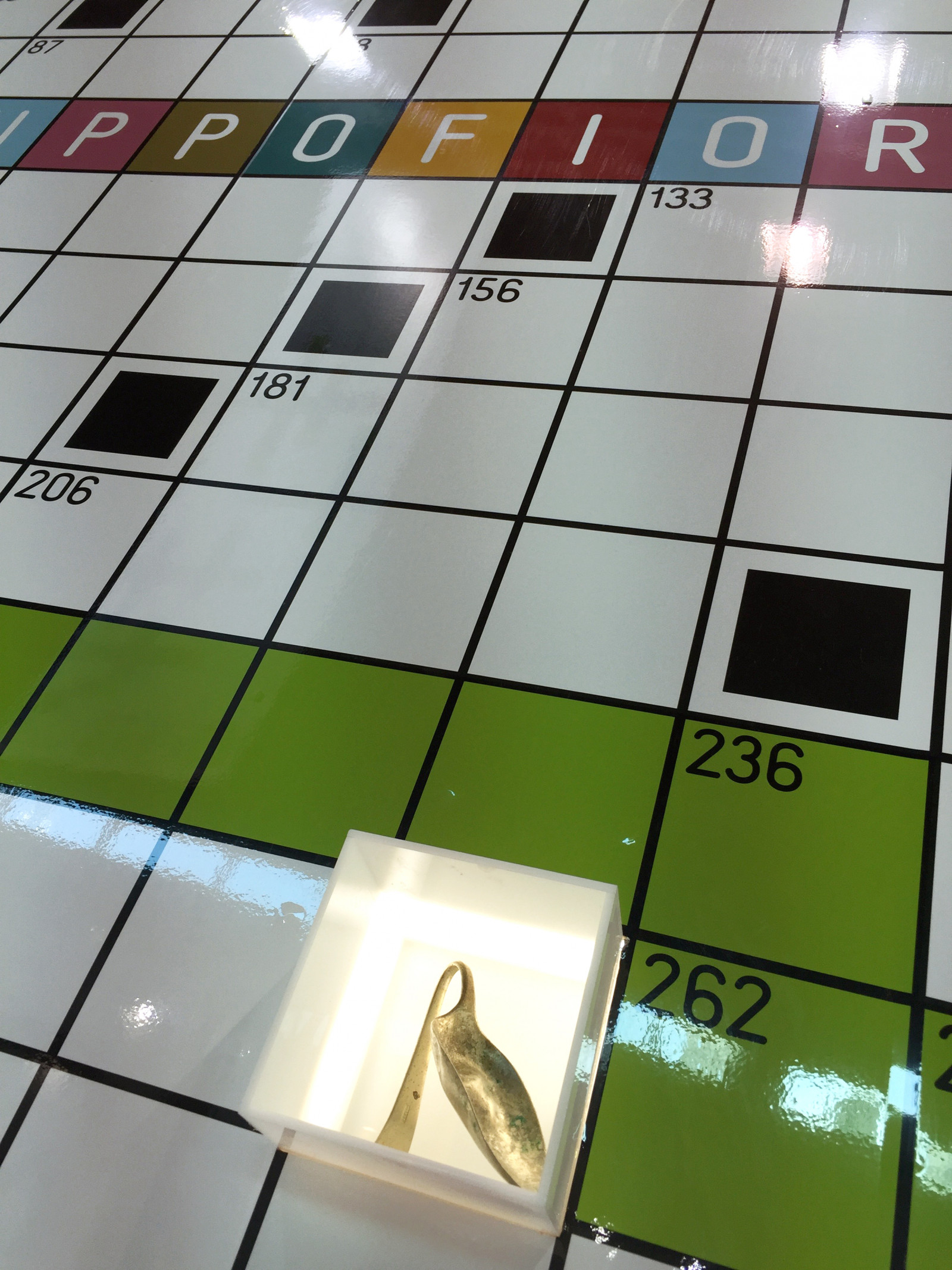
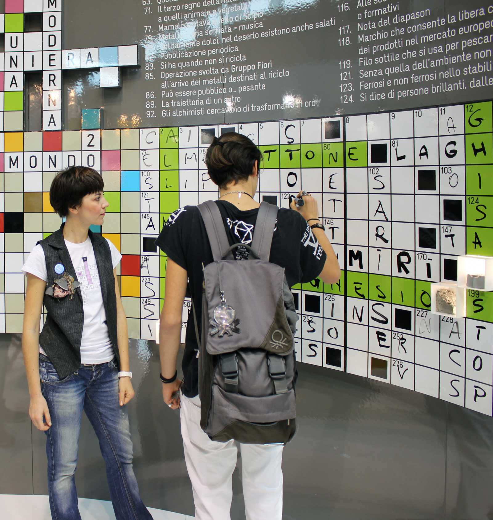
Rimini, Ecomondo 2015. This year the Fiori Group stand takes the form of a crossword 1 metre high and 14 metres long, containing 320 words of crucial environmental significance.
Each year we develop a new strategic concept, but the challenge remains the same: to communicate what Fiori Group does, encouraging people to interact, take part, have fun, and share the experience of enjoying this space.
How. A maxi-crossword in which to find over three hundred words crucial for the environment, the ones that really make a difference in the Fiori Group's modern mine.
What. Analysis, design and production, staging, catalogue.
Client. Fiori Group, Valsamoggia (IT).
Year. 2015.
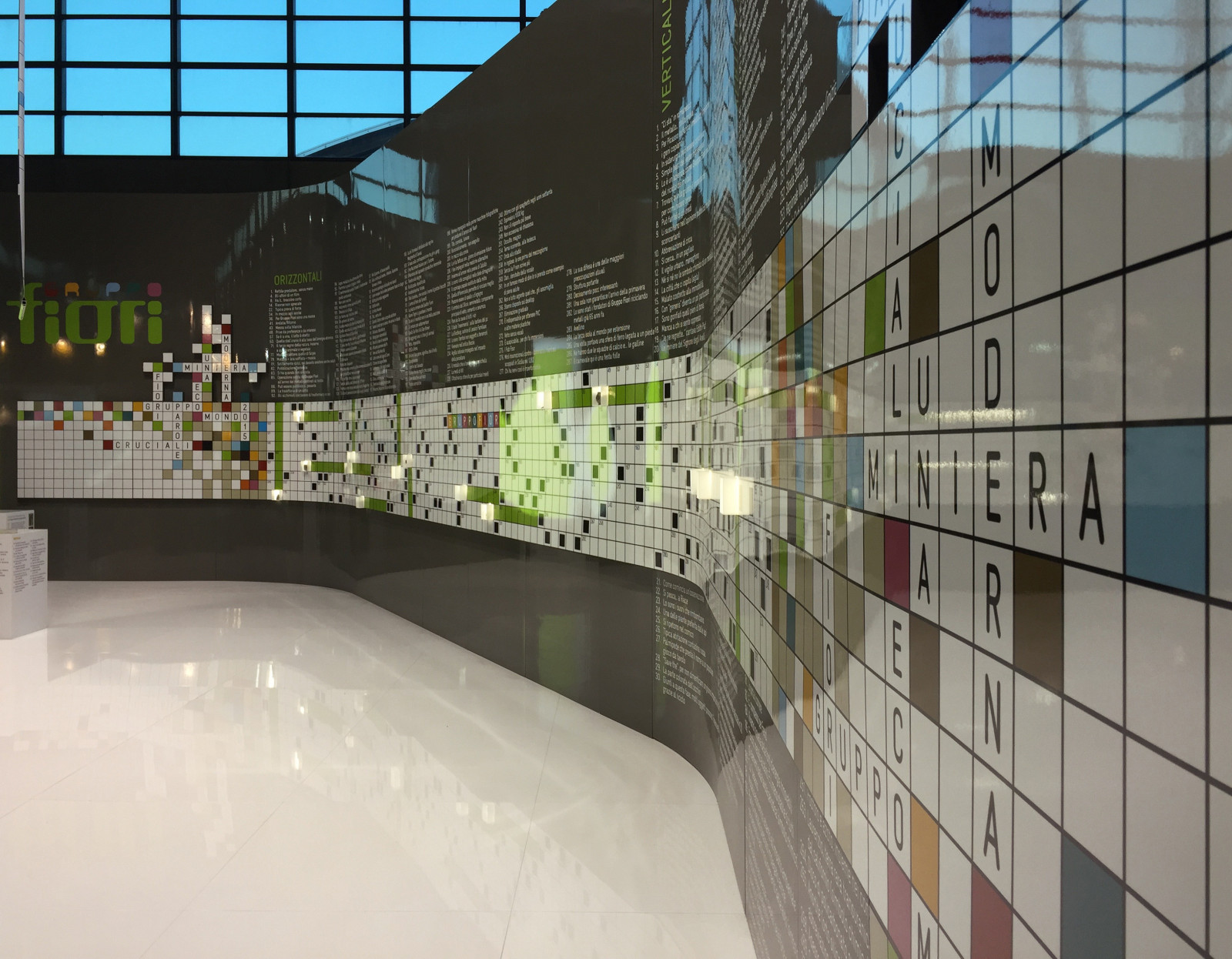
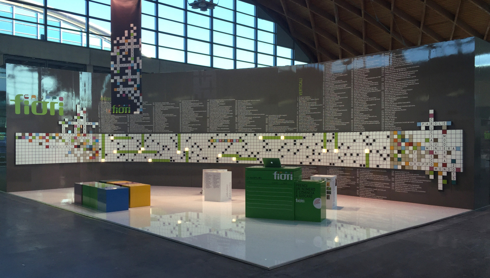 Parole cruciali
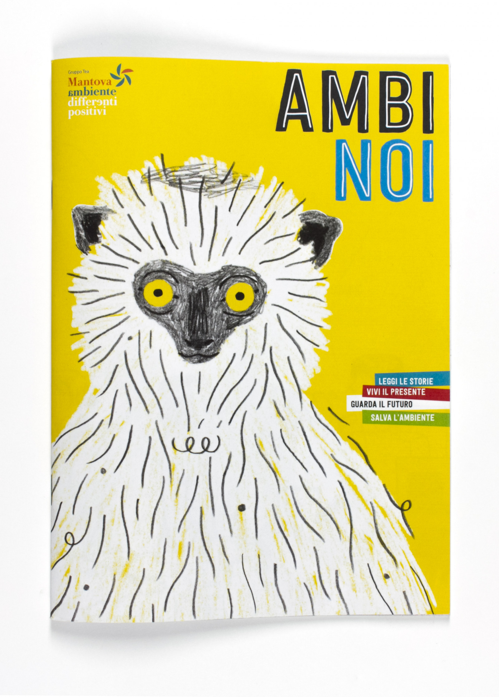
Ambinoi: we are the environment
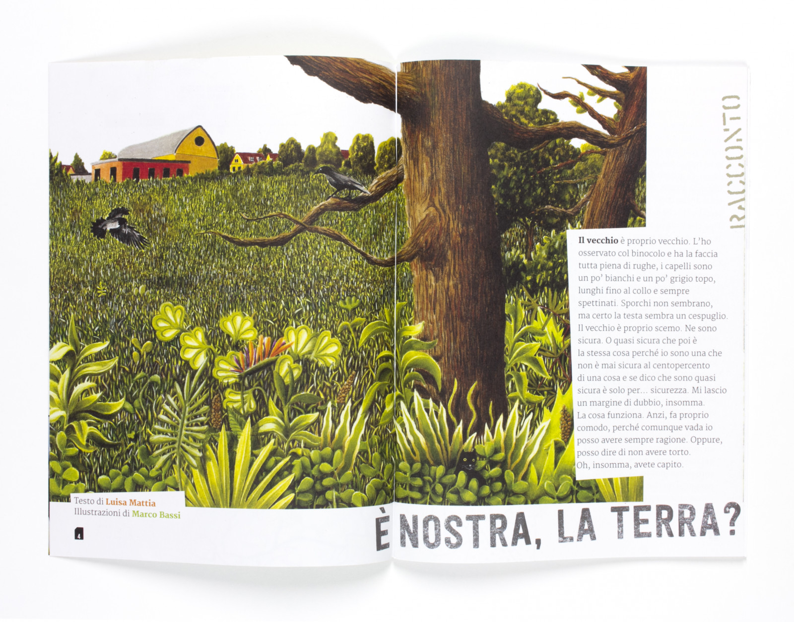
Ambinoi is the fruit of a publishing workshop, designed and created for Mantova Ambiente, which became a magazine.
How. Forty-eight 17x24-cm pages, to help children aged eight to thirteen to reflect on environmental topics. Art, science, comic strips, games, reports, interviews… the ingredients are all there, and were produced by Marco Bassi, Luca Capuano, Carlo Favero, Luisa Mattia, Lorenzo Monaco, Giuseppe Palumbo, Matteo Pompili, Bruno Tognolini.
What. Publishing project, graphic design, editing and page layout.
Client. Gruppo TEA, Mantova (IT).
Year. 2015.
The digital version of Ambinoi can be seen on BiblioTEA.

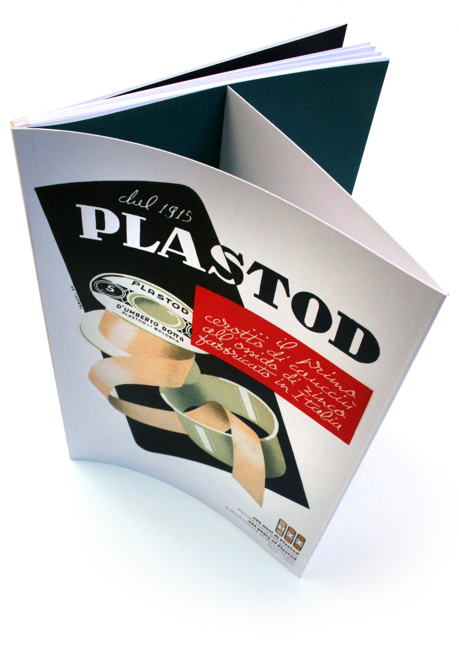
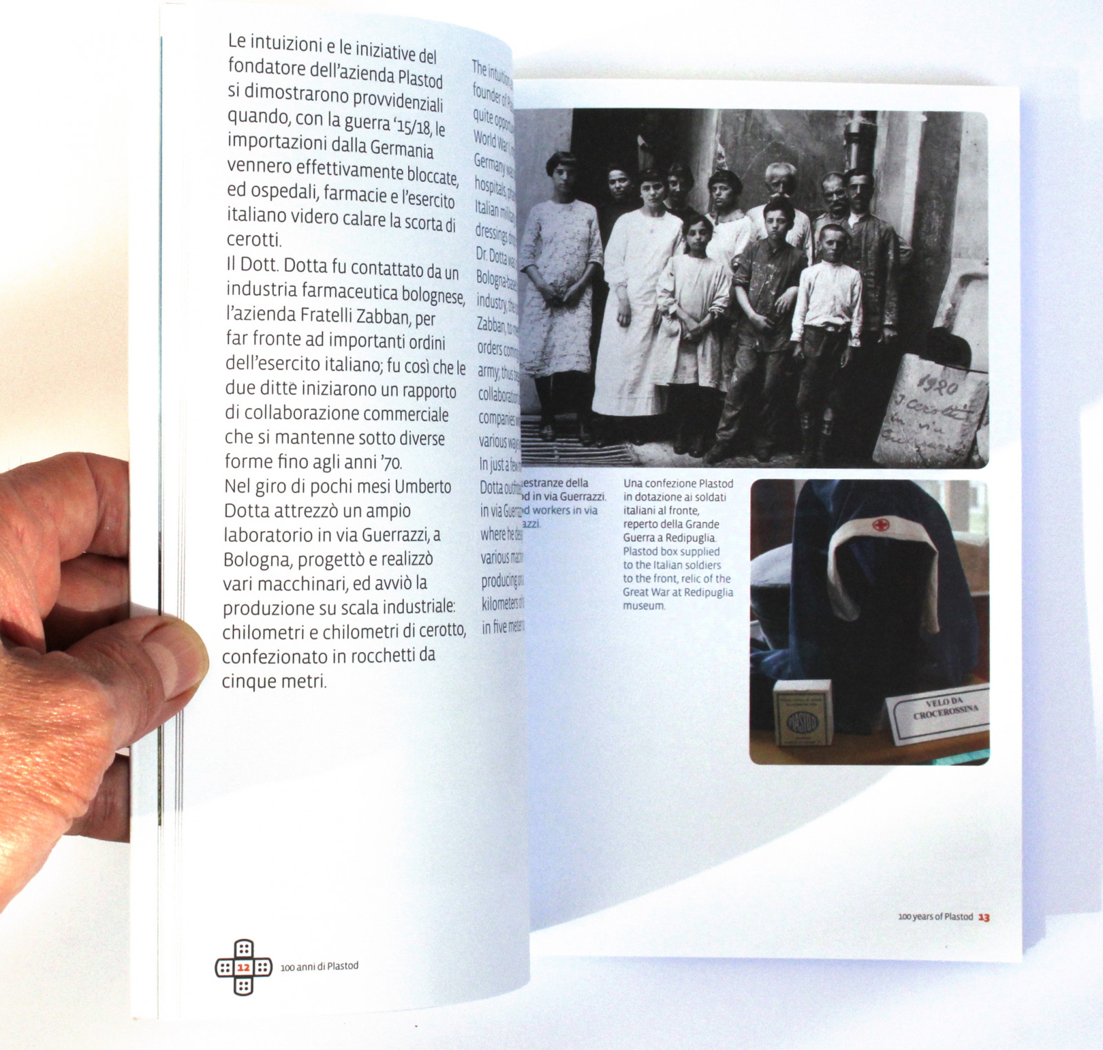
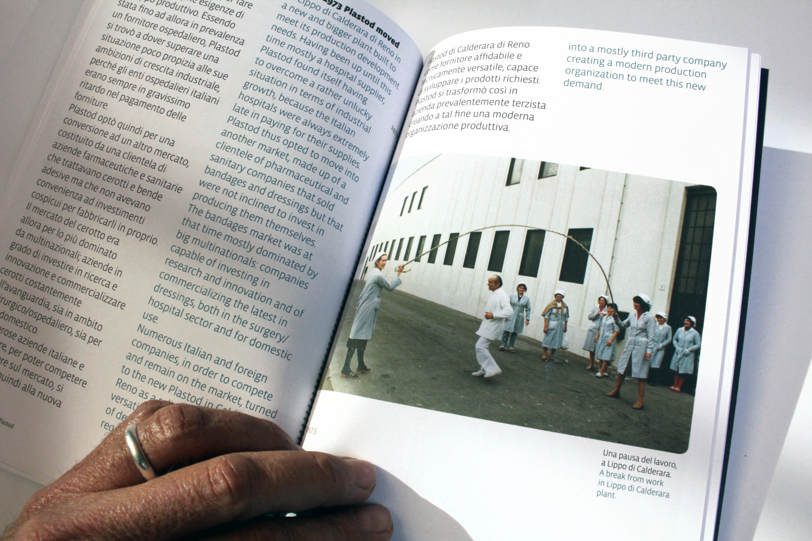
100 years of gauze and plasters
Plastod is an Italian company that has been producing gauzes and sticking plasters since 1915 and marketing them around the globe.
How. We designed a publication with photos, interviews, drawings and patents to tell the story of the first hundred years of Plastod.
What. Publishing project, graphic design, editing and page layout.
Client. Plastod, Bologna (IT).
Year. 2015.
“… the first natural rubber zinc oxide plaster made in Italy”.

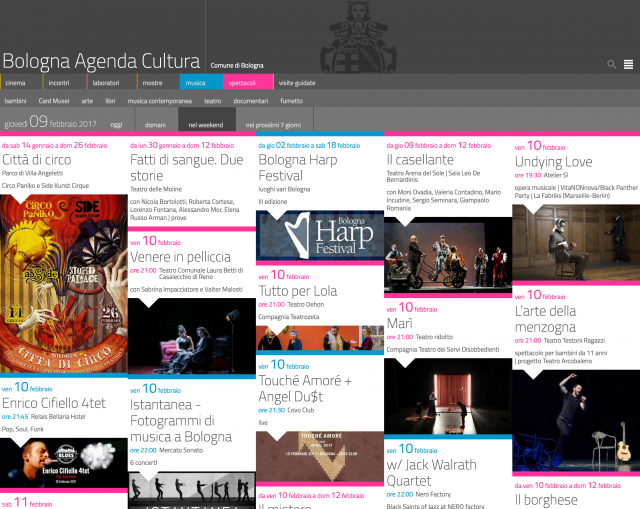
Agenda Cultura: what to do in Bologna
How do you get a city's cultural activities at your fingertips, according to your own interests and times? Bologna Agenda Cultura is our answer.
A colourful visual field bursting with pictures, showing everything that is happening in the city, with filters to choose your personal interests. A visual field in which the identity of the city emerges spontaneously, through the events, their quality and quantity.
How. We designed a technological infrastructure, based on BEdita CMS, which searches and aggregates contents from the contents selected by the editorial staff. These are automatically gathered and catalogued to facilitate production flow and publication.
What. Design, UX, UI, development.
Method and technologies. HTML5, CSS and Javascript, BEdita CMS, API REST.
Client. City of Bologna Culture Office, Bologna (IT).
Year. 2015.
Partnerships. Channelweb (server methods and RSS BOTs).
agenda.comune.bologna.it
The Agenda Cultura project
BEdita CMS
Agenda Cultura is growing: we have completed the development of the REST APIs for Agenda Cultura. This service provides all information on programmed events as raw data. This enables the City of Bologna to feed the data to other autonomous apps and services.
Interactive eBook
A new school year begins. Students open their books. Our Zanichelli Interactive eBook (in Italian) has grown with new functions and the online version.
The OECD (Organisation for Economic Co-operation and Development) has published their report (which you can read here) on the impact of digital technologies at school (but not only). A few months ago, an article by Fabio Di Giammarco (in Italian) was published in Nòva, the online magazine of "Il Sole 24 Ore", on digital learning and cites Interactive eBook as one of the innovations of Italian publishing.
The Interactive eBook - one of the most advanced digital books - represents Zanichelli's main product for digital schooling.
It includes all of the content of the printed version but it is enriched with more in-depth multimedia activities with the addition of sharing services among students and professors. It is easily accessible - thanks to excellent graphics - from any device: from a computer screen to a tablet or smartphone.

Egyptian Museum
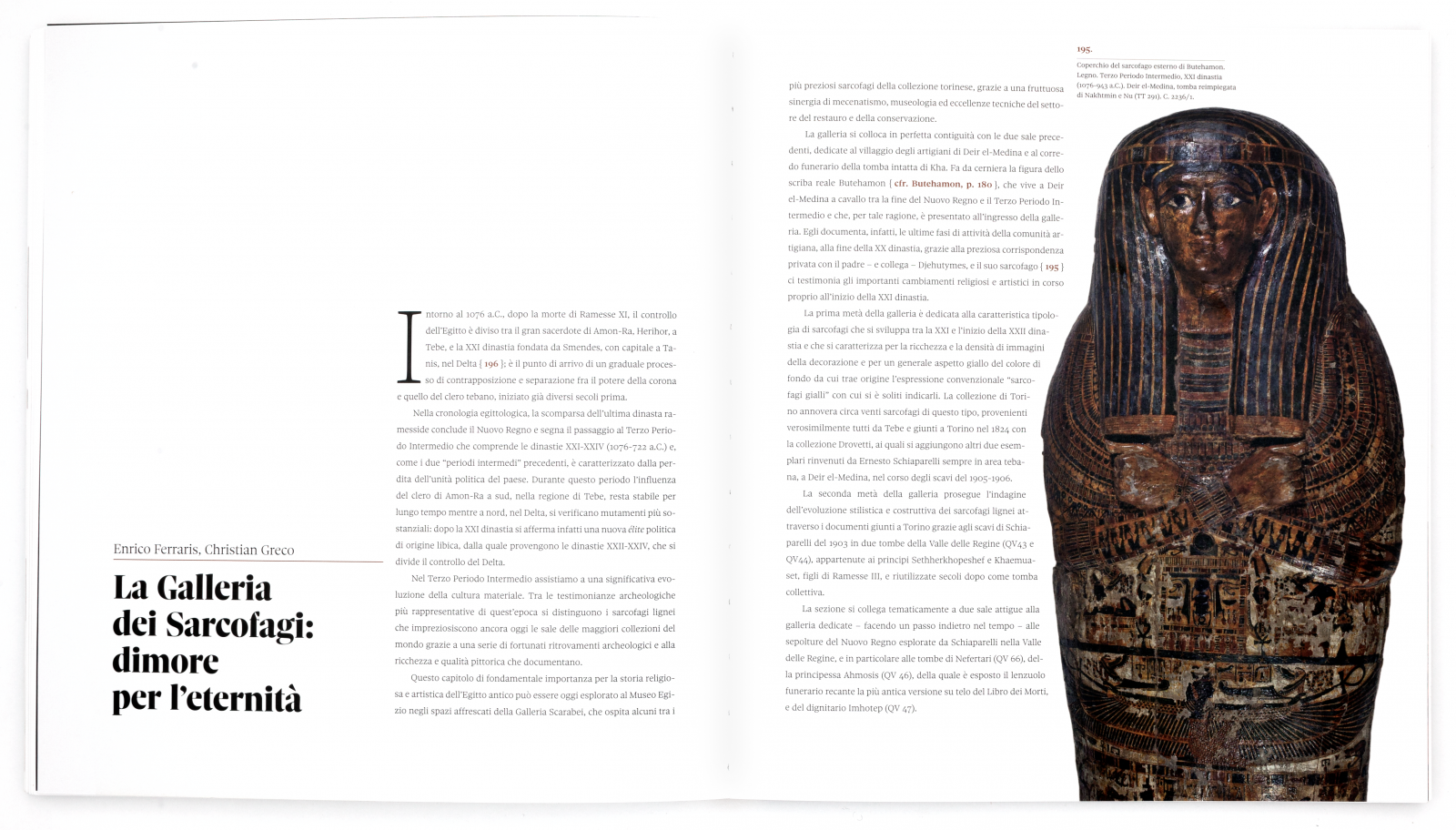
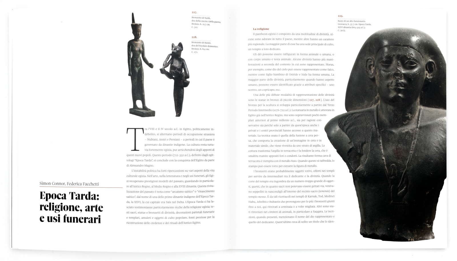
The Egyptian Museum in Turin is getting renovated.
The publisher Franco Cosimo Panini, who will curate the new editions, has entrusted us with the graphics and layout of the official museum catalogue. 268 pages, 24.5x27 cm, with case binding and Sole (Molotro) typography, the catalogue was prepared in advance for the inauguration of the museum and is already being reprinted. From the great, one of a kind sculptures, to everyday objects, every page is a treasure, a new discovery with every turn of a page.


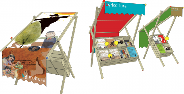
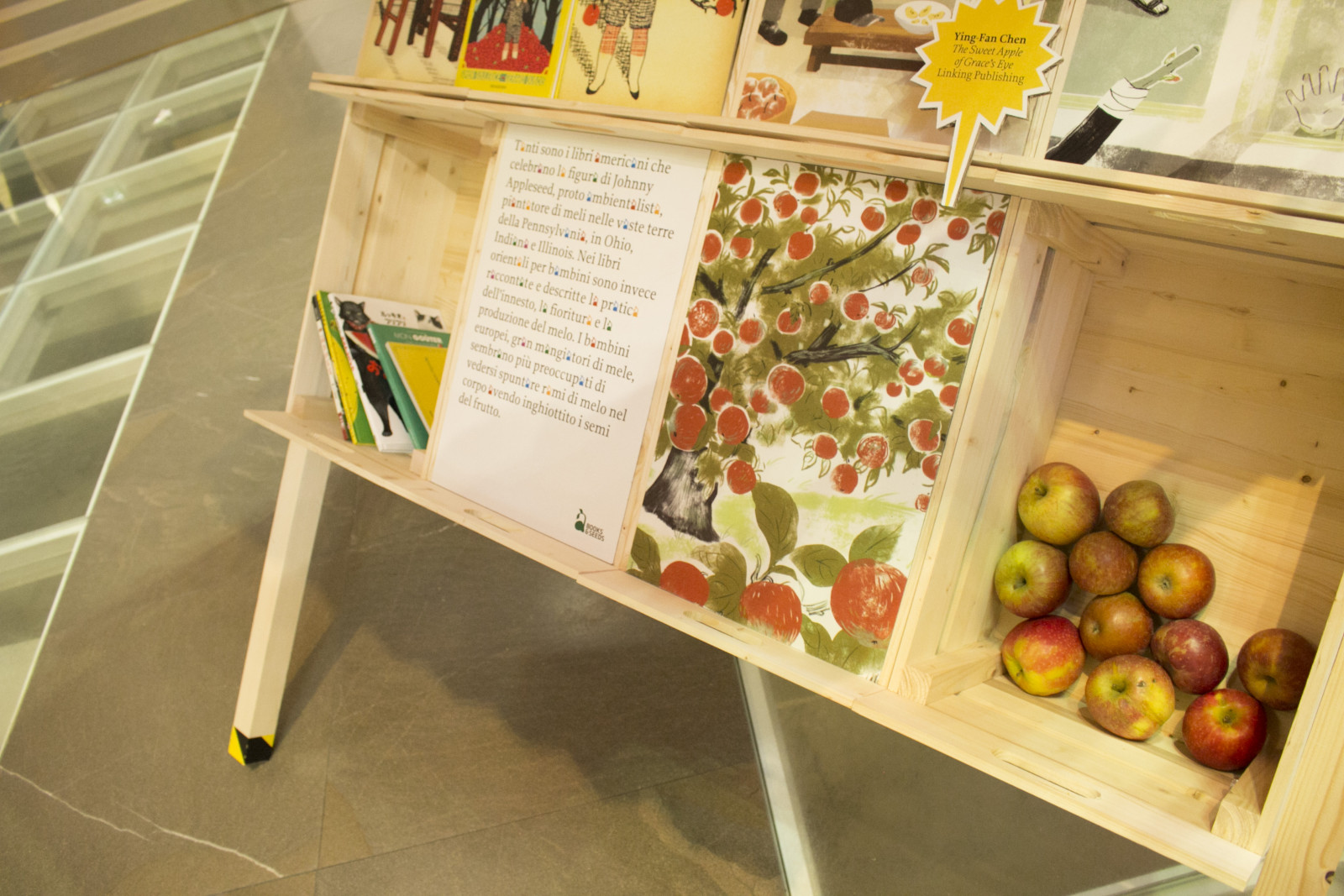
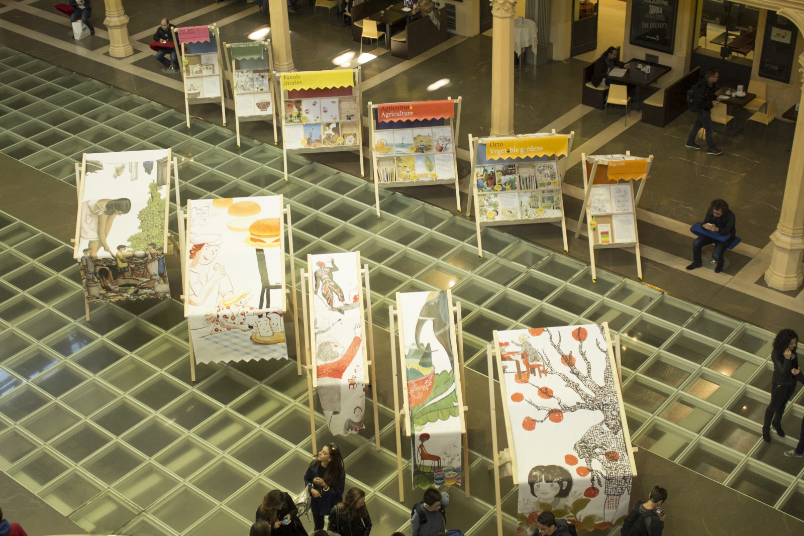
Books & Seeds
Books & Seeds is an exhibition bringing together a selection of over a hundred books from across the globe, dedicated to the main themes of Expo Milano 2015: agriculture, organic cultivation, biodiversity, food surplus and deficit, cooking.
It was held at the Salaborsa library in Bologna and at the EXPO Bio Diversity Park in Milan.
How. We designed an exhibition system derived from the fruit stands that we see on provincial roadsides. Nomadic architecture, made with basic materials, simple to set up and to move, everything can be dismantled and reassembled in five minutes. The illustrated canvases attract distracted passers-by, while the crates contain not only fruit, but also books, seeds, figures and ideas.
What. Design, staging of exhibition.
Client.Bologna Children’s Book Fair, Bologna (IT).
Year. 2015.


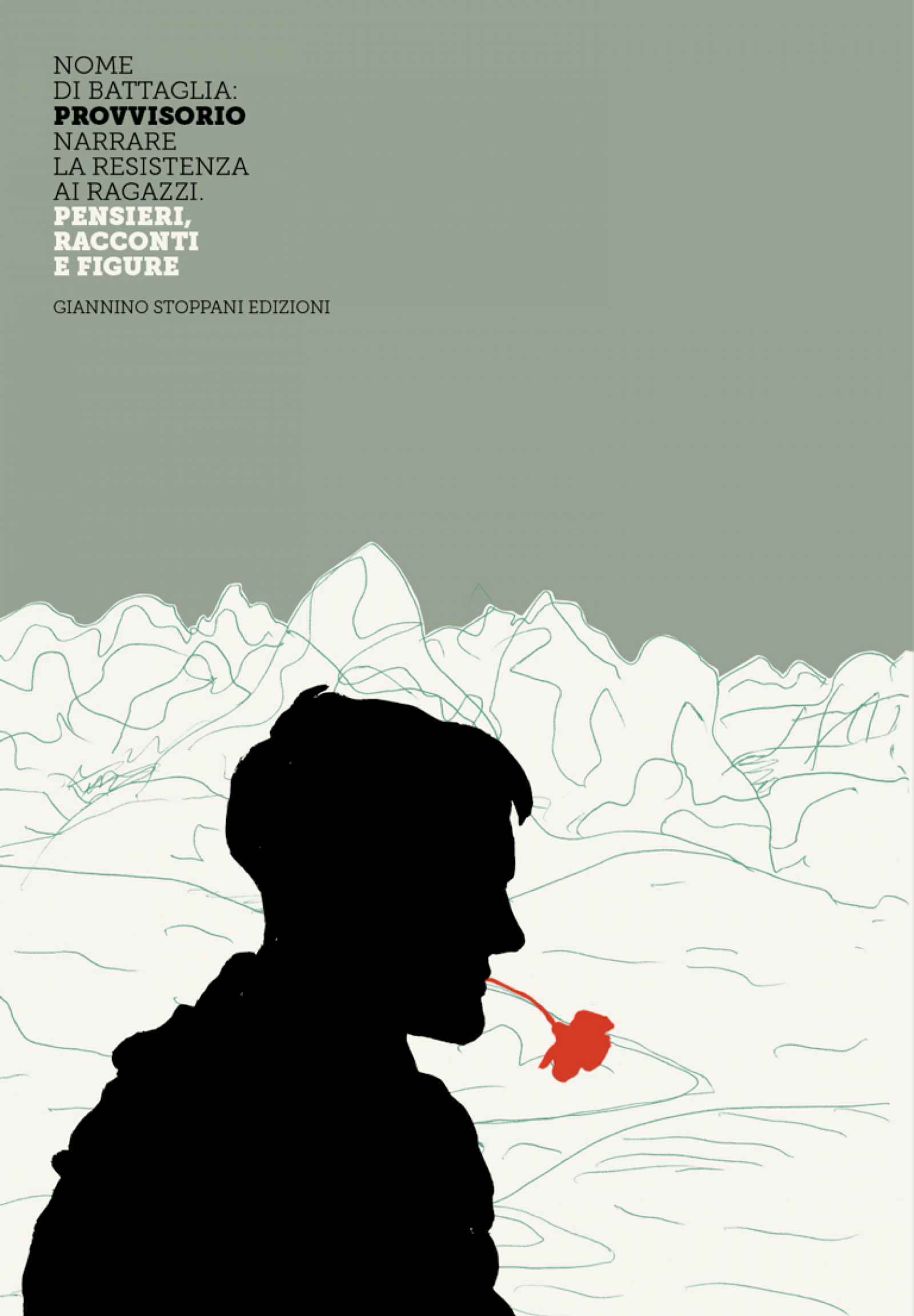
Code name: temporary
Nome di battaglia: Provvisorio [Code name: temporary] is a small anthology, a book and an educational journey dedicated to the Italian Resistance. It brings together thoughts, stories and characters from books for young people.
How. We designed the volume and arranged the page layout, freely interpreting the eight-module grid to set out a wide and varied range of contents on the page. Nome di battaglia: Provvisorio is also an exhibition that we set up in Biella, at the Museo del Territorio Biellese museum.
What. Graphic design, page layout, staging of exhibition.
Client. Giannino Stoppani edizioni, Bologna (IT).
Year. 2015.
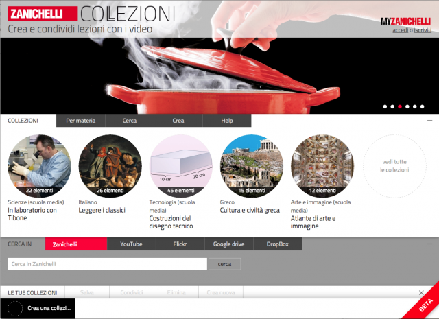
Zanichelli Collections
The Zanichelli Collections website was created to give teachers and students a single environment where they can search for, collect and share multimedia resources (videos, images, texts, audio clips), which are often dispersed in various contexts, with the greatest of ease.
Creating your own collection is simple and intuitive: the search for multimedia resources can start with the Zanichelli archives, but it can also continue on to the internet or personal archives like DropBox and GoogleDrive.
Zanichelli Collections is useful for teachers in preparing and managing their lessons and for students to organize materials and do research.
Collections was designed and developed for Zanichelli editore. To take advantage of the full potential of Zanichelli Collections, you must register at MyZanichelli.


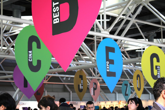
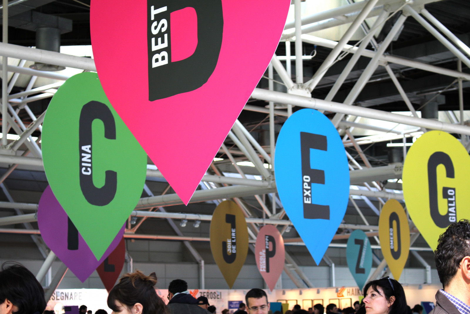
International Bookstore
An enormous space, thousands of people, thousands of books, a limited visiting time. How do you find your way among the volumes selected from the international scene by the Libreria Giannino Stoppani bookstore, Bologna?
How. We imagined a route through 26 themes, marked by as many letters. The marker icons on the maps, reproduced with huge dimensions above visitors' heads, enabling them to instantly find their bearings and guiding them among the thousands of titles for children and teenagers.
What. Interior design, archi-graphics.
Client. Bologna Children’s Book Fair, Bologna (IT).
Year. 2015.
Partnerships. Giannino Stoppani Cooperativa Culturale.
A: Alice, Alfabeti, Attività, Architettura [Alice, Alphabets, Activity, Architecture]. B: Best from the world, Bologna Ragazzi Award, Books&Seeds. C: Cina, Classici [China, Classics]. D: Disabilità [Disability]. E: Expo. G: Giallo [detective novels]. H: Haiku. I: Illustrazione [Illustration]. J: Jolly [wild card]. K: Kamillo Kromo [an Italian cartoon character]. L: Legalità [Legality]. M: Mappe, Matematica, Musica, Migranti [Maps, Mathematics, Music, Migration]. N: Natura [Nature]. O: Omero [Homer]. P: Pippi, Piccolo Principe [Pippi Longstocking, Little Prince]. Q: Quadri [Paintings]. R: Resistenza [Resistance]. S: Scienza, Storia, Sport [Science, History, Sport]. T: Tesori [Treasures]. U: Umorismo [Humour]. V: Vite [Lives]. W: Welcome. X: Pareggio [Draw/Tie]. Y: Young adults. Z: Zuzzurellone, Zerotre [Man-child, Zero-three].


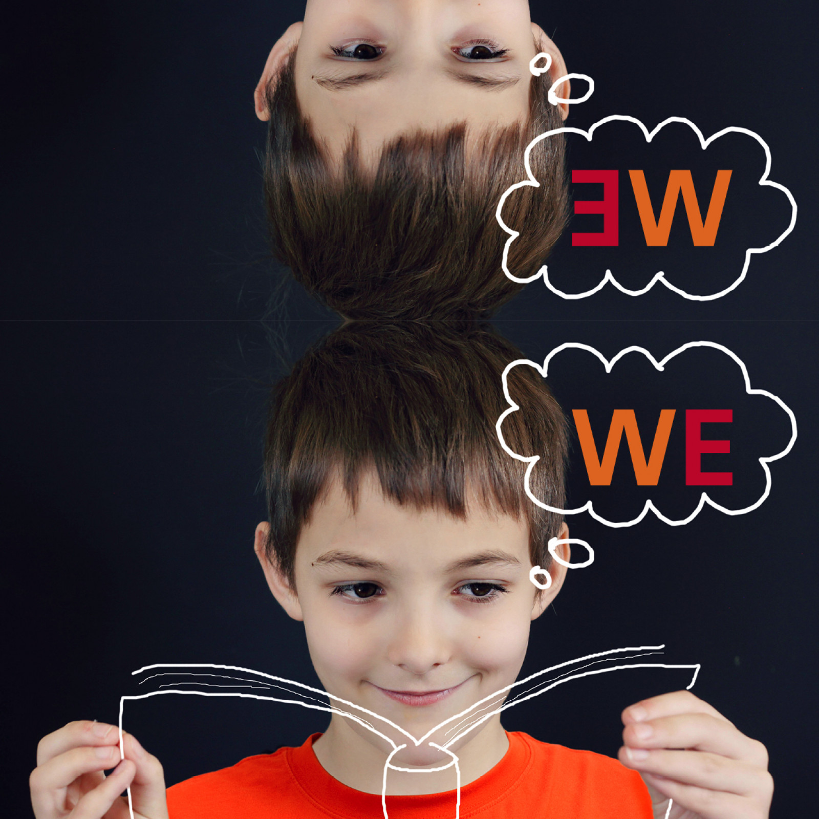
WE. Young readers’ Weekend
Bologna, 28 and 29 March 2015. For Bologna Fiere we created the name WE and designed the visual identity for the Young Readers' Weekend.
WE is the preview to the Bologna Children’s Book Fair, open to all and bursting with ideas and activities.
How. “WE” instead of “I”, us instead of me, and thus an invitation to make reading a shared experience, and books a focal point for hygge.
What. Visual identity, naming.
Client. Bologna Trade fairs, Bologna (IT).
Year. 2015.

Reading accessibility
Our research on how to increase the accessibility of text continues.
How. Together with Zanichelli, we have formalized and identified the few minor visual variables which, when used within the right ranges, increase the chances of removing visual obstacles to reading a textbook. Based on our decades of experience as graphic designers (but also as readers) we have identified ten significant variables: two related to page layout, three to text composition, two to colours and three to font and graphics. ISIA Urbino, took on the task of analysing Zanichelli's textbooks
Client. Zanichelli Editore, Bologna (IT).
Year. 2015.
Partnerships. ISIA Urbino.
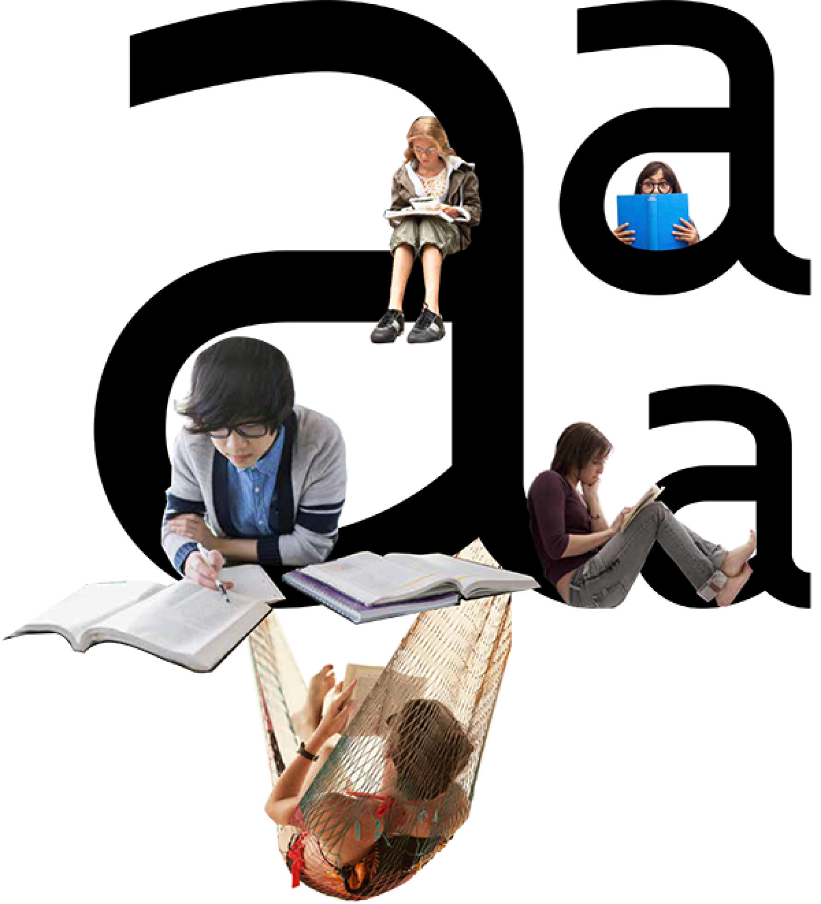

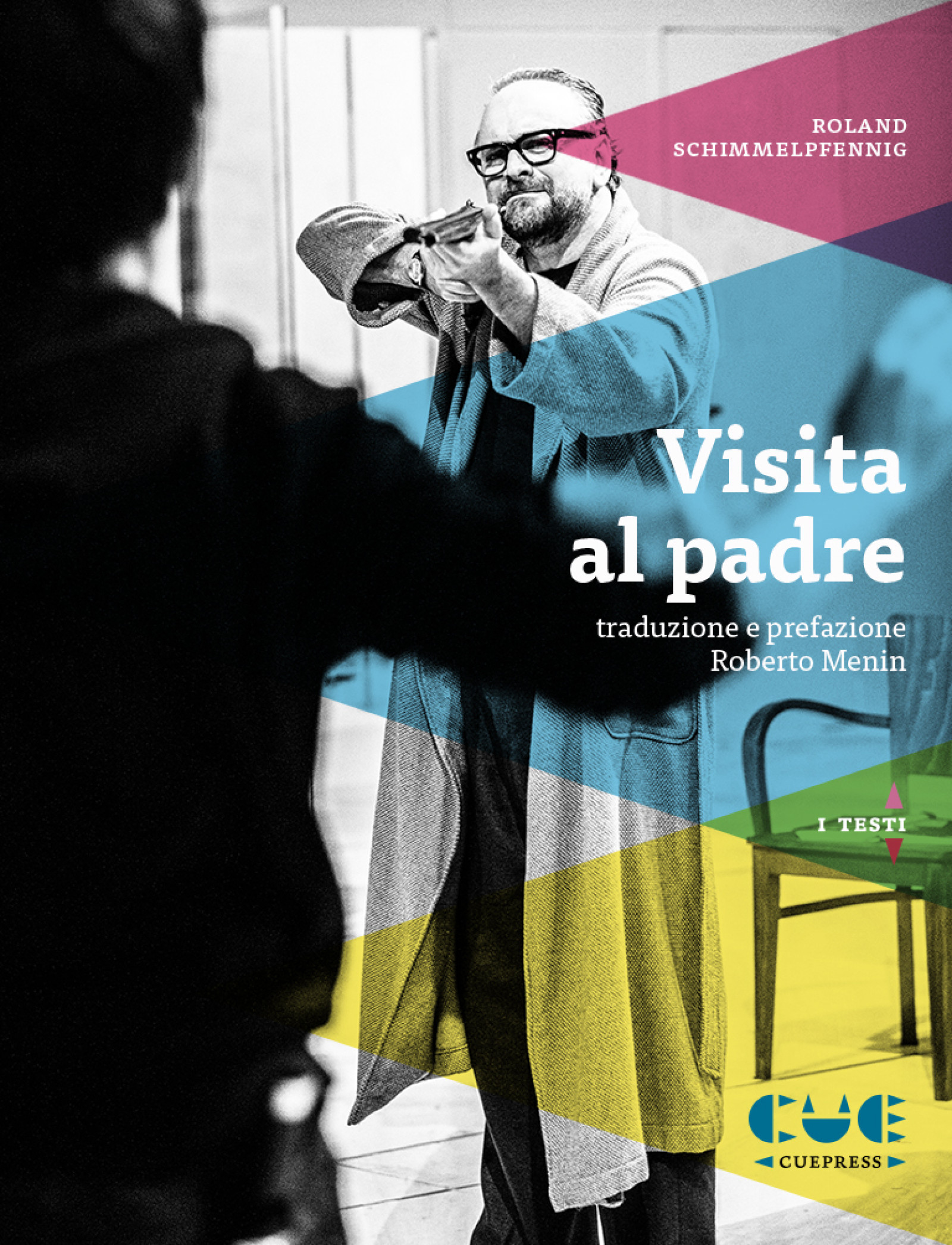
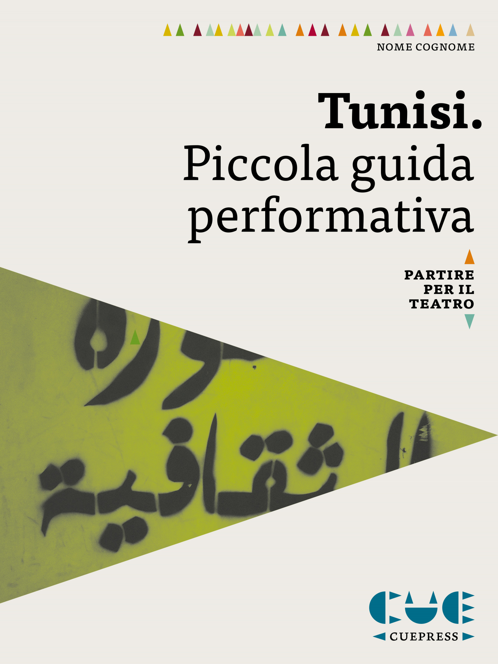
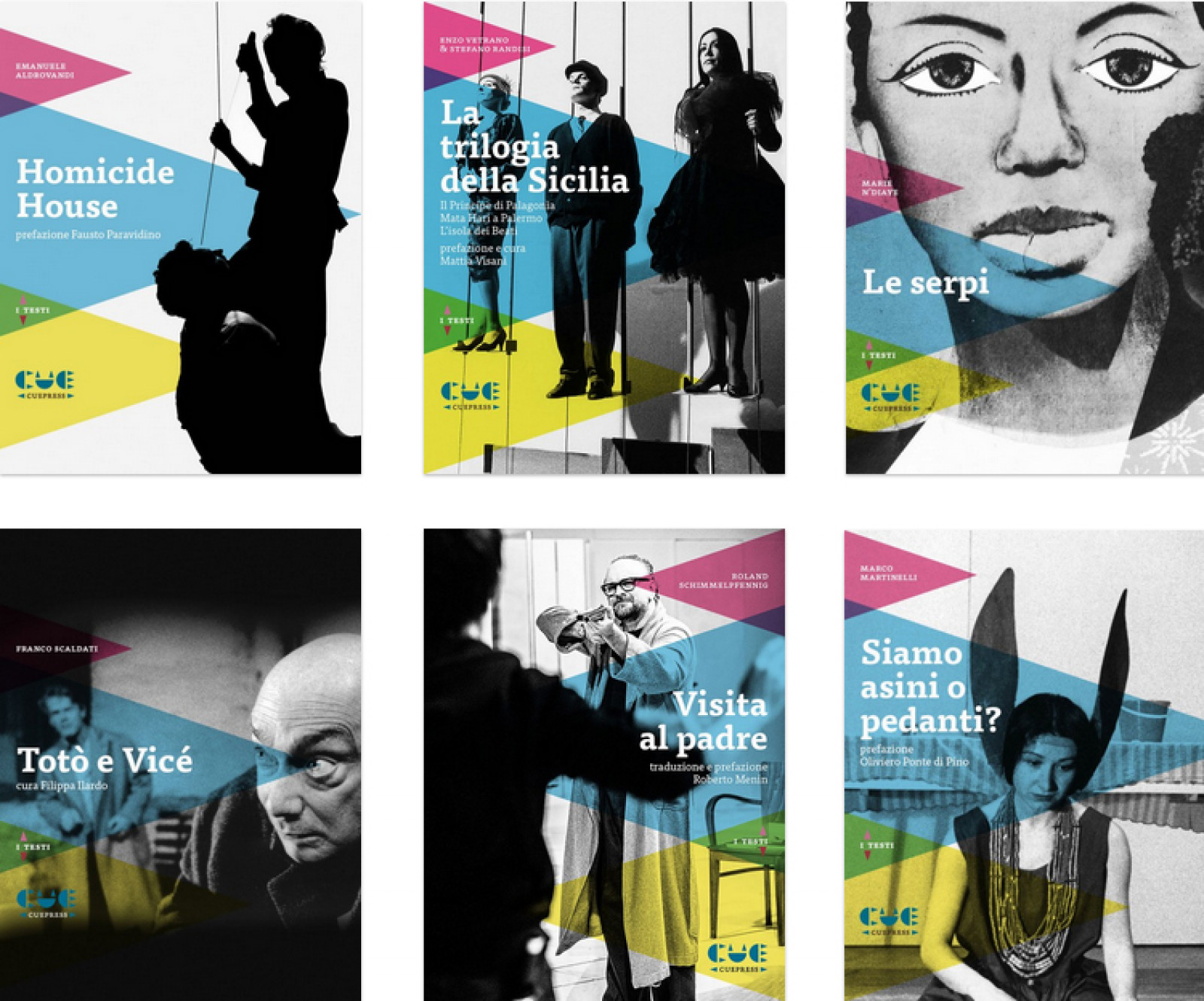
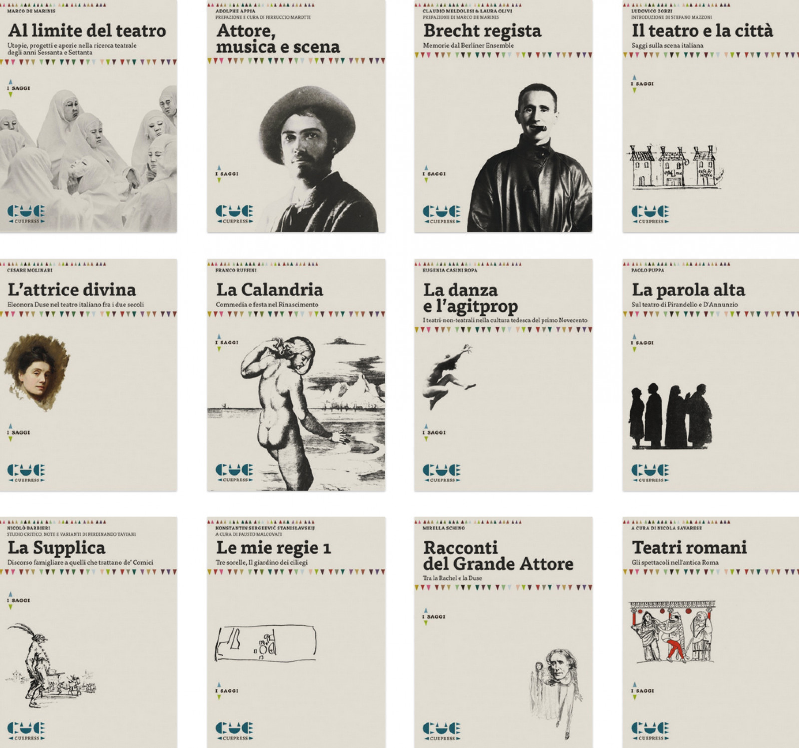
Cue Press - Digital limelight
Cue Press is the first digital publishing house dedicated to the theatre and performing arts. It is a sustainable, scalable, reproducible digital publishing project.
How. With a little training and some dedicated tools, we enabled Cue Press publishing house to become autonomous in producing its own graphic artefacts. Just a few simple rules regarding the visual variables to be used within established limits are enough to ensure autonomous production, recognisability and visual quality.
What. Graphic design.
Client. Cue Press, Imola (IT).
Year. 2015.
Cue /kju:/: a signal to an actor or other performer to enter or to begin their speech or performance.


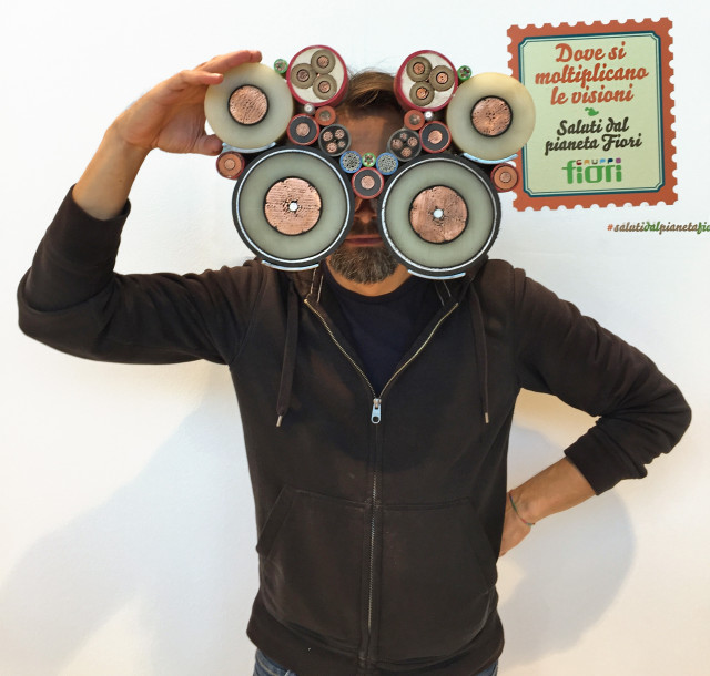
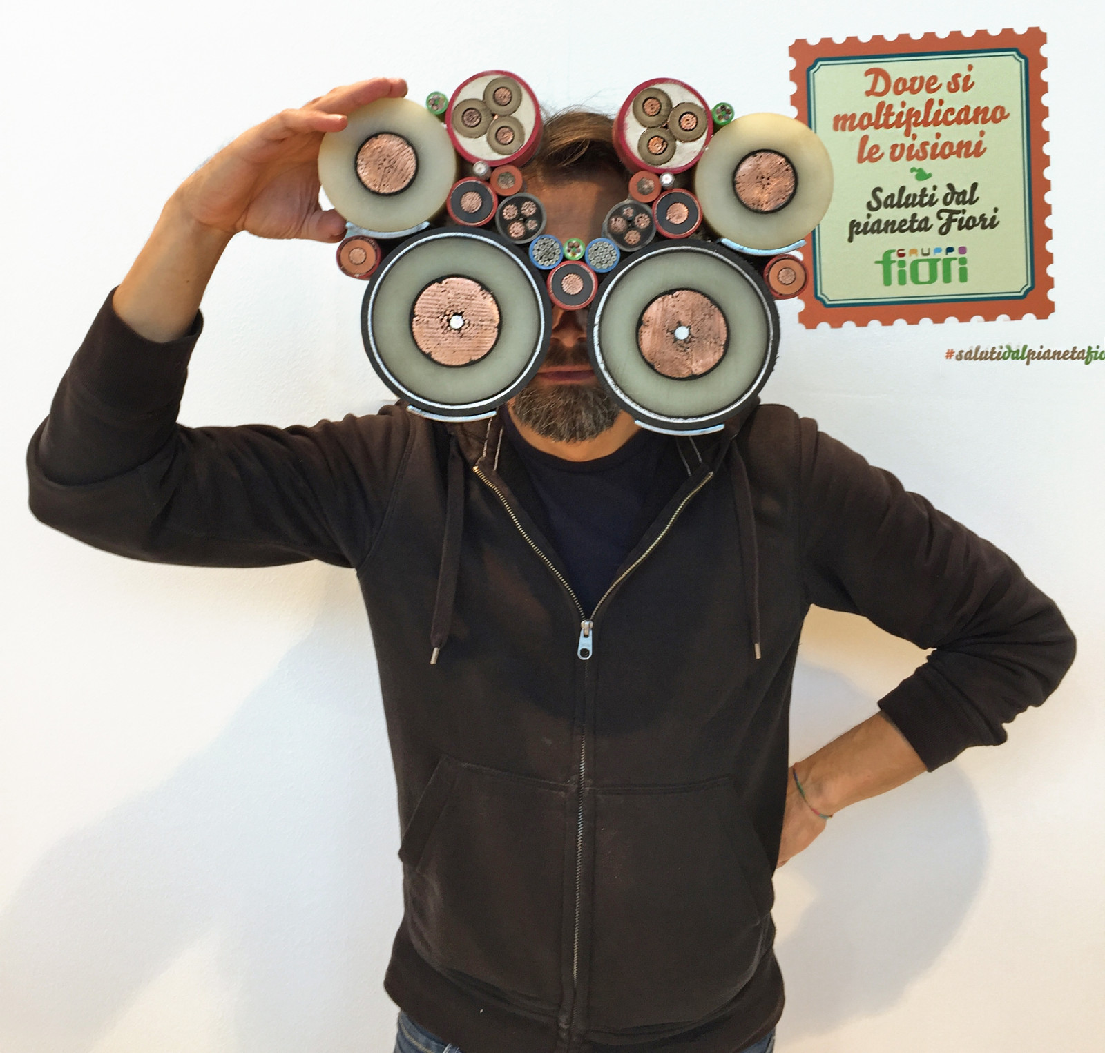
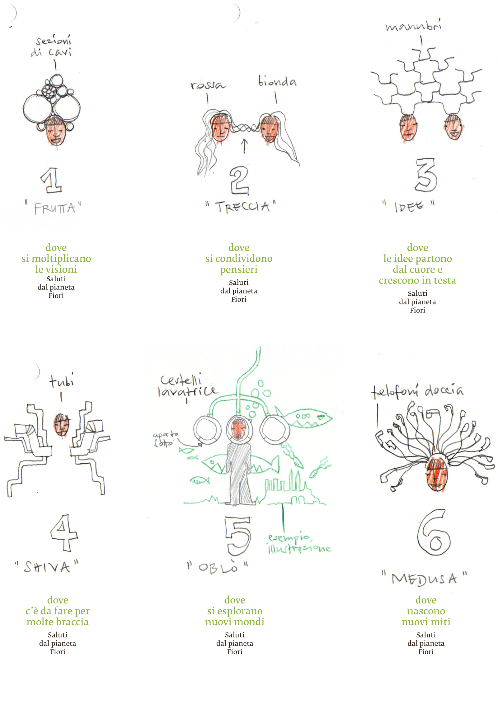
Planet Fiori
Rimini, Ecomondo 2014. An interactive space with six “wearable” sculptures for as many selfies in a futuristic and (sur)real environment. A snap-shot of Planet Fiori, the place “where things never run out” but where everything is kept to be used again.
On Planet Fiori there are no limits to regeneration. Every material, gathered by Gruppo Fiori, is transformed, creating new environments, new objects, new stories. Those who visited the stand at Ecomondo fair became inhabitants of “Planet Fiori”, leaving a trail behind them on social networks here and here (both sites are in Italian).
The illustrations are by Angelo Monne.
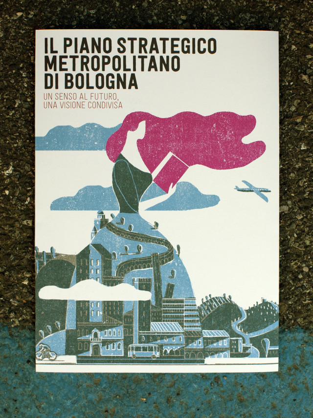
Plan B
With a pamphlet and a book we explained the Strategic Metropolitan Plan for Bologna, a big workshop used to imagine how the city will develop over the coming years.
This wide ranging project involves both the public and private sectors, with the aim of defining the direction of development for the metropolitan area of Bologna.
How. In the 128-page book, with the help of illustrations by Angelo Monne, we explored the ideas and data that emerged from three forums, four roundtable design discussions, 26 work groups, and 67 comprehensive projects.
Year. 2014.
Partnerships. Angelo Monne.


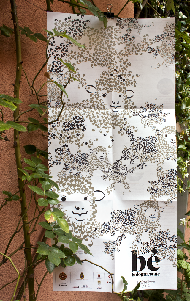
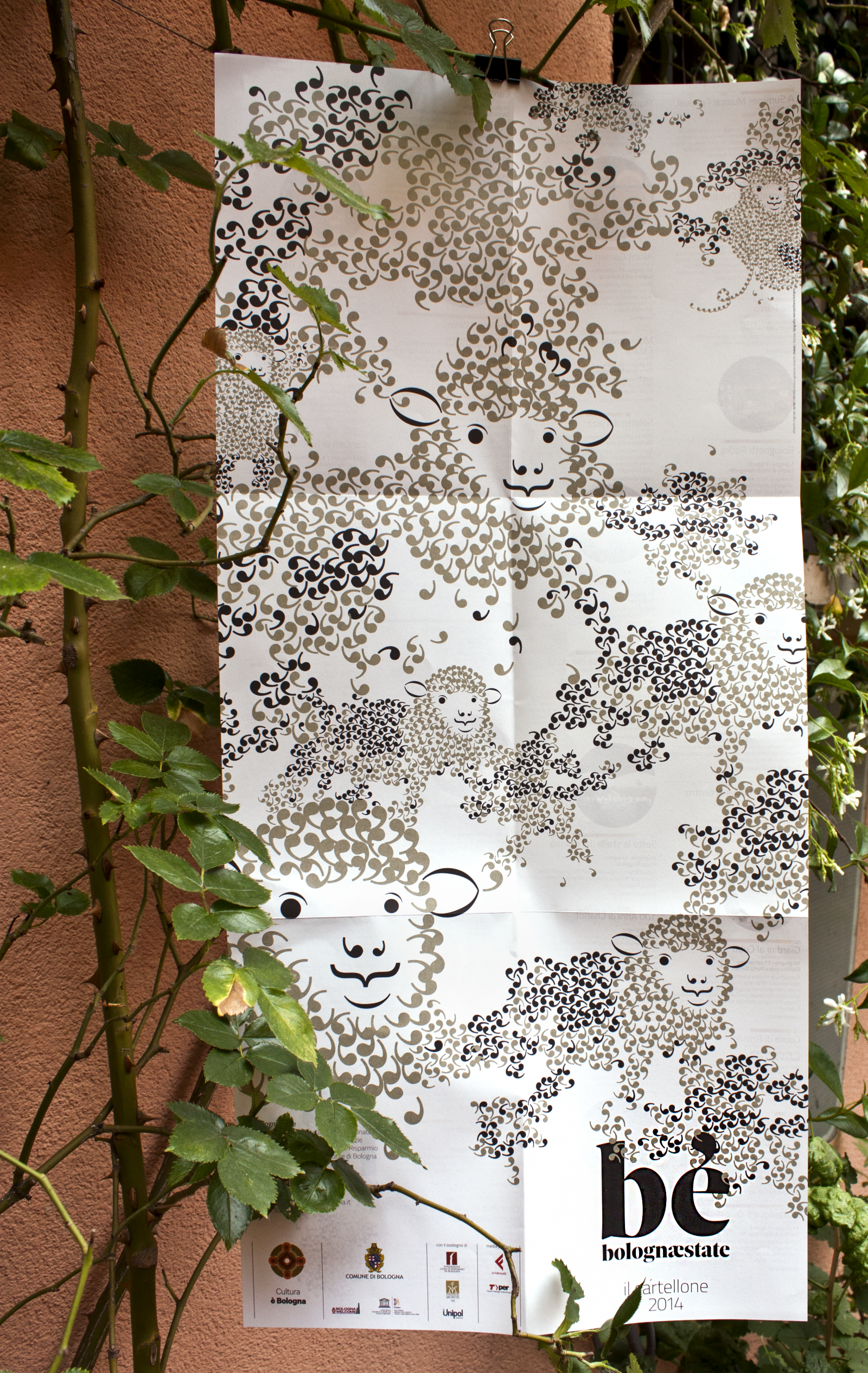
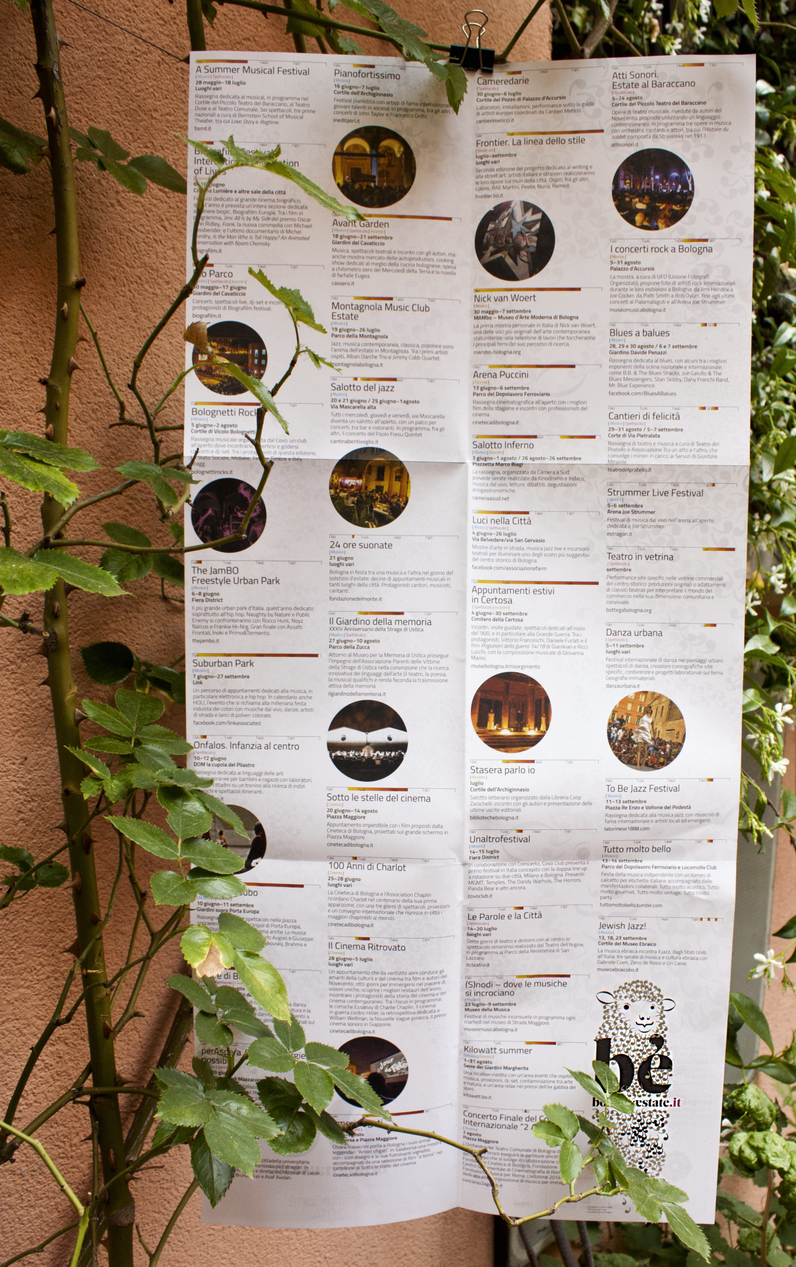
Bè!
We created Bè, Bolognaestate [Baa! Bologna-summer], the summer events calendar coordinated by the city of Bologna.
How. Bè the sheep, with her fleece made of apostrophes, was designed by to/let. We welcomed her into our studio, brushed and sheered her, then took her out to graze in the streets and squares of Bologna until September.
What. Graphic design.
Client. City of Bologna (IT).
Year. 2014.
Partnerships. to/let.