Design for all: Macramè
Graphic design for a series of high-legibility narrative school books.
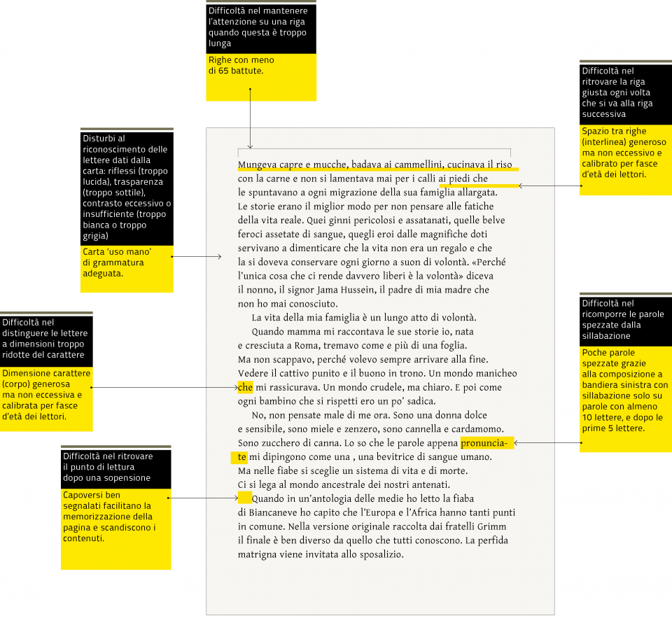
For publisher Loescher we conceived the graphic design of a series of narrative school books for ages 12 to 16, with the following challenge in mind: “Children in school read very little, and reading long texts can be a problem. Furthermore, not all children read in the same way, and it is important to ensure maximum accessibility for both stronger and weaker readers”. To meet these demands, we used a design for all approach.
Defining diversity as our core value, we ensured that the visual appearance of the books would provide the best possible accessibility for everyone.
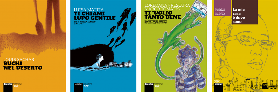
The project covered all aspects of the books. From the covers – conceived in collaboration with Cecilia Fabbri and the illustrations of Alessandro Sanna, Marco Paci, Cinzia Ghigliano, Caterina Giuliani – to the organization of the pages. We also decided to use a special font for the series, created in collaboration with Luciano Perondi, type designer and lecturer at ISIA (Higher Institute for Artistic Industries) in Urbino, Italy.
Kind: the made-to-measure font
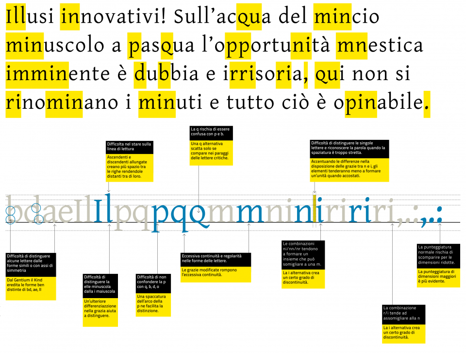
The font created is Kind, issued under Open Font License (OFL), with a design based on Victor Gaultney's Gentium, with amendments added to emphasize the differences between similar glyphs (for example the letter group p, b, d and q), and to make it easier for readers to stay on the right line.
Kind is available in a series of stylistic sets, making it possible to customize the reading experience: by progressively activating the different sets, the number of alternative glyphs increases, along with the entity of the differentiations.
In this way, each publication can be calibrated according to the type of reader targeted.