Does data visualisation help or confuse?
Considerations on how the spread of COVID-19 is represented
With the continuous spread of COVID-19 throughout the world, mapping the virus is no longer just a medical and safety requirement, but has become a visual element of the crisis itself. For good or bad, it is a delicate element that can influence behaviour and political choices. The data regarding the population affected (including deaths and recoveries) provided by press agencies and government or research institutions, takes different forms and the most common form of display is a map on a cartographic base. Graphs are less common. In general, the data is disjointed and inconsistent.
All this has led us to ask questions about types of representation, production methods and efficiency in relation to certain objectives.
Maps and boundaries
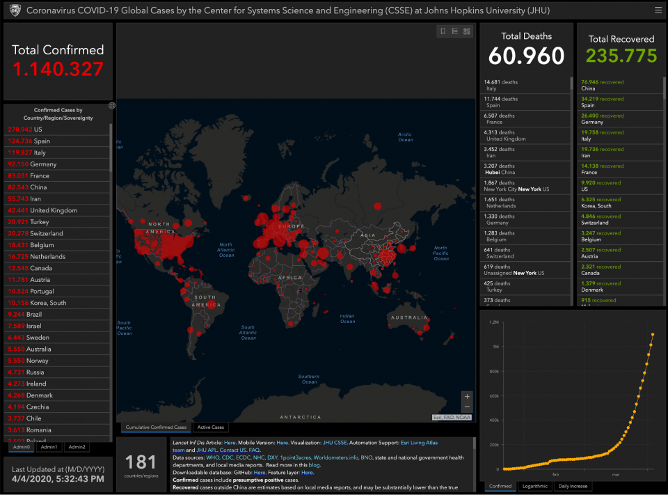
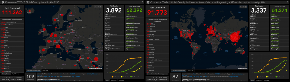
The Johns Hopkins University (JHU) dashboard seems to have become one of the most popular tools for tracing COVID-19 through time and space. Referenced by journalists and scientists, at a certain point, the map even began to appear in official government meetings in Germany, Italy, Israel and probably many other countries too. This use in a political context becomes particularly interesting if we consider the website’s official disclaimer: “Questo sito web e i suoi contenuti, inclusi tutti i dati, la mappatura e l'analisi ("Sito"), copyright 2020 Johns Hopkins University, tutti i diritti riservati, sono forniti al pubblico esclusivamente per scopi educativi e di ricerca accademica. [...] Il sito web si basa su dati disponibili al pubblico provenienti da diverse fonti, che non sempre sono d'accordo. Con il presente documento la Johns Hopkins University declina ogni e qualsiasi dichiarazione e garanzia in relazione al Sito Web, incluse l'accuratezza, l'idoneità all'uso e la commerciabilità. È severamente vietato fare affidamento sul Sito Web per una guida medica o per l'utilizzo del Sito Web in commercio.”
This website and its contents herein, including all data, mapping, and analysis (“Website”), copyright 2020 Johns Hopkins University, all rights reserved, is provided to the public strictly for educational and academic research purposes. [...] The Website relies upon publicly available data from multiple sources, that do not always agree. The Johns Hopkins University hereby disclaims any and all representations and warranties with respect to the Website, including accuracy, fitness for use, and merchantability. Reliance on the Website for medical guidance or use of the Website in commerce is strictly prohibited.
Observing this visualisation within government institutions and the respective authorities responsible for communicating the crisis, gives it a level of credibility that goes beyond its intended use, which is strictly educational and academic.

The JHU dashboard is not an aberration and many countries have reproduced it to represent the data collected on a national scale. This type of visualisation, which has become to all effects a standard, is only altered in its surface aspects in order to visually dramatize the data to a greater or lesser extent.
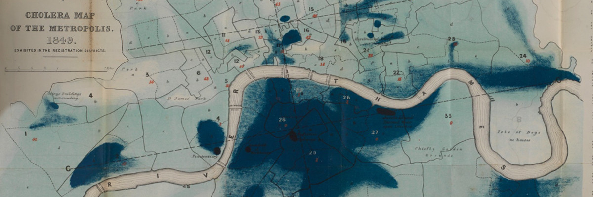
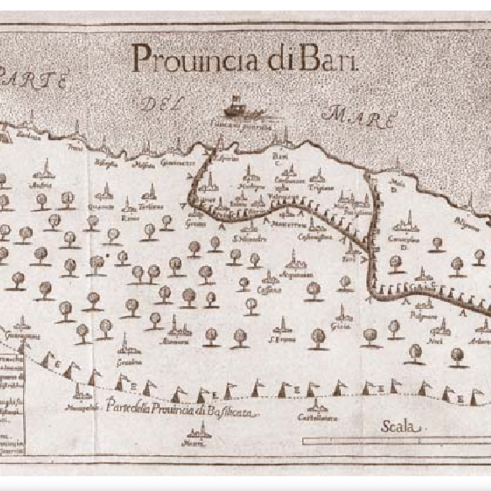
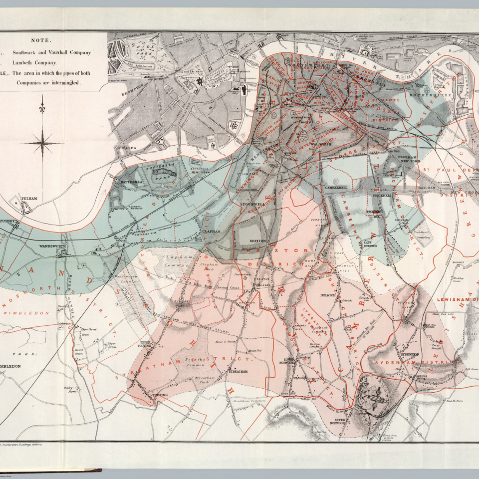
This use of a cartographic base that “spreads” data over an entire area, diminishes its accuracy. As history shows us, visualising epidemics has always required a meticulous level of precision. We can see this immediately in studies performed to contain the spread of cholera in the province of Bari, and in John Snow or Richard Grainger’s maps of London.

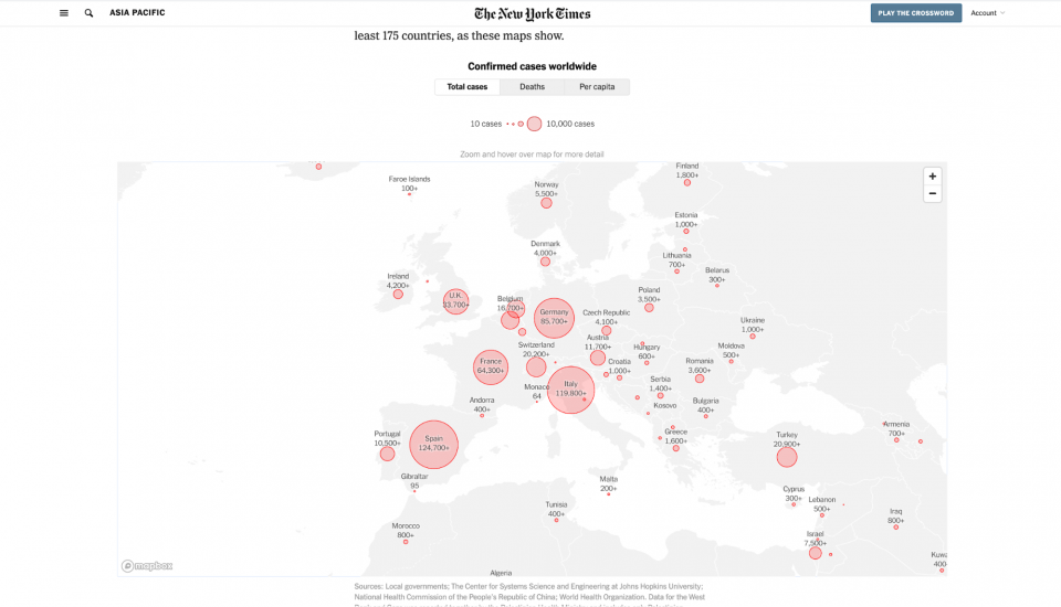
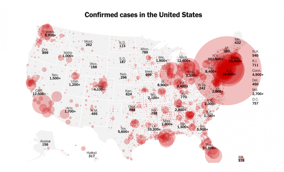
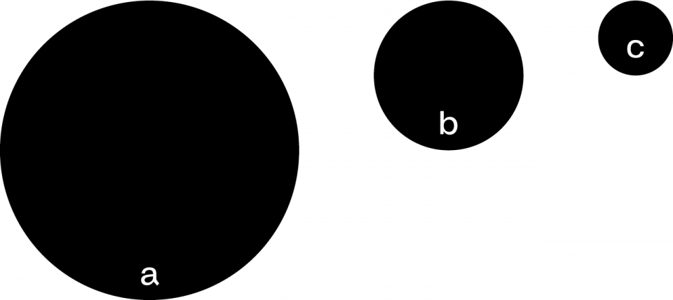
Unlike these, most of the maps that appear online display data on a national, regional or even provincial scale, using a marker (normally a circle) inside the area boundary. These markers, whose size is proportional to the number of people affected by Coronavirus, are not accurate from a geographical point of view and they are not useful for understanding when infected people recover or how the pandemic is spreading. Their circular form also makes it difficult to compare data between areas.
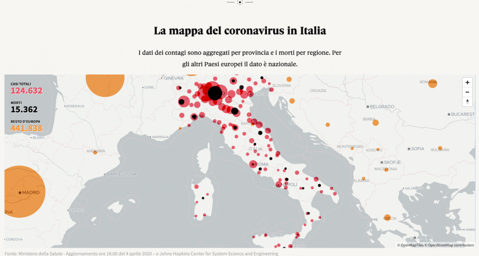
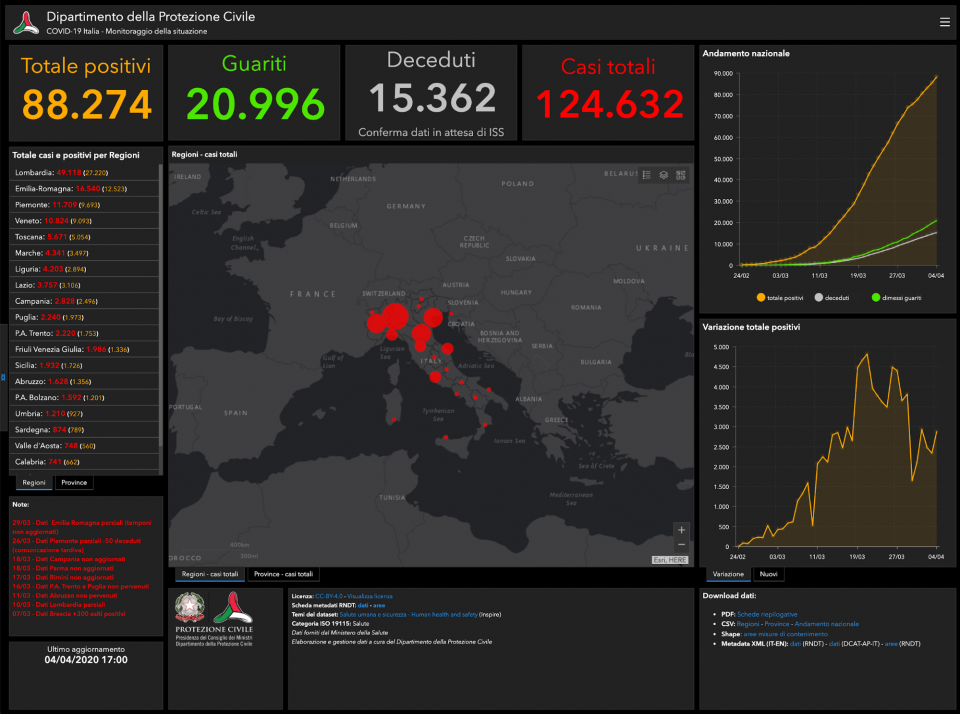
If we use, as an example, the maps representing Italy where pointers are placed in every province, we can see how this type of display shows that the whole of the country has been hit by the virus more or less evenly. Vice versa, if COVID-19 cases are displayed according to the percentage of the population, the graphic representation of this data changes completely, and it becomes evident that it is mainly the Northern Italian regions that have been hit (Data source: Protezione Civile).
By comparing the visual representation of these small examples, we can see that one kind of display is not necessarily more correct than another, but whichever one is chosen (deliberately or not) inevitably highlights certain aspects and conceals others.
Maps do not show data impartially. They make reality as much as they represent it. (Crampton Krygier, 2015).
Maps featuring cartographic bases and political boundaries (that COVID-19 takes no notice of), marker circumferences that are difficult to compare and have no real detail, and colour coding that dramatizes or downplays situations in a highly imprecise way, are not easy to read, interpret and analyse. And yet - or perhaps for this very reason - they are the display tool most commonly used.
Graphs for the few
Curves and graphs plotted on axes are used less often, but they become more frequent at a higher level of analysis. They are more abstract visualisations that lose the localisation of a map but gain the opportunity to be controlled and altered more easily by the user. In fact, they offer dynamic data comparisons and a greater degree of readability.
In this case too, it is important to note that changes in scale (linear or logarithmic) can render the data comforting or alarming. The choice between the two scales (often dictated by the size of the data and the space available) must therefore be explained clearly.
Visualisations that move away from spatial representation are particularly interesting in this respect. These are displays that seek to explain how the virus is transmitted, like the Washington Post simulations (even if they have a very laboratory-style aesthetic).
Uncertain, limited data
Last of all, at the heart of this particular problem is the data itself. The limited, inconsistent and discontinuous data used reveals significant discrepancies when viewed in real time. Like the apparent drop in COVID-19 cases at weekends. Of course, these cases exist, but they are only communicated at the beginning of the week. What happens in Italy, happens in every other foreign country. Every country collects and communicates data in different ways. Ways that are often incomplete and partial (Costa, 2020). Viruses have no borders, we hear that all the time, but data has limits. Limits in terms of format, language and country.
Just as there are protocols for meteorological data, there should be a uniform standard for collecting and disseminating data linked to the pandemic.
The data is collected and processed in different asynchronous and discontinuous phases. It starts from the hospital and test centres in each region and arrives at national institutions who group together and disseminate the numbers and statistics. These numbers that are released by state civil protection bodies cannot be compared at a cartographic level.
Even if COVID-19 mapping is the most common visualisation system, it is imprecise and has no scientific foundation.
The choice of representation, the combination of graphic and chromatic elements can look simple and easy to manage, but their explanatory power is based on an infrastructure of diversified data that is incomparable and therefore imprecise.
Temporary conclusions
In recent years, data visualisation has exploded alongalong with its focus on tools and potential uses. What is required with some urgency now is an appropriate, non-regionally-based database. A production process that integrates in a single flow the choice of data, the representation of interaction, the graphic design, clarity of context and type of use.
This article seeks to make a small contribution to the efforts being made by citizens and institutions to ensure that data collection and visualisation is useful for studying pandemics and divulging clear and correct information.
Giacomo Nanni
Julian Peschel
-
Costa, F (2020).
Official data is an optical illusion.
Retrieved from francescocosta.net/2020/03/19/dati-ufficiali-illusione-ottica/Crampton, J. W., Krygier, J. (2015).
An Introduction to Critical Cartography. ACME: An International Journal for Critical Geographies, 4(1), 11–33.