Bologna Children’s Book Fair
The visual identity of the world’s largest children’s book fair.
The Bologna Children’s Book Fair is an important annual event which welcomes thousands of exhibitors and visitors from all over the world. It is a fair for professionals who work in children’s publishing. Every year since 2009 (with the exception of 2016) we’ve been responsible for the fair’s visual identity. This identity pervades the entire fair, welcoming and guiding visitors through its stands and numerous events.
Each year, our aim is to create a holistic and compelling visitor experience, a unique and memorable encounter with the Bologna Children’s Book Fair brand.
The Fair’s organisers comment: “In response to recent developments in the publishing industry, the BCBF has been expanding its horizons over the last few years, to include digital publishing, apps, animation and licensing. The fair brings together thousands of people from diverse backgrounds who have a common interest: content for children. The fair is no longer merely a place where copyrights are exchanged. It has become a cradle of innovation and an laboratory for ideas, offering numerous creative workshops and activities.”
Visitors to the fair are attentive and discerning consumers of visual media. Our main challenge has been to give visibility to all the elements comprising the event.
Each year, Chialab creates a different visual theme. This theme inspires, and features on, all the communication material, from the fair’s website to its map, from its signage to its stands. This theme provides the distinctive visual identity of the annual event. It welcomes visitors and guides them around, and outside, the fair. In this way, the identity of the Bologna Children’s Book Fair brand is strengthened and renewed each year.
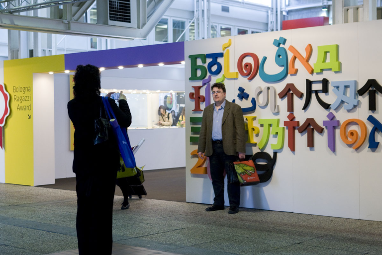
2009 – 2012. The Shape of The Letters
During the first four years of our collaboration with Bologna Fiere, our challenge was to create a specific visual identity for the institutional brand BCBF. We wanted it to be consistent over time, and distinct from the visual identity of the themed annual fairs. We developed the brand identity by outlining clear guidelines in the Manual on visual identity , which we prepared for BCBF. We also established a visual identity for the communication material that would be used at the next four editions of the event.
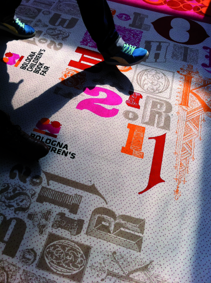
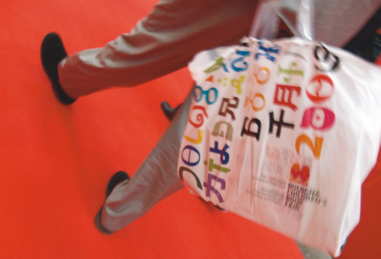
The guidelines called for the design of a specific font and the use of a unique colour palette for each edition of the fair. We excluded all graphic material (such as photos and illustrations) from the fair, in order to focus attention exclusively on the typographical design.

2013. The Bologna Children’s Book Fair celebrates its 50th birthday
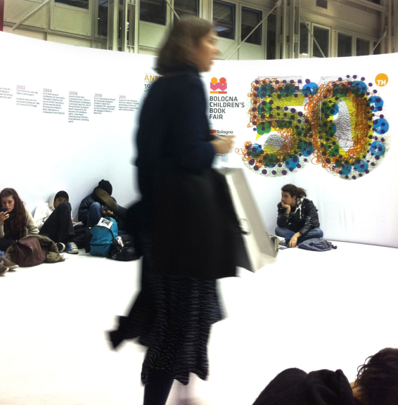
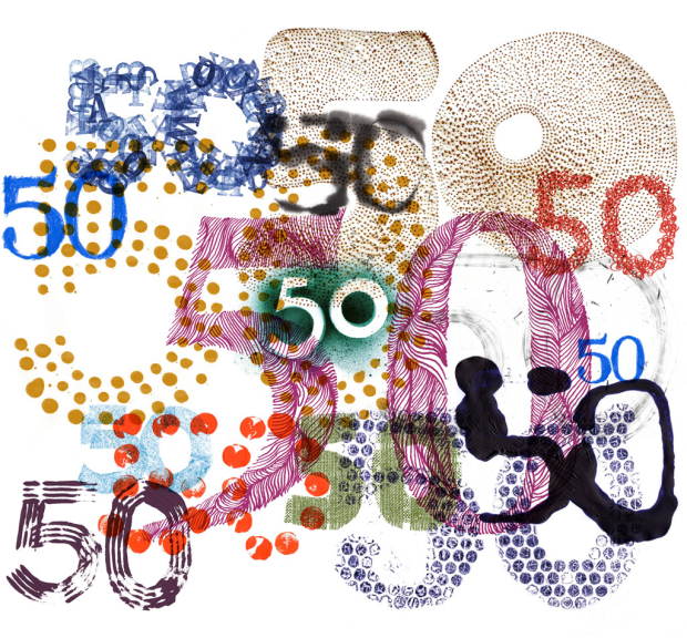
In 2013, the event celebrated its 50th anniversary and the number "50" became the visual motif across all communication material. We created 50 designs of the number 50, using different typefaces to make each number 50 unique. Arranged in ordered or random patterns, reproduced individually or superimposed, these 50s complemented and energized the fair’s lavish programme of events.

2014 – 2015. We love difference
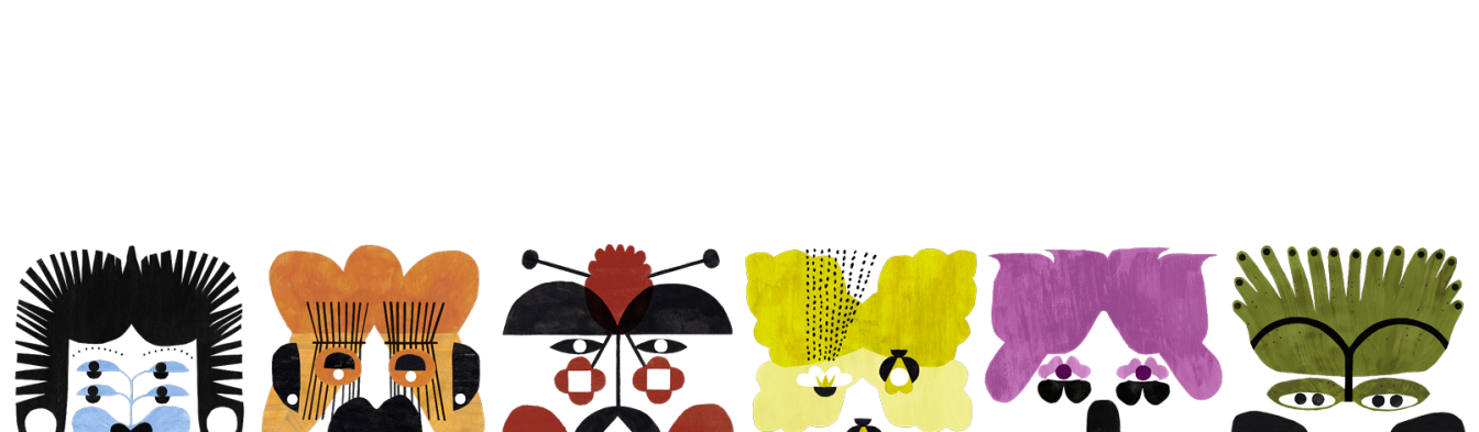
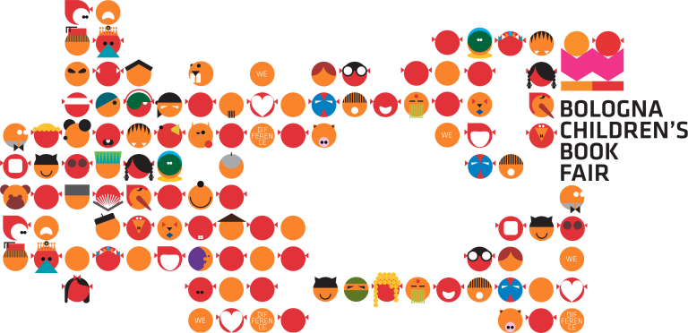
For the years 2014-2015 the visual identity of the event was informed by the idea of difference as a value. This was expressed in the event’s tagline ‘We love difference’. A little boy and girl immersed in reading were the protagonists of the communication material. Past icons of the BCBF brand were also brought back to life. A hundred drawings of real and imaginary faces, related to the world of children’s literature, appeared in a colourful, abundant and multiform cascade across all communication devices.
2017 – 2027. Visual Identity Workshp
Since 2017, we have been developing the event’s visual identity through the Visual Identity Workshop (VIWS) in collaboration with an illustrator selected from among the 300 finalists and 80 winners of the Bologna Illustrators Exhibition. If you'd like to learn more, check out the VIWS behind-the-scenes content.