Frels - keep in touch with your glasses
Identity and strategy for an innovative product.
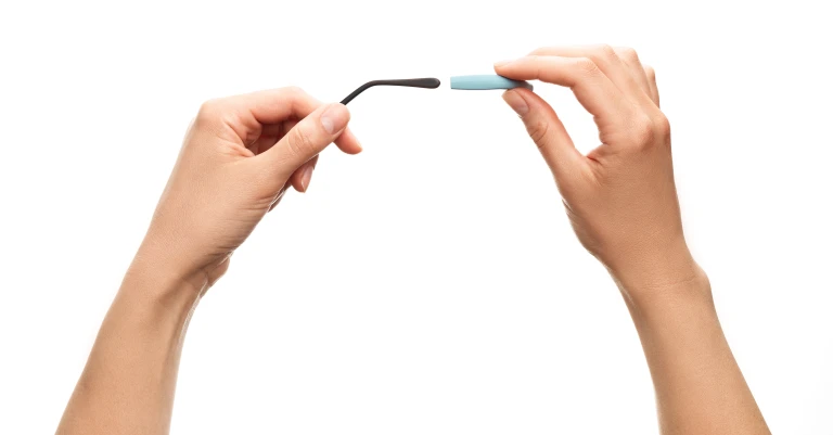
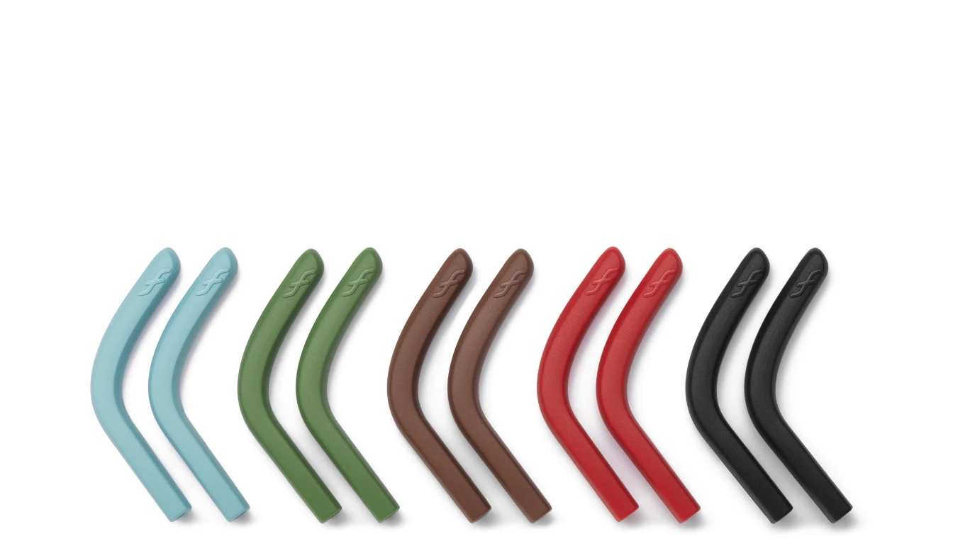
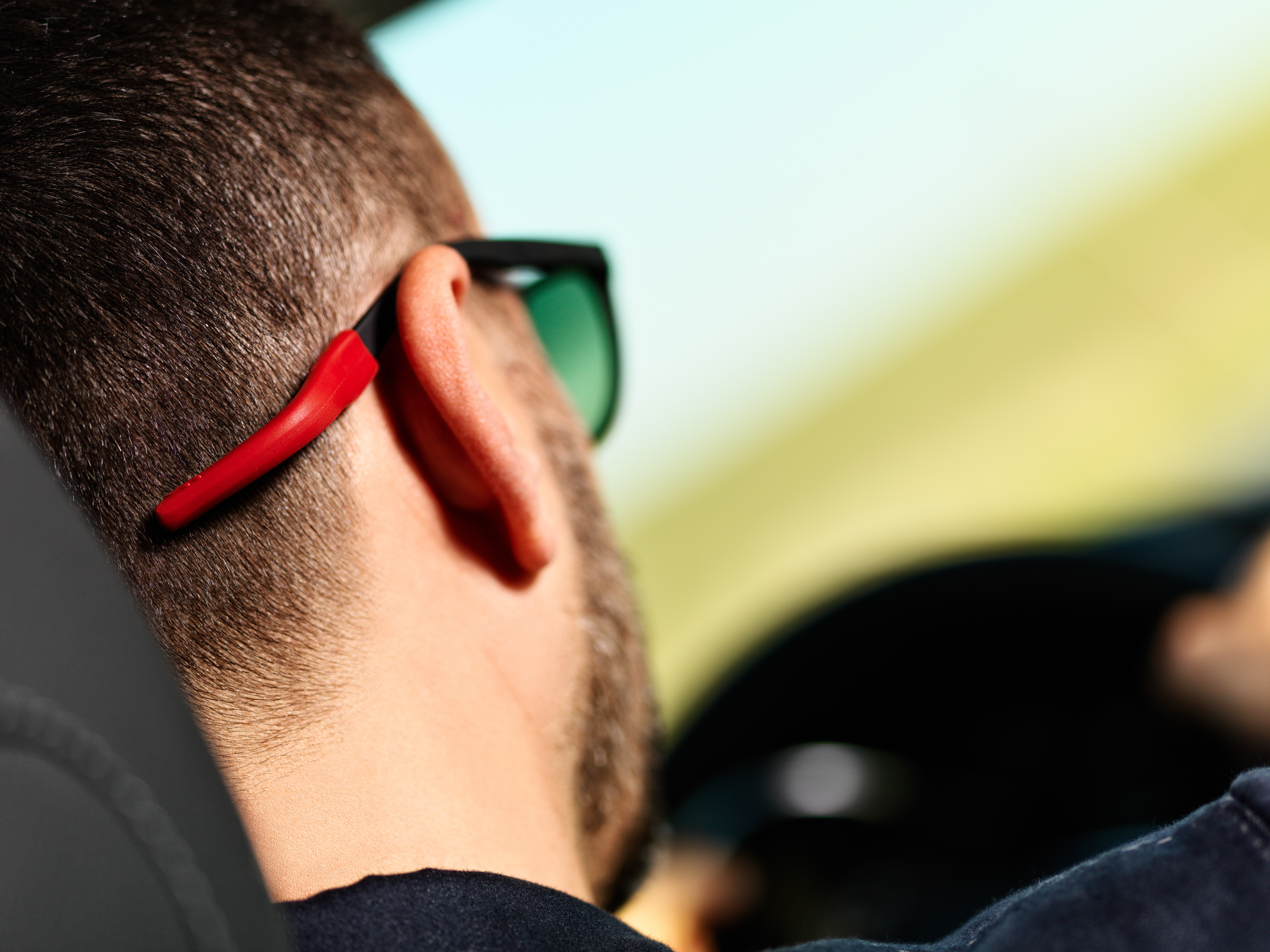
Frels is a new eyewear product: two small extensions to the temple tips that ensure you don't lose your glasses, and can wear them comfortably on your shoulders. After two years of research into usability, biocompatibility and technology, they were developed to maintain the exacting standards of top-quality Swiss production.

Small and new: how do you increase the visibility of a product when it does not immediately stand out, and people don't know how it works?
We set out from a careful analysis of its characteristics, and of its future habitat in opticians' shops. We then used our conclusions to define the strategic aspects and the architecture of communication. The objective was to create a natural, immersive communicative environment, based on a clear, distinctive image that would ensure good recognisability, particularly within stores. Naturalness, simplicity, warmth, high technology and Swiss precision were some of the key words we worked with.
The logogram
The logogram is a mainstay of communications: the shapes of its glyphs are derived directly from that of the product, making it an original way of writing and reflecting Frels.
Unique characters for a unique product.
Its value lies in the very fact of asking to be read and interpreted.
We drew our inspiration for it from the shape of Frels and from anthroposophical typography, which does not allow the use of right angles and sharp turns. The lettering demands interpretation, which ensures it will subsequently remain impressed in the memory.
Visual identity, packaging and communication tools
Colours, lettering, faces, recycled paper backgrounds, white spaces. These are the ingredients we designed to give an identity to Frels that we could apply coherently and consistently. Packaging, flyers and all other elements comprised in the store kit interpret the lines laid down in the style manual.
The key player in the kit is Monsieur Frels, the head of a family of human-shaped displays whose job it is to present the product in stores.
Monsieur Frels also welcomes visitors to frels.swiss, the mini-website containing all the essential information: Where does the Frels design come from? What are its technical characteristics? Where can I buy a pair of Frels? The photographs and FrelStories convey the experiences of people who use Frels every day.
Website: www.frels.swiss
Visual identity and web design: Chialab
Photography and video: Raffaele Mariotti
Design Strategy: Alskar
Technical development and production: Biwi


