Before and after 100
Having designed the logo for the centenary of Gianni Rodari’s birth for Edizioni EL, we went on to create layouts for grammars, fairy tales and nursery rhymes.
100, first challenge.
The centenary logo. We began by ensuring we had a clear idea of the project’s imaginative scope and stipulations. To tell the truth, this was nothing new, because design is what we do, so we felt perfectly at home. The brief was that the logo should not be corporate, formal or celebratory, but clear, simple and maybe with a visual joke or two.
Rodari’s immense imagination opens potentially inexhaustible scenarios that risked taking us on an endless journey.
We focused on word play, alliteration and double meanings, highlighted by the choice of colour and lettering. With this first release the publishing house drew attention to its Rodari centenary re-issues.
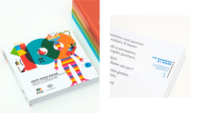
300, second challenge.
Gianni Rodari one hundred + one hundred stories and rhymes + one hundred illustrators. The challenge was to create the design for a volume featuring 100 illustrations, 100 illustrators and a collection of 100 stories, rhymes and poems. Not a catalogue, not a binder, not a picture book, not a book of poems, not an essay, not an anthology… but all the publishing paradigms put together.
A cage with rubber bars and a typeface that would bridge the gap between stories and illustrations.
This is how we began the graphic design for an edition featuring 100 different illustrations interpreting 100 Gianni Rodari stories and rhymes. The design didn’t cage the illustrations, it welcomed them onto the page, and left them free to adapt their characteristics to it.
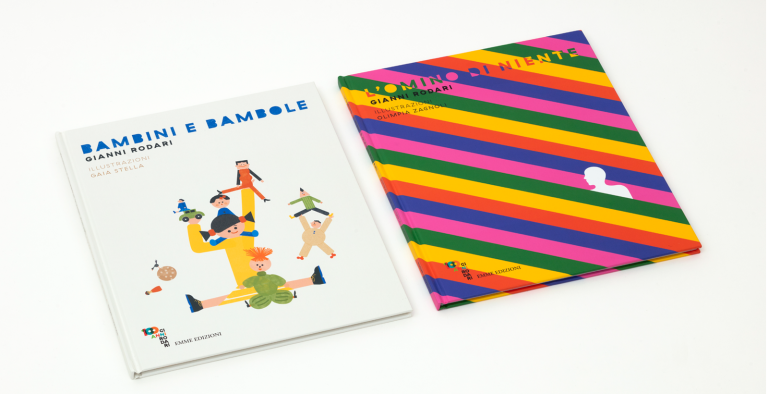
28, third challenge.
28 because that was the average number of pages in the picture book stories. These four stories by Gianni Rodari had been interpreted by four different illustrators (Beatrice Alemagna, Manuel Fior, Gaia Stella and Olimpia Zagnoli). Generally, picture books are editions that go their own way and refuse to follow a series template as there is such a close relationship between text and image. But, here, we wanted to keep the leitmotif of the centenary alive.
The publisher wanted to continue to convey Gianni’s spirit in these four artists’ picture books.
The lettering used, in fact, is the centenary typeface (Haptik), but on the cover, the title font is invaded by the colours, style and themes of the illustrations. This allowed us to maintain the unique mood of the title and style created for the series.
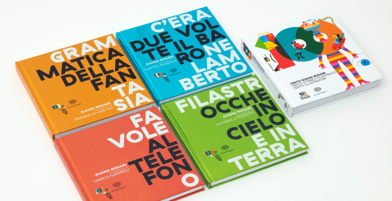
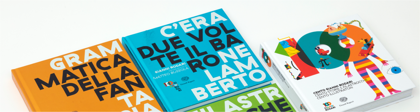
4, fourth challenge.
4, not because we have reached the fourth challenge, but because Einaudi Ragazzi commissioned 4 special editions and asked us to create something special and out of the ordinary. An opportunity that occurs about once every hundred years. So, we did what we should never have done…
… cover titles split in two, no images whatsoever and bright and glossy colours, almost like chocolate boxes.
You can see them in shop windows, they shine and dazzle, and so far, no one has asked a bookseller if “Due volte il baro” has arrived. No one has boasted about reading “Matica della fan”! And no library has catalogued “Ocche in cielo” or been asked for “Al telefon”. Perhaps we got something wrong and imagination no longer lives here.