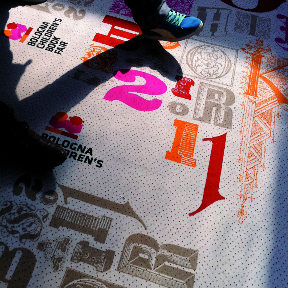
Bologna Children’s Book Fair
The visual identity of the world’s largest children’s book fair.
The Bologna Children’s Book Fair is an important annual event which welcomes thousands of exhibitors and visitors from all over the world. It is a fair for professionals who work in children’s publishing. Every year since 2009 (with the exception of 2016) we’ve been responsible for the fair’s visual identity. This identity pervades the entire fair, welcoming and guiding visitors through its stands and numerous events.
Each year, our aim is to create a holistic and compelling visitor experience, a unique and memorable encounter with the Bologna Children’s Book Fair brand.
The Fair’s organisers comment: “In response to recent developments in the publishing industry, the BCBF has been expanding its horizons over the last few years, to include digital publishing, apps, animation and licensing. The fair brings together thousands of people from diverse backgrounds who have a common interest: content for children. The fair is no longer merely a place where copyrights are exchanged. It has become a cradle of innovation and an laboratory for ideas, offering numerous creative workshops and activities.”
Visitors to the fair are attentive and discerning consumers of visual media. Our main challenge has been to give visibility to all the elements comprising the event.
Each year, Chialab creates a different visual theme. This theme inspires, and features on, all the communication material, from the fair’s website to its map, from its signage to its stands. This theme provides the distinctive visual identity of the annual event. It welcomes visitors and guides them around, and outside, the fair. In this way, the identity of the Bologna Children’s Book Fair brand is strengthened and renewed each year.
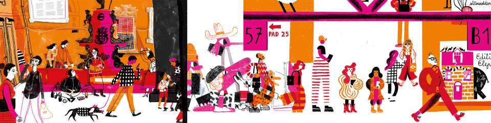
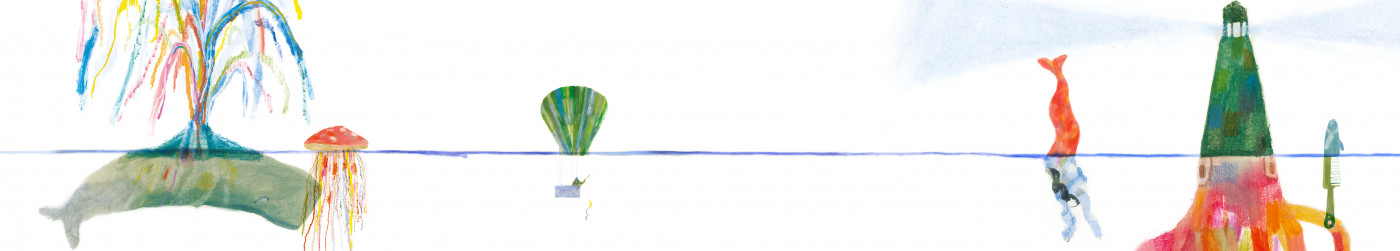
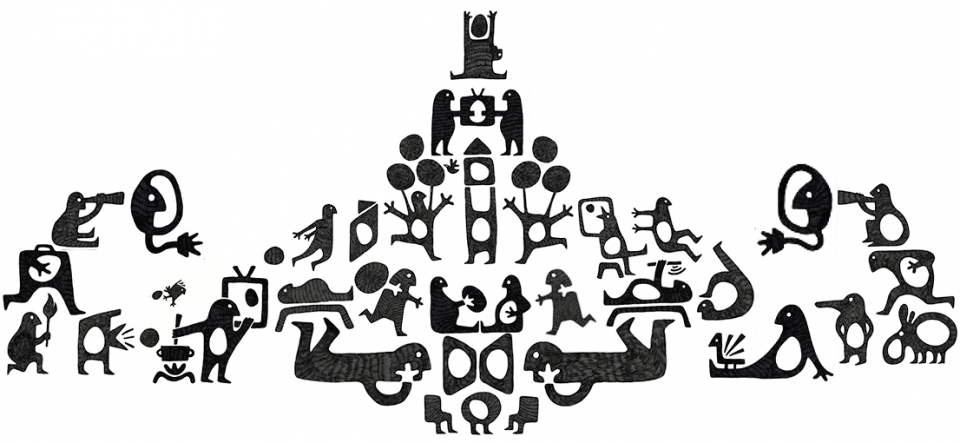
2022. Children’s Content rocks! Join the party
The visual identity of this year’s fair emerged from a workshop that for the first time ever was held completely online. Staggered time zone video calls, shared whiteboard exchanges, notes and comments on digital files and continuous revisions were the unusual backdrop to our conversation with Sólin Sekkur. Diluted in numerous small meetings and exchanges, the journey undertaken with the Mexican illustrator selected, generated from originally dark and cloudy atmospheres, a brightly coloured parade of people eager to celebrate the return to physical locations. A big party is also the inspiration for the title of the edition: Children’s Content rocks! Join the party.
Here is the complete backstage story.
2021. The Symbiotic Network of Children’s Content / Online Special Edition
Lockdowns, social distancing, masks, video meets, takeout lunches, four walls, disinfectants, regular handwashing… from all the things that Covid has stopped us from doing, the idea arose that the image of the BCBF should help us to not overlook relationships, unexpected discoveries, worldwide bonds, the hum of crowds, the nosy exchange of ideas, wandering between stands and browsing through books. Jean Mallard paid a visit to our studio for our usual workshop on visual identity during a respite in the virus. For four days, between games of “Exquisite Corpse”, we gradually assembled an idea of symbiosis and close cooperation between entities that are separate but connected. The characters and contexts that emerged constitute an illustrated ecosystem that is fantastic, multiform, immaterial, heterogeneous, and focused on collaboration and reciprocal integration in order to construct, in turn, other new environments.
Here is the complete backstage story.
2020. Giving life to children’s Content / Online Special Edition
BCBF 2020 is a special edition. The pandemic led to the physical event being cancelled, but many activities were held online. The exhibitions we were responsible for setting up were transferred online here: BCBF galleries: eight exhibitions with over eight hundred images. Design, development, web editing and tests with very tight deadlines.
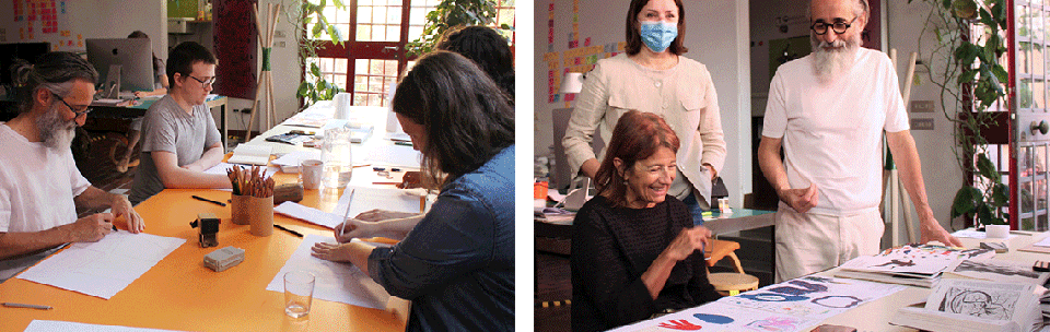
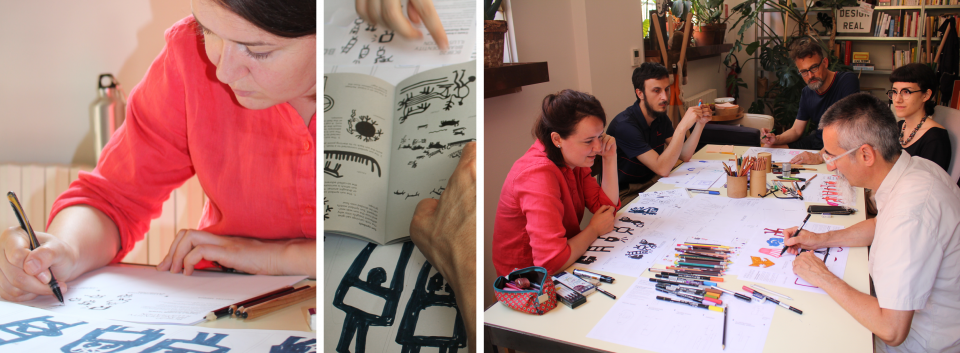
The Visual Identity Workshop was established before COVID-19 began to circulate. The whole thing was based on four words: evocative, primordial, monochrome and symbolic. This was what we wanted to achieve with the visual identity for BCBF 2020. The illustrators in the Illustrators Exhibition 2019 who showed the greatest affinity with this, were Rasa Jančiauskaitė (Lithuania), Miyata Takashi (Japan), and Ten Yu (Taiwan). These four words were particularly evident in the work of Rasa Jančiauskaitė, which indicated a potential way forward for us. She was “our” illustrator. During the workshop held at our studio, Rasa drew with us and our design team drew with her. This was July 2019. We worked with no masks or social distancing and with pencils, pens and no limits. We produced a series of ideas that Rasa then took home with her to Lithuania. And little by little, the BCBF 2020 visual identity began to take shape with the phrase: “Giving Life to Children’s Content”. The backstage experience is captured here: BCBF20 Backstage.
2019. Staging children’s content
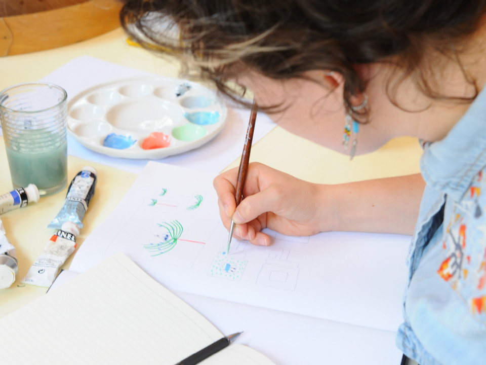
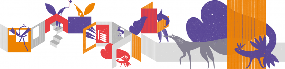
For the third year running we created the visual identity of the new Bologna Children’s Book Fair in the BCBF visual identity workshop. The lead figure in this edition was the young Russian illustrator, Masha Titova, who was selected from the illustrators in the Illustrators Exhibition 2018. We were looking for images that would move away from Daniele Castellano’s animal kingdom (2017 edition) and Chloé Alméras’ vegetable kingdom (2018 edition). We spent three extremely intense days with Masha at our studio, creating drawings, card models, ideas and corrections. The result was a labyrinthine world of walls that looked like the scenery of a theatre stage, populated by figures that became backdrops and backdrops that became figures. This is how the “Staging Children’s Content” theme of this edition came about. The Bologna Children’s Book Fair became a stage for the myriad facets of children’s illustration. This was a visual identity that departed from traditional canons. It was multi-faceted, animated and multi-form, but there was also consistency in its multiple variations.
Behind the scenes - between the pages, windows and walls on the BCBF worksite captures the workshop experience.
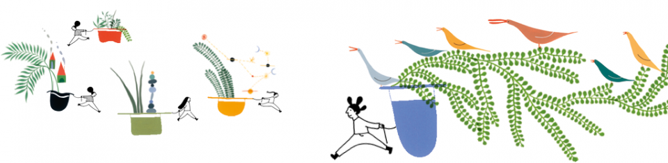
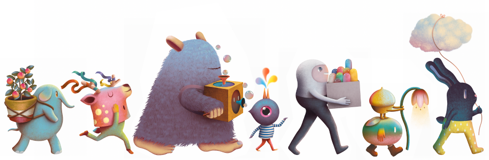
2018. Fertile Ground for Children’s Content
In 2018, we worked together with the 22-year-old Parisienne, Chloé Alméras to create the image for the Bologna Children’s Book Fair. We were looking for microcosmic architectures, inhabited landscapes, planetary systems and environments that were structured and alive. We plunged into the microscopic details and blue tones of Chloé’s illustrations in search of an insight that could become the theme for the fair. This was a world teeming with details, but also distinguished by a calm intensity. Chloé came to see us in July and we spent many hours sharing ideas and creating a harmonious relationship. In short, we immersed ourselves in her drawings that are full of minuscule details, until we came up with the concept of a fertile world in which stories could sprout, grow and multiply. This then began the key theme for this edition: Fertile Ground for Children’s Content. The BCBF worksite narrates the experience of the BCBF visual identity workshop 2018: “Behind the scenes: plants, leaves, hats, wayfarers, ships, stars and much more”.
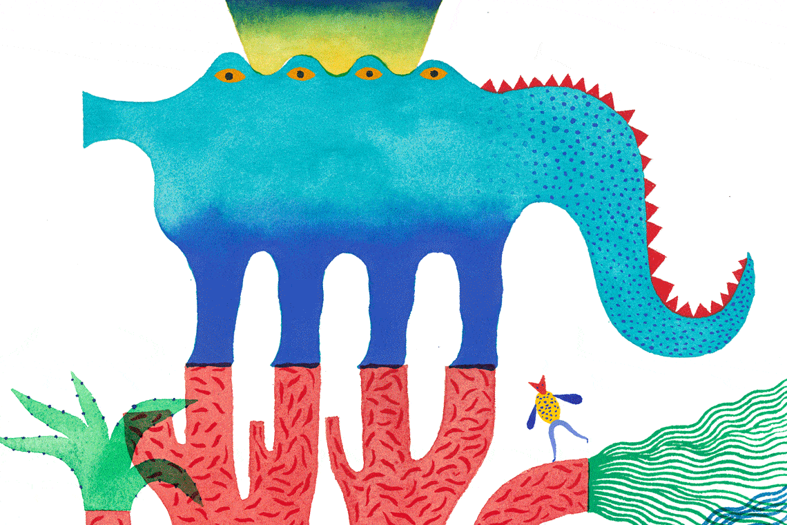
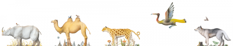
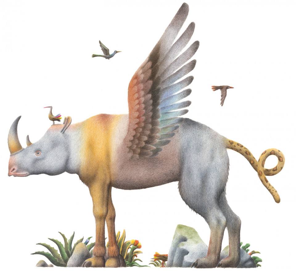
2017. The Natural Habitat
For the first time, the visual identity emblem of the Bologna Children’s Book Fair is an illustration or, rather, an ecosystem of illustrations called The Natural Habitat for children’s content. It consists of six animal drawings: the mythological chimera symbolises the event in its entirety, while each of the other five creatures represents a themed area inside the fair. The Natural Habitat offers editors, illustrators, agents, journalists and other publishing professionals a memorable figurative symbol of the Bologna Children’s Book Fair 2017.On the BCBF website a visitor commented on the image: "You sense the singularity of an image and the plurality of the visual world".
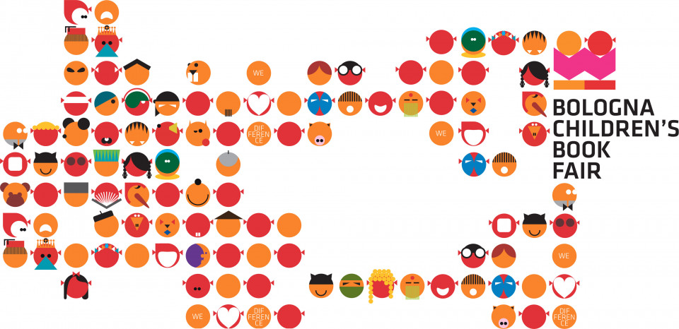
2014 – 2015. We love difference
For the years 2014-2015 the visual identity of the event was informed by the idea of difference as a value. This was expressed in the event’s tagline ‘We love difference’. A little boy and girl immersed in reading were the protagonists of the communication material. Past icons of the BCBF brand were also brought back to life. A hundred drawings of real and imaginary faces, related to the world of children’s literature, appeared in a colourful, abundant and multiform cascade across all communication devices.
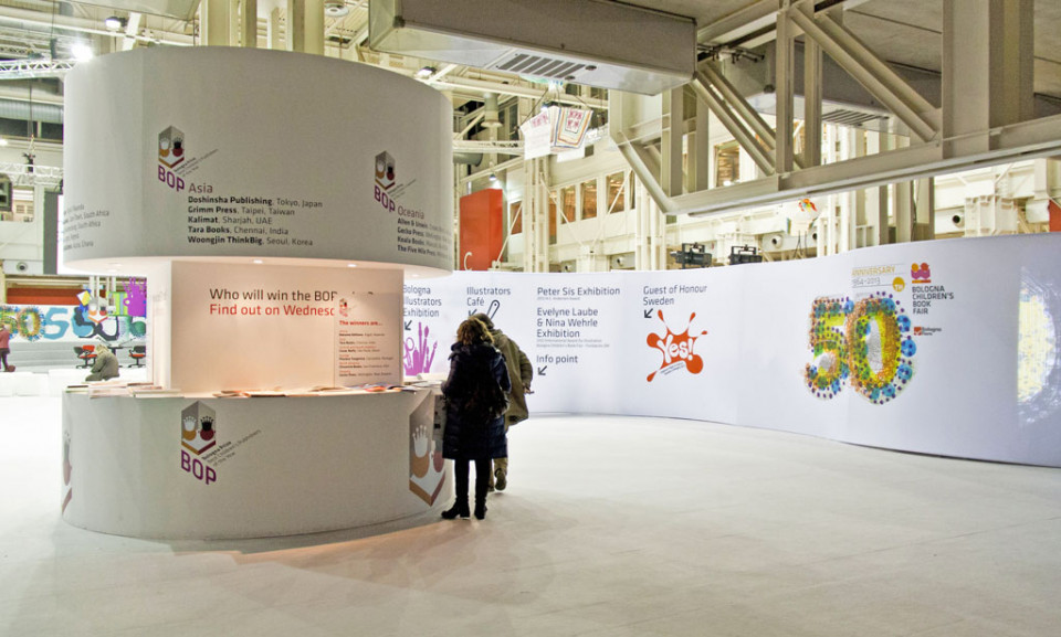
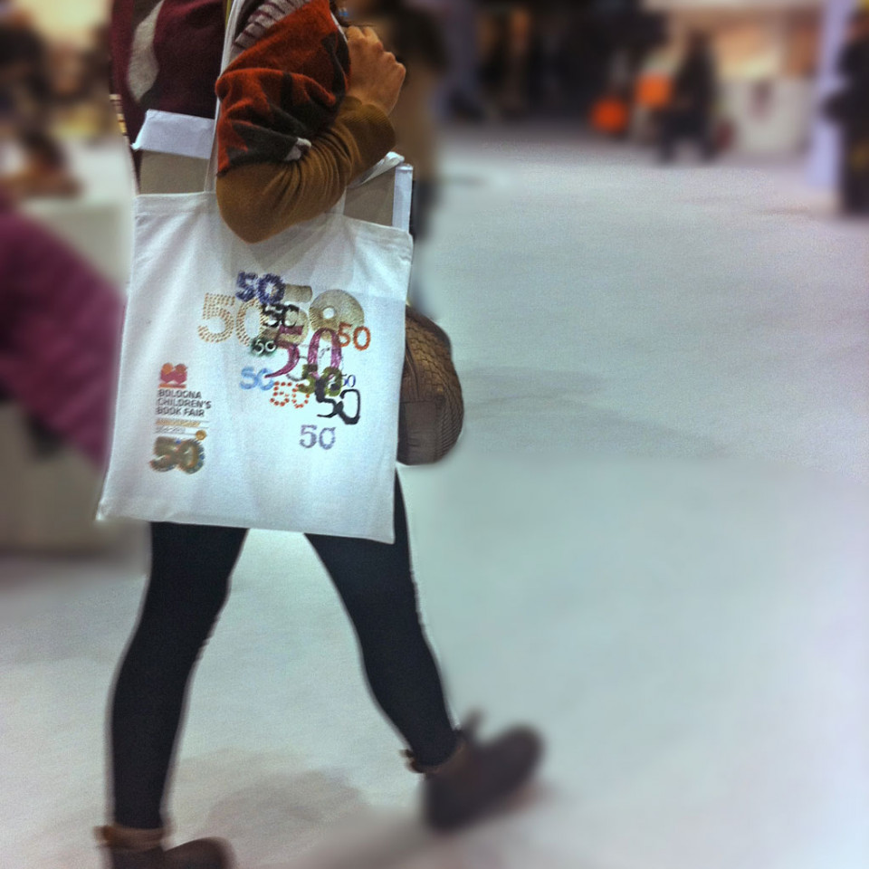
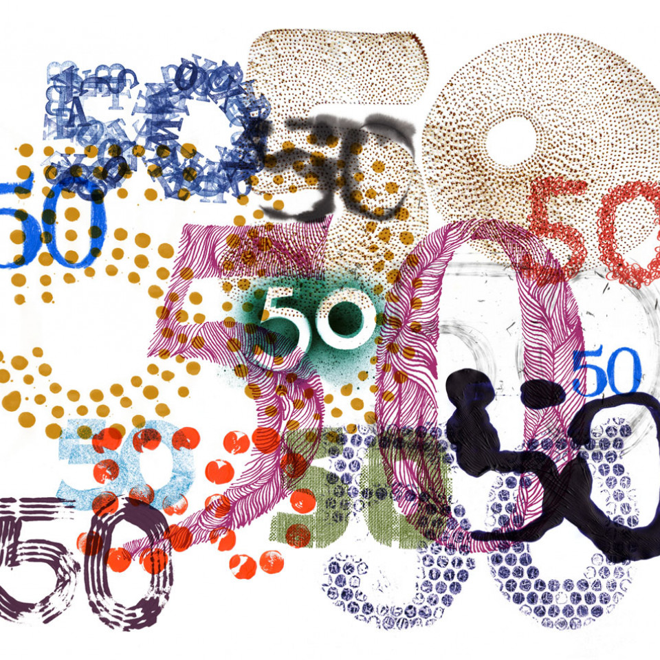
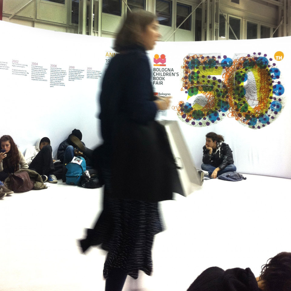
2013. The Bologna Children’s Book Fair celebrates its 50th birthday
In 2013, the event celebrated its 50th anniversary and the number "50" became the visual motif across all communication material. We created 50 designs of the number 50, using different typefaces to make each number 50 unique. Arranged in ordered or random patterns, reproduced individually or superimposed, these 50s complemented and energized the fair’s lavish programme of events.
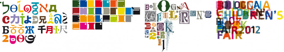
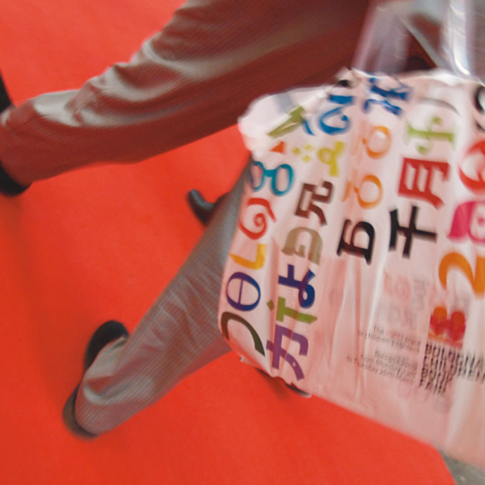
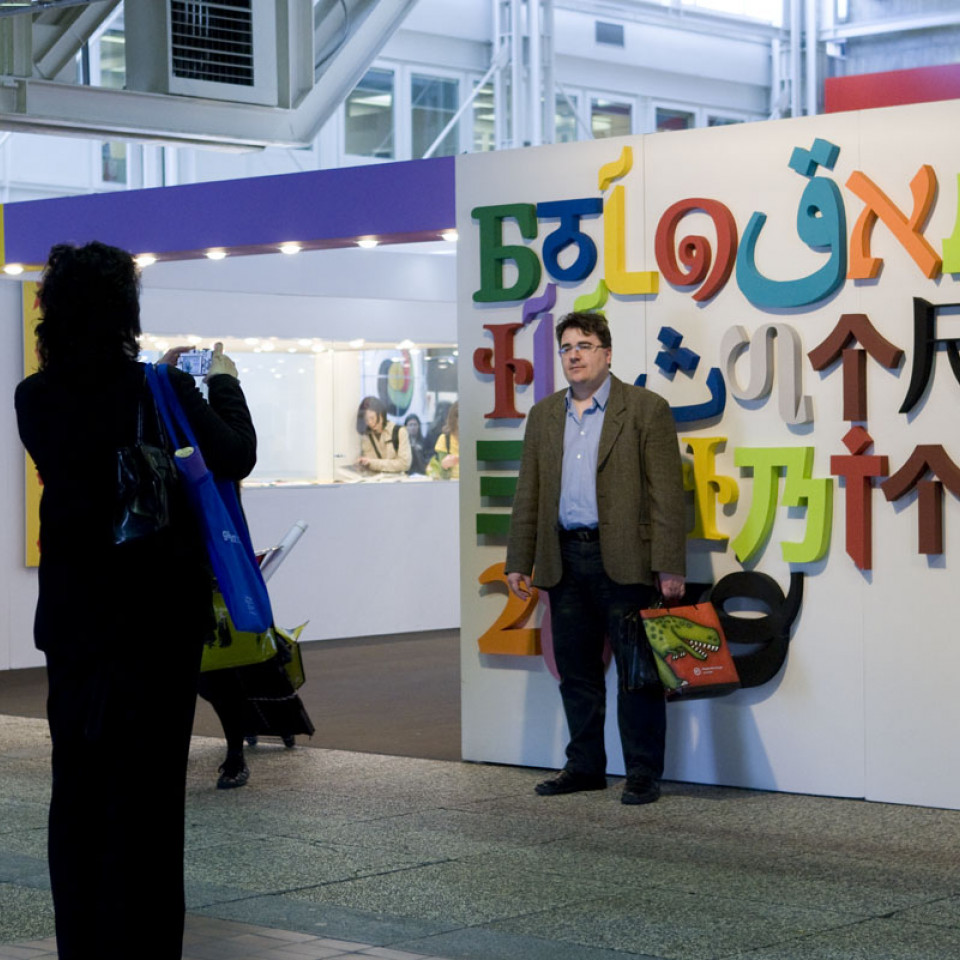
2009 – 2012. The Shape of The Letters
During the first four years of our collaboration with Bologna Fiere, our challenge was to create a specific visual identity for the institutional brand BCBF. We wanted it to be consistent over time, and distinct from the visual identity of the themed annual fairs. We developed the brand identity by outlining clear guidelines in the Manual on visual identity , which we prepared for BCBF. We also established a visual identity for the communication material that would be used at the next four editions of the event.
The guidelines called for the design of a specific font and the use of a unique colour palette for each edition of the fair. We excluded all graphic material (such as photos and illustrations) from the fair, in order to focus attention exclusively on the typographical design.
Fringe events and features
Weekend dei Giovani Lettori (Young Readers’ Weekend), International Bookstore, Bologna Licensing Trade Fair and much more. Exhibitions, lectures, workshops, conferences and other activities linked to the Bologna Children’s Book Fair. Our remit included creating the visual identity and visual communication material for all these events.
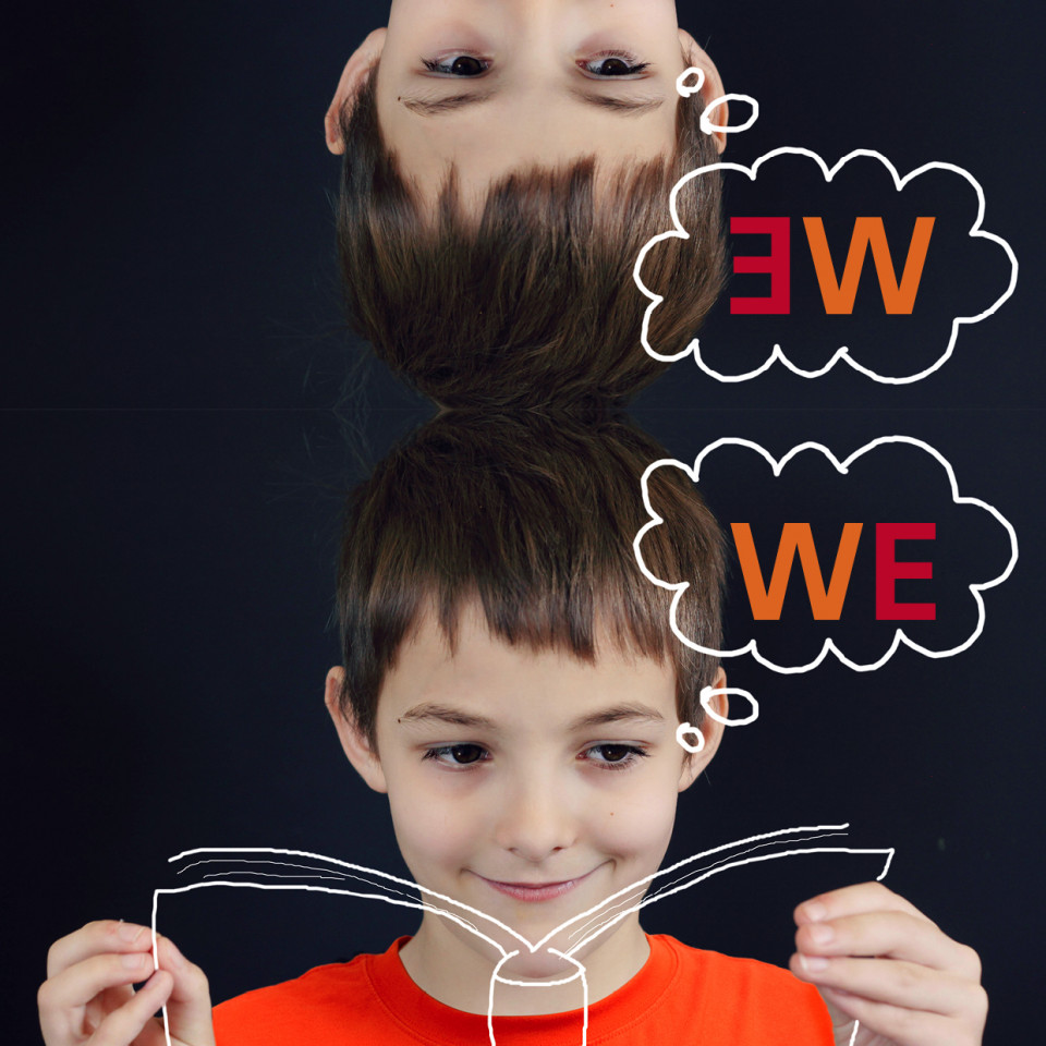
The WE Weekend dei giovani lettori is the public preview of the Bologna Children’s Book Fair. We decided to use “WE” instead of “I” to encourage people to see reading as a shared experience, and the book as a promoter of friendship and conviviality.
In working on the design of the International Bookstore, our challenge was to guide thousands of people during typically brief visits to a vast space which contained thousands of books. Our solution was to put in place enormous signs that were legible from a distance, which allowed visitors to easily find their way.